What is VAT?
VAT, the Vulnerability Assessment Tracker, supports Iron Bank container image review by helping vendors, maintainers, and cybersecurity reviewers assess vulnerabilities, manage findings, submit justifications, and track compliance status.
WHAT WAS THE PROBLEM?
The actual problem
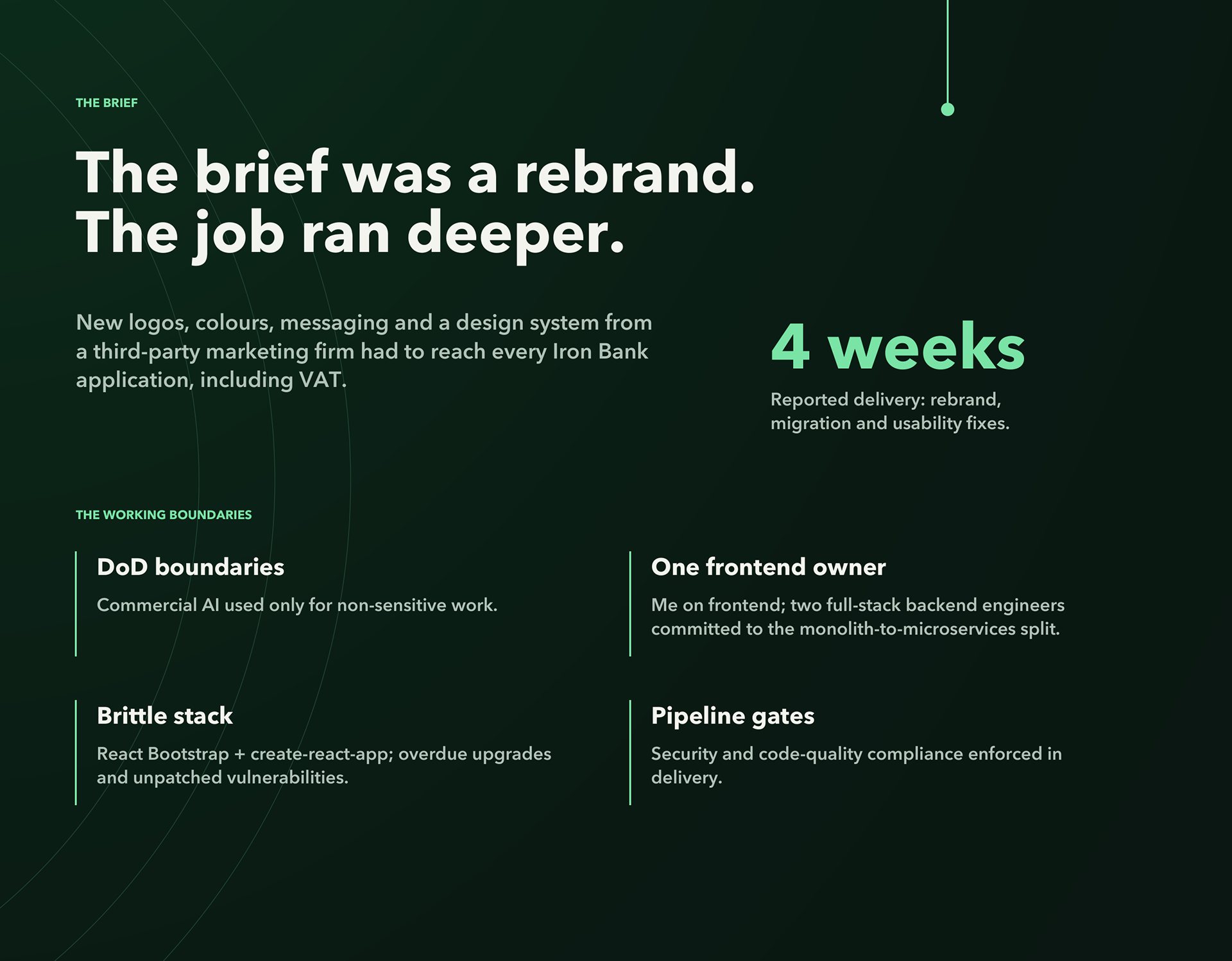
VAT had the data, but the interface did not turn that data into a clear review decision.
What users experienced
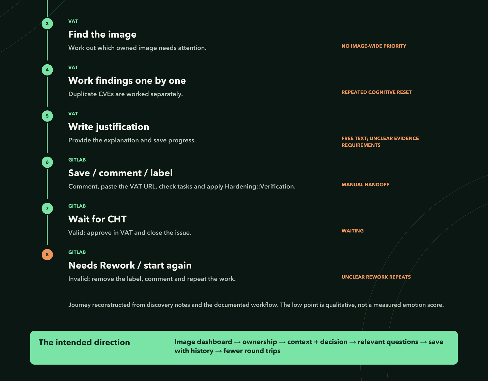
Security reviewers had to scan across dense rows, multiple status indicators, risk scores, verified percentages, and finding counts to answer basic workflow questions:
- What needs attention?
- What is already handled?
- What requires justification?
- What action should I take next?

Why it mattered
VAT supports compliance and vulnerability review work. When the review state is unclear, users do not simply “take longer”. They re-check the same information, second-guess decisions, miss signals, and lose trust in the workflow.​​​​​​​
Supporting evidence
Before the redesign, usability metrics showed high average clicks, high median task time, lower task success, and an accessibility score near 62%. The interface was exposing information, but not guiding the work.
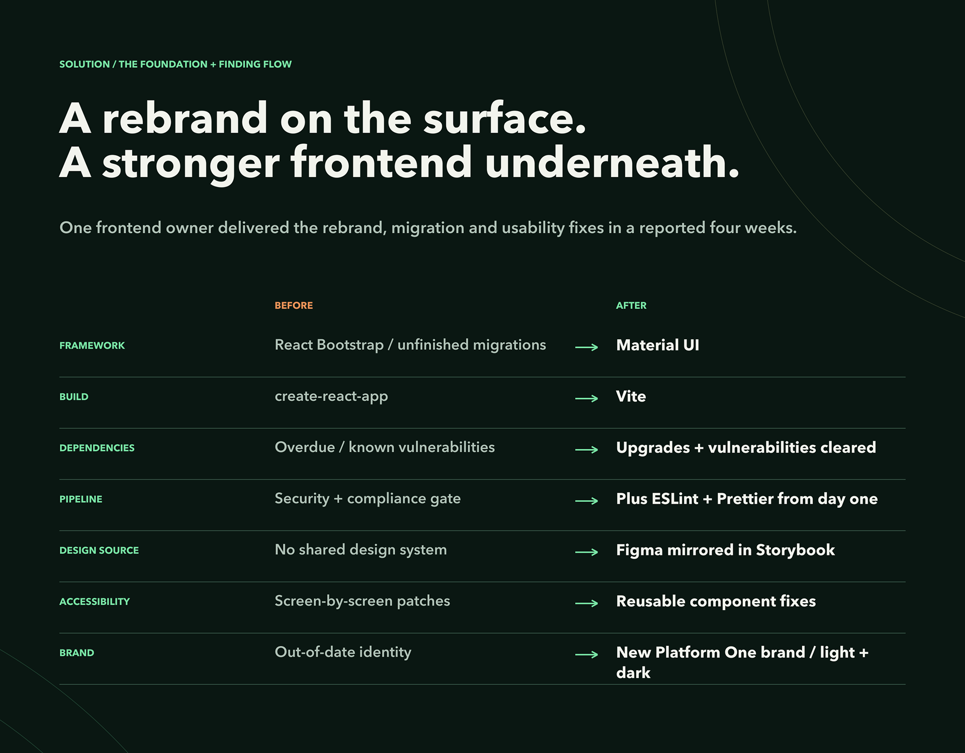
​​​​​​​The legacy React Bootstrap interface made VAT harder to maintain, theme, scale, and improve consistently. It also made the product feel disconnected from the newer Iron Bank ecosystem.
Solution
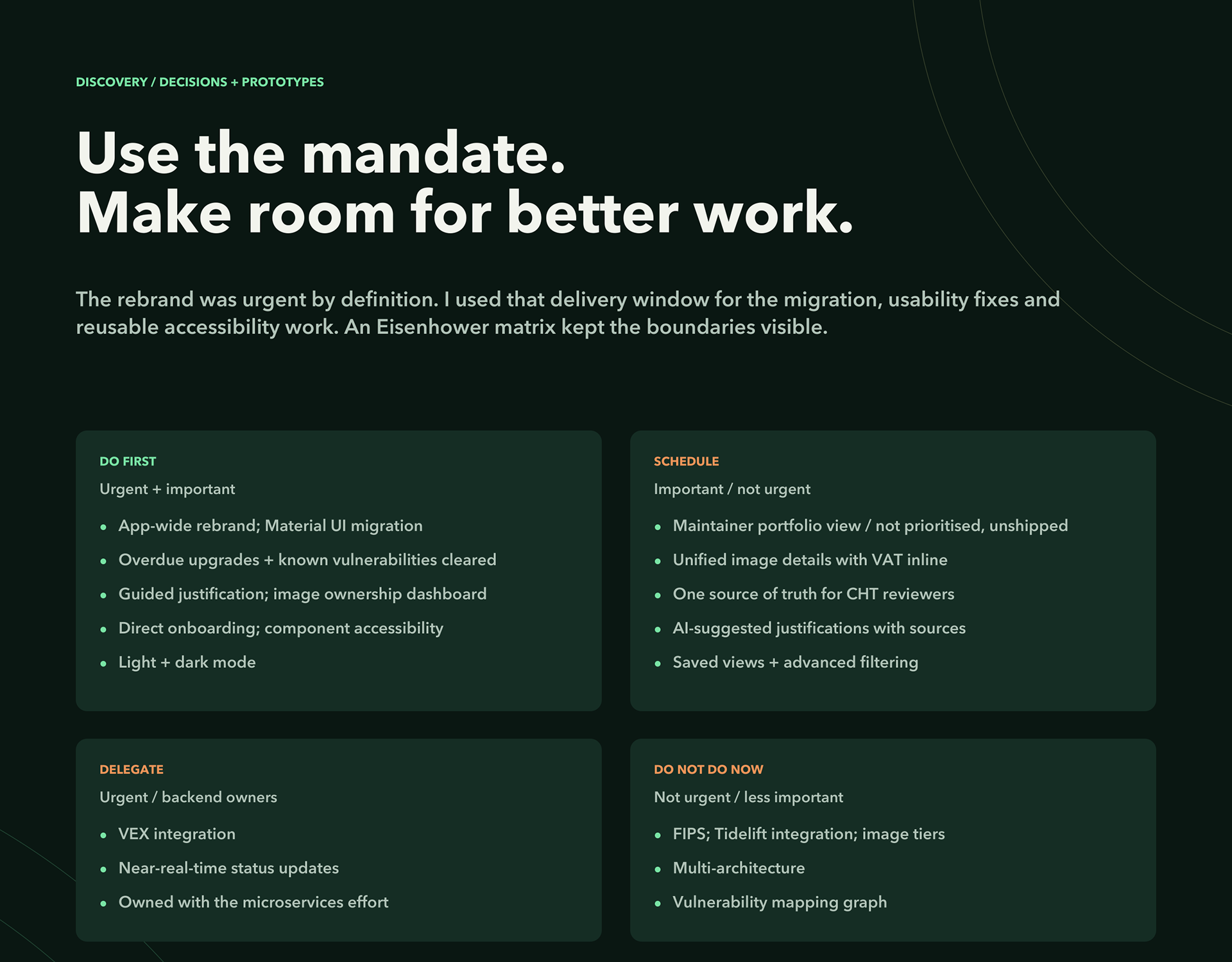
• I redesigned and rebuilt the VAT frontend around clearer workflow behaviour.
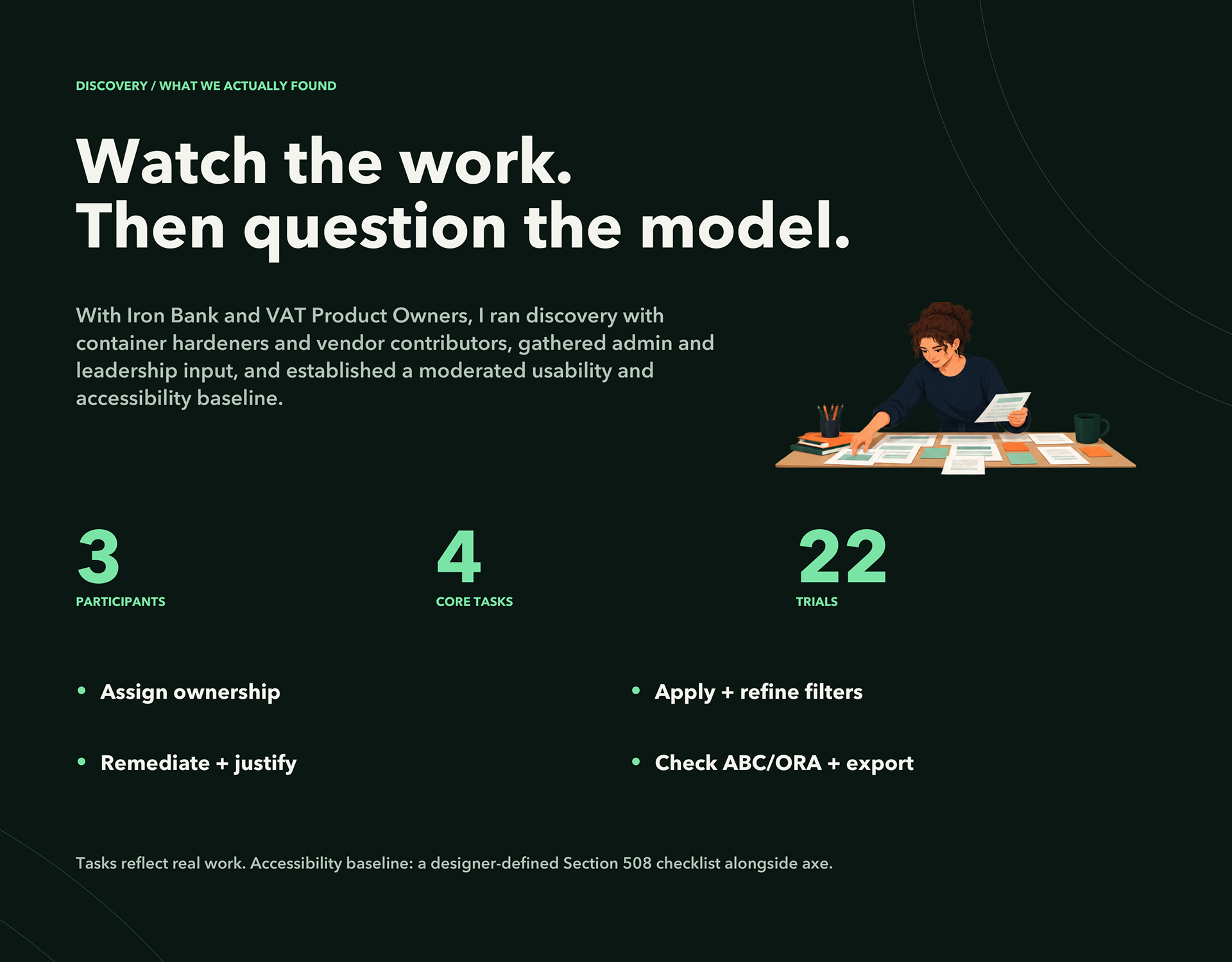
Focused on reducing friction in the core tasks: assigning ownership, applying and refining filters, marking findings remediated with justification, and verifying ABC / ORA summaries for export.​​​​​​​
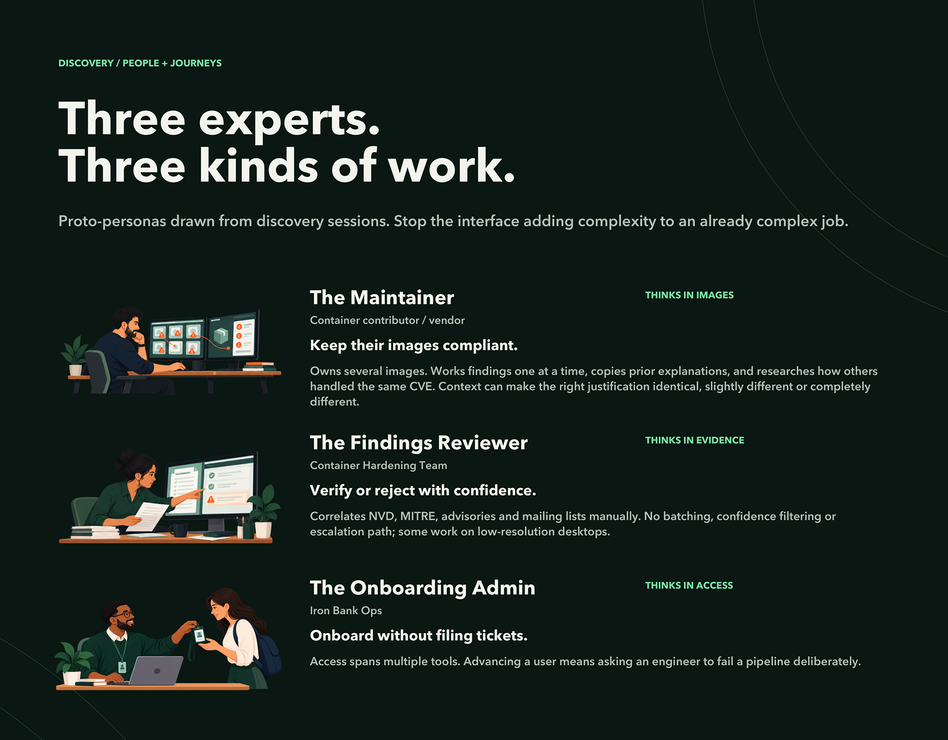
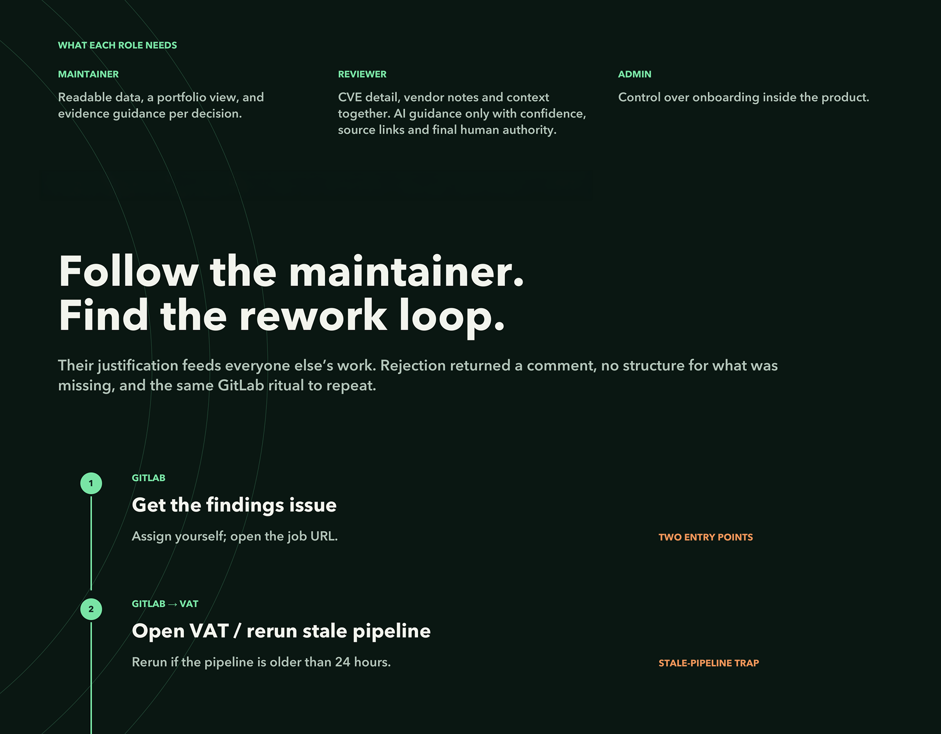
I led interviews, surveys, and journey-mapping sessions with Container Hardeners, Vendors, and CHT/POPs to identify where VAT users struggled most. We found onboarding friction, dense data tables, missing accessibility cues, and confusion over “non-compliant” statuses tied to ORA timing. Mapping these workflows by pain intensity and confidence revealed that users spent up to 15 minutes deciphering metadata or re-checking findings. These insights grounded the redesign’s focus on clarity, efficiency, and trust.
• A reworked dashboard that gave users a real overview of the images they managed and who owned what.​​​​​​​
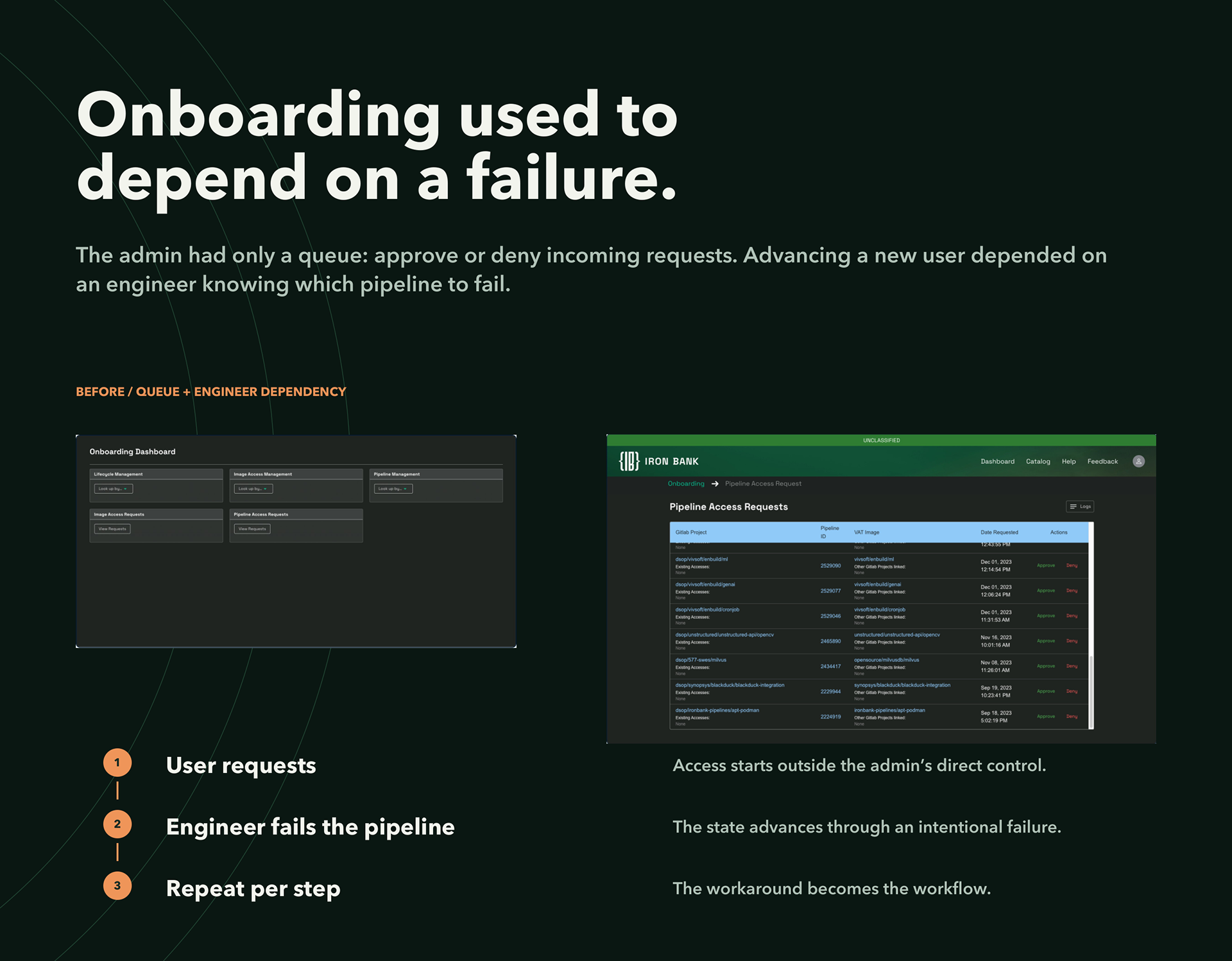
• A fix to the onboarding workflow that had required engineers to manually trigger intentional pipeline failures to move a user forward
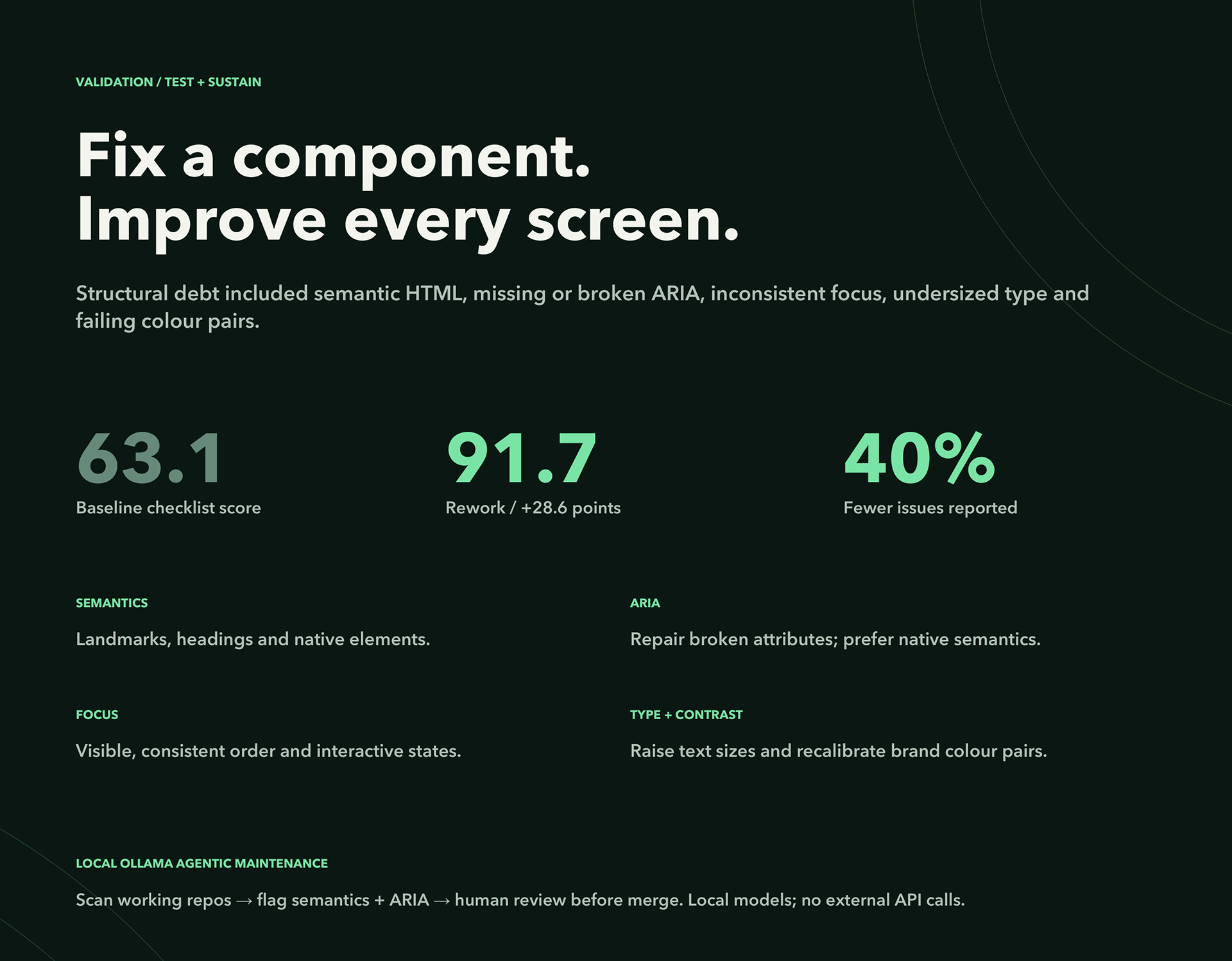
• brought the UI closer to WCAG / Section 508 expectations.
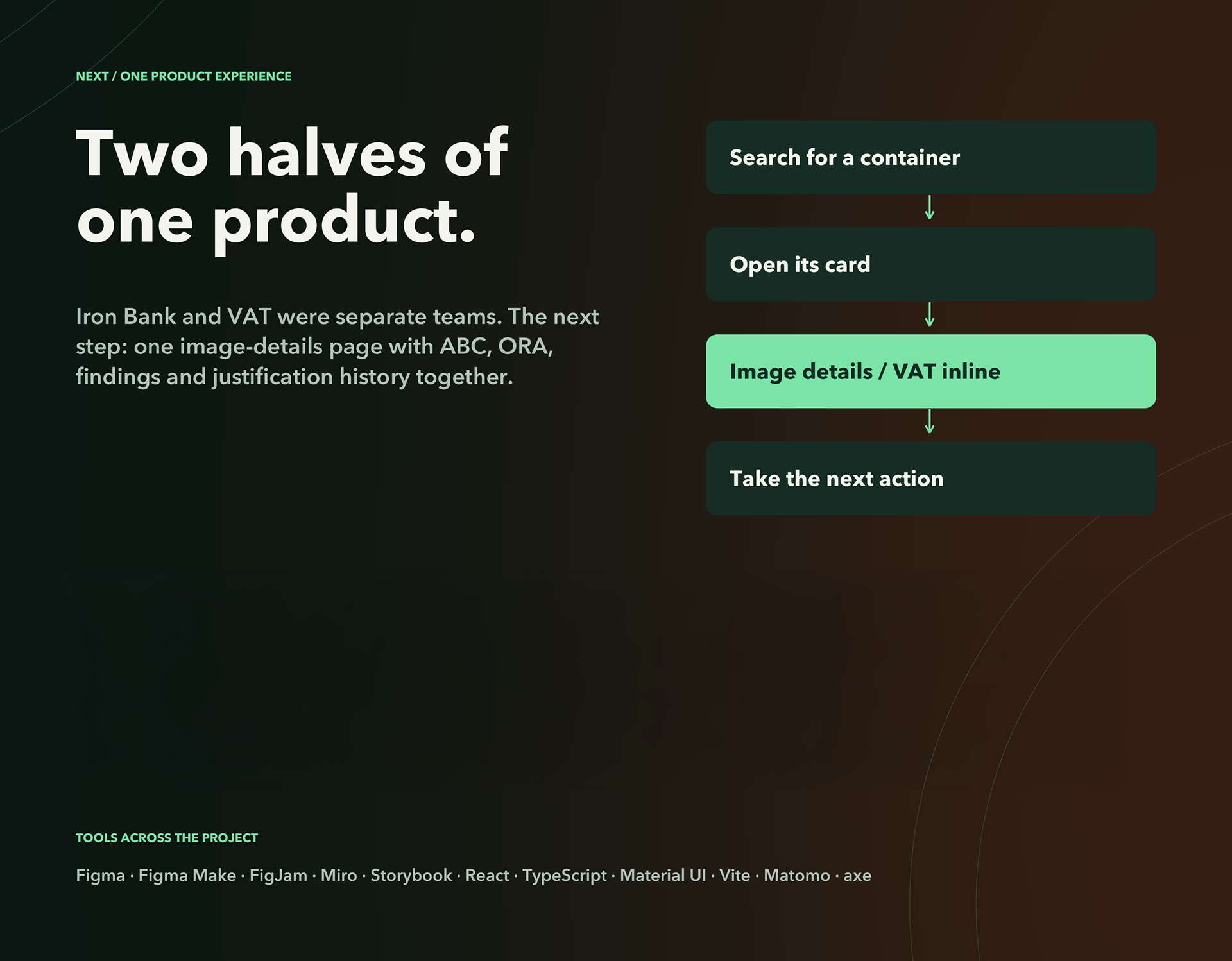
• I moved the interface away from the older React Bootstrap patterns and rebuilt the experience with Material UI.
The new 2025 Design System (third-party marketing team)
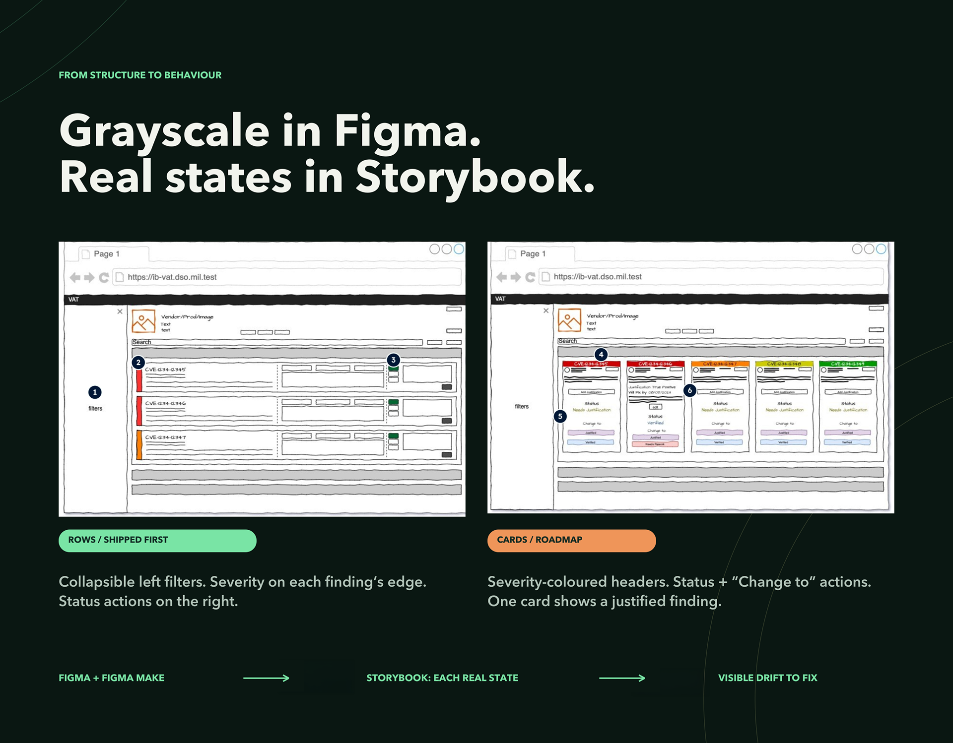
I built mid-fidelity wireframes and a fully interactive Figma prototype grounded in a new Material UI v5 design system. This replaced the old React Bootstrap stack with modular, ARIA-ready components and a rebranded Iron Bank palette. Core flows like, onboarding, findings justification, findings review, were remodelled for clarity and progressive disclosure. Accessibility was baked in from the start: keyboard navigation, high-contrast modes, and ARIA labelling reduced axe-core issues by 40%, with 92% of automated checks passing Section 508 standards.
Prototype Preview
View the Figma Prototype Here.
The Outcome
Before:
After:
Data Comparison:

You may also like

Back to Top