The Catalyst (The "Why")
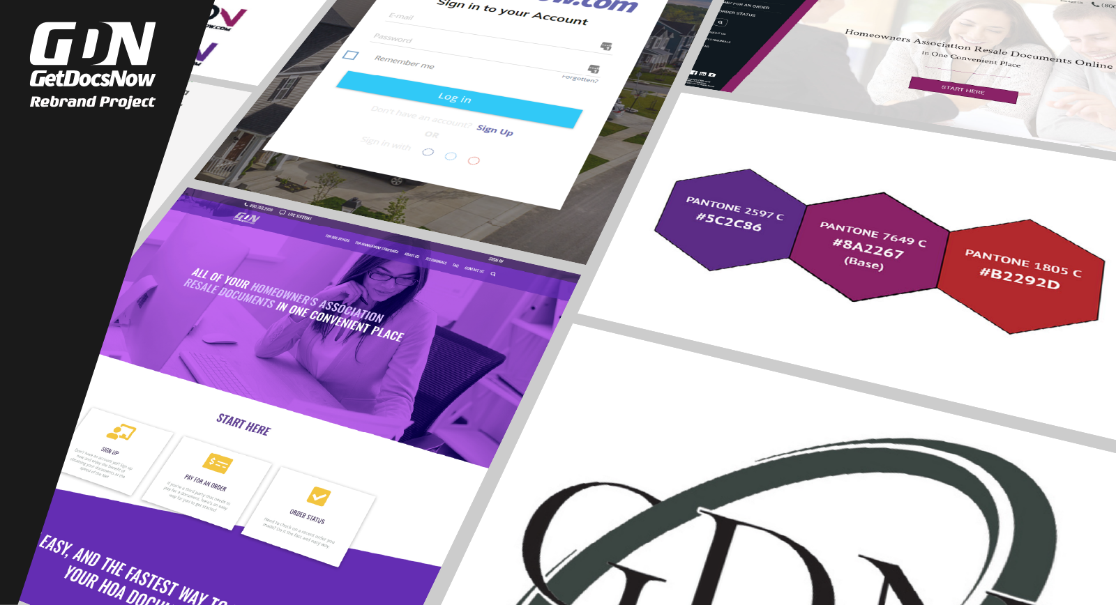
GetDocsNow moves volume: over 1,500 documents monthly across 40+ management companies. Yet, the public-facing platform (GetDocsNow.com) fails to reflect that authority. We are not just giving the site a "fresh look". We are rebuilding the marketing front from the ground up to solve a critical business gap.
The legacy website falls behind in essential metrics. It lacks brand consistency, ignores modern web standards, and struggles with cross-device usability. This rebrand is a strategic overhaul. The goal is to establish a unified visual identity, enforce technical compliance, and drive user acquisition through a responsive, high-performance interface.
Before we get to the bottom of it all, we need to visit some principles so we can decide how it should look, namely: Colours, Fonts, Logo Design, and the website framework.
Defining the New DNA
GetDocsNow lacked official branding guidelines. The legacy site relied on a fragmented approach to colour. An audit of the stylesheet revealed a haphazard mix: generic HTML "purple" (#800080) competing against inconsistent hex codes (#870960). It was a guess, not a system.
We engineered a new baseline. I extracted a foundational purple from the legacy site and anchored it to its closest Pantone equivalent. A brand cannot exist solely on a screen. Web colours fail in print production without proper translation. By rooting the new digital palette in a Pantone matching system, we ensure cross-medium consistency from day one.
With the base colour established, we applied strict colour theory to generate a scalable theme. This isn't just a palette. It is a functional UI system designed for high contrast and accessibility. The combinations below demonstrate how these rules now govern the entire visual hierarchy.
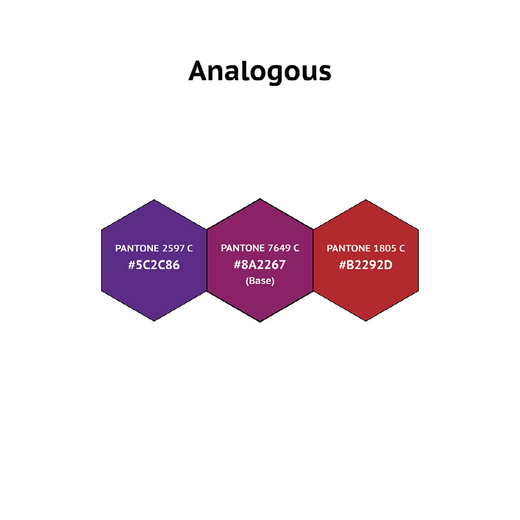
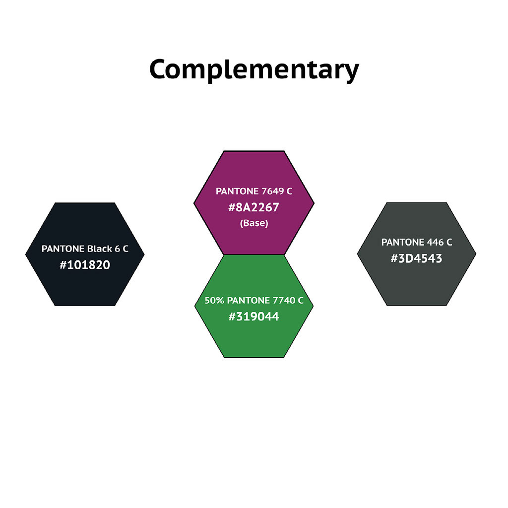
[From Left to right]
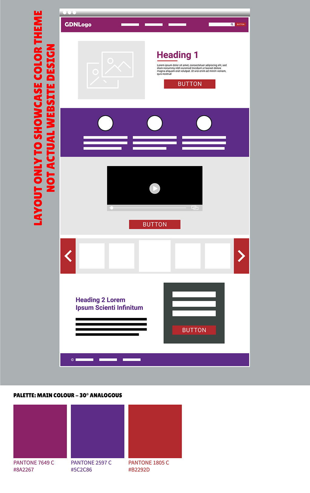
(1) Analogous. The analogous approach pairs the base purple with its immediate neighbours on the colour wheel. It is highly effective in tight, whitespace-heavy components. However, scale it across a sprawling layout, and it quickly becomes visual noise. We restrict this palette strictly to micro-interactions and subtle gradient accents.
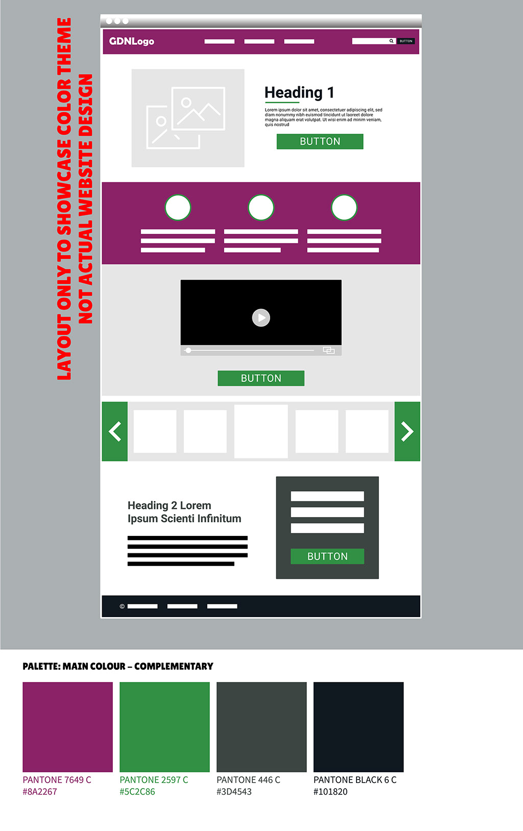
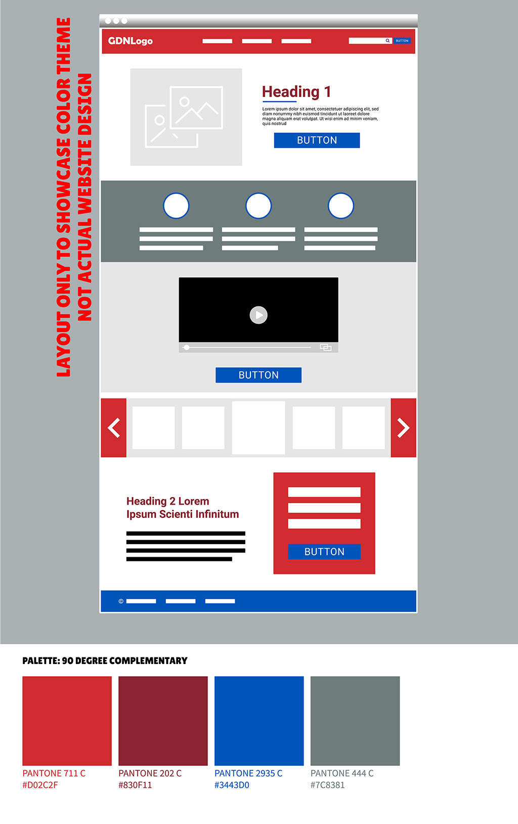
(2) Complementary. Complementary palettes are trendy, but they often force a clash. The direct complement to GetDocsNow’s purple is a jarring grass green. It creates vibration, not harmony. Split-complementary scales are even worse for this specific hue. I discarded the green entirely and introduced black and grey as supplementary anchors. (Side note: this extreme visual friction is exactly why Marvel put the green Incredible Hulk in purple trousers – it demands attention, but it does not belong on a corporate interface).
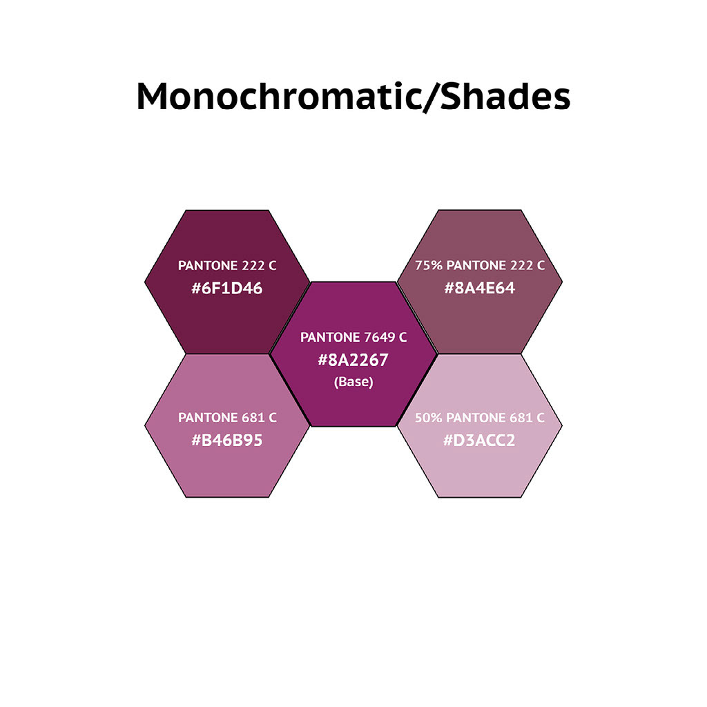
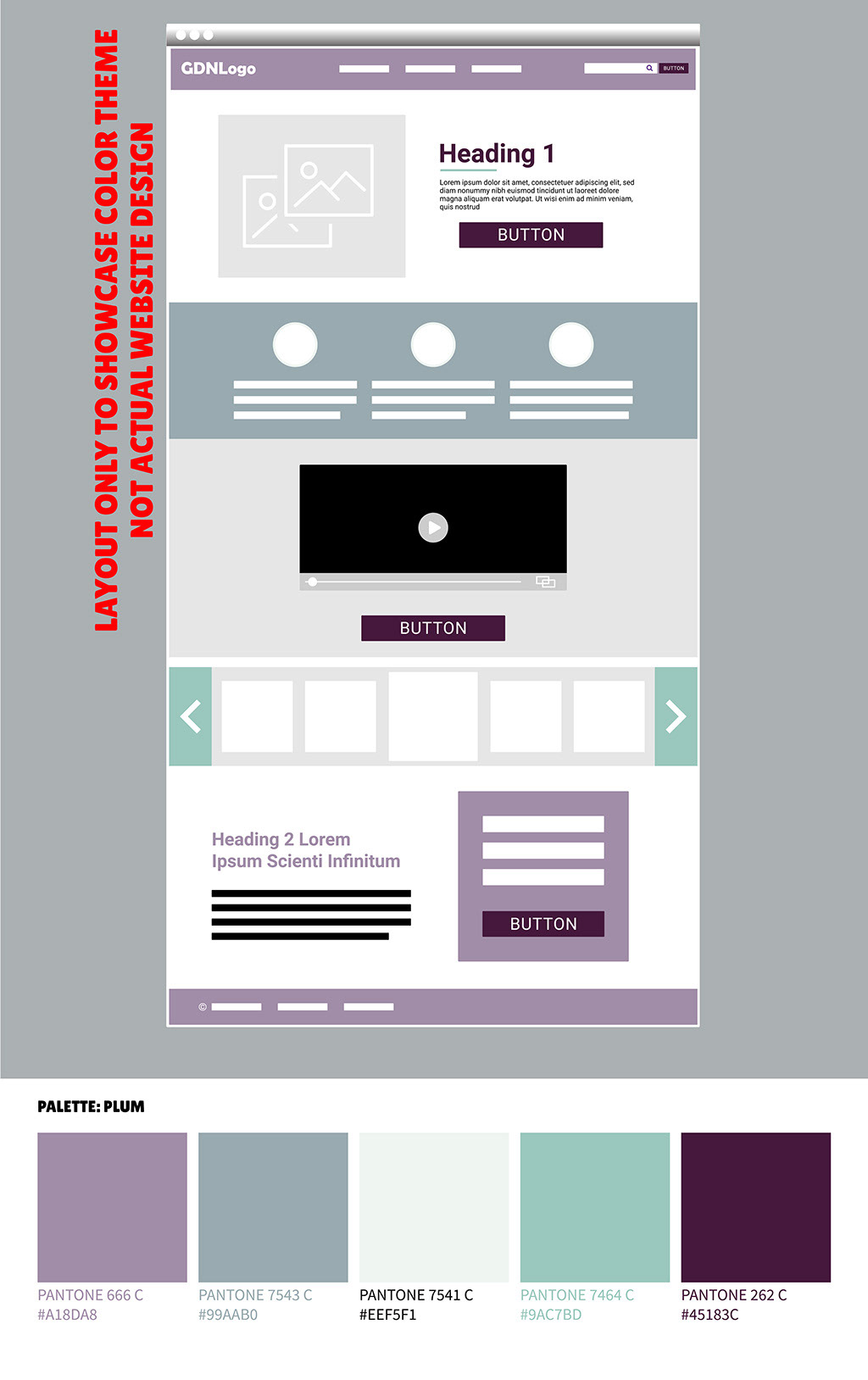
(3) Monochrome and Shades. Monochrome and shades often get confused, but the difference dictates the UI's hierarchy. Monochrome scales adjust the tint percentage; shading introduces pure black or white. For this concept, we anchored the base purple with a darker shade (Pantone 222 C) and a lighter one (Pantone 681 C), then built a strict monochromatic step-down. It creates depth without introducing competing colour variables.
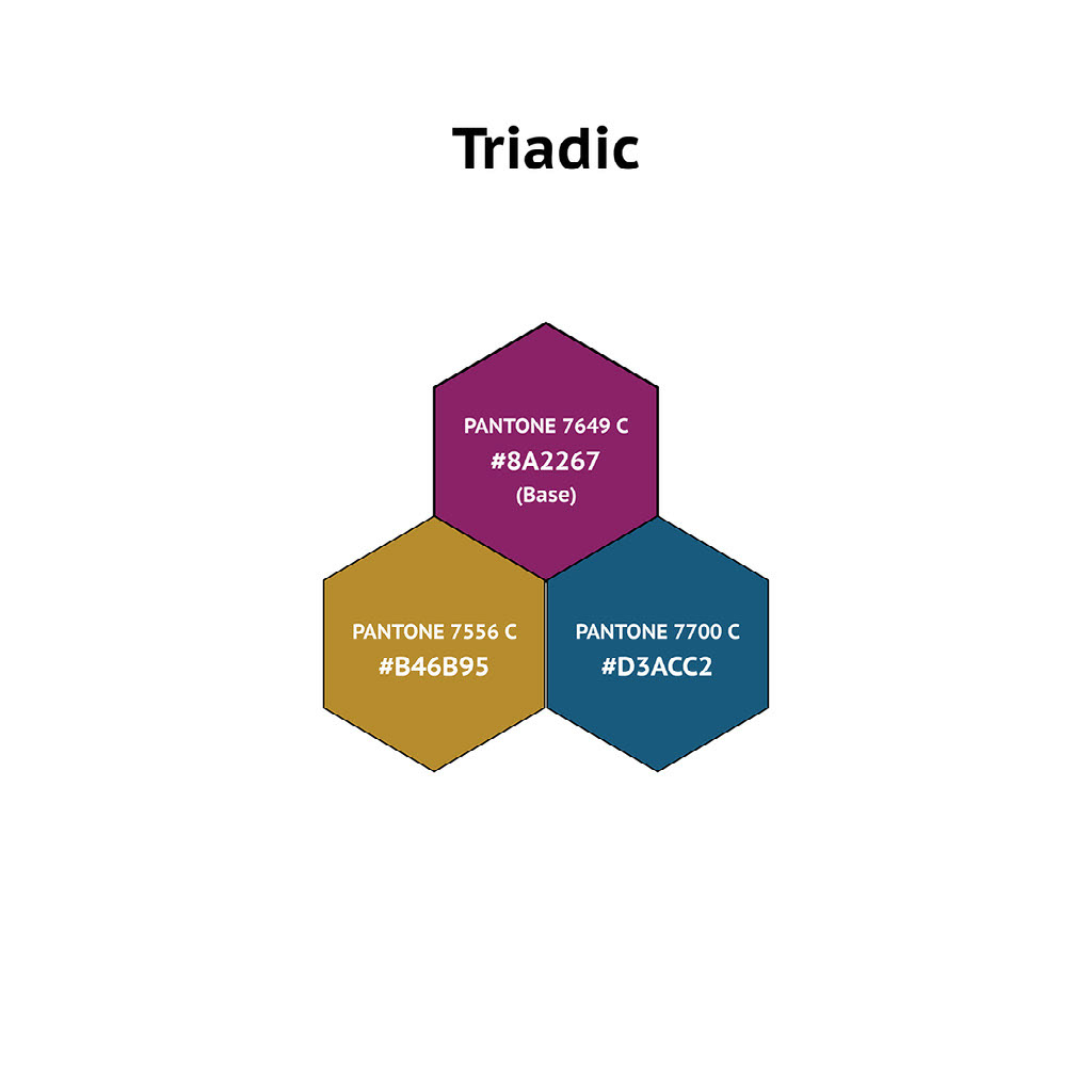
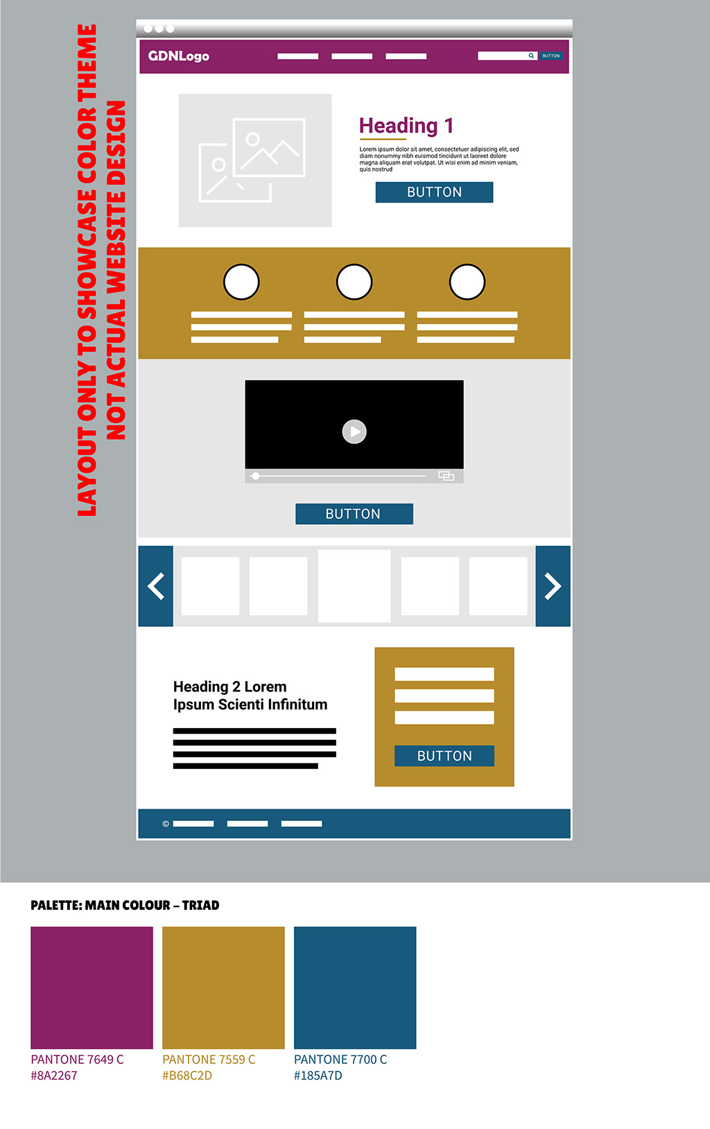
(4) Triadic. The triadic system pulls three equidistant colours from the wheel to provide high contrast while retaining balance. Its success lives or dies on execution. You do not flood the layout with all three. We assign the purple as the primary authority, restricting the other two strictly to secondary accents and high-priority call-to-actions.
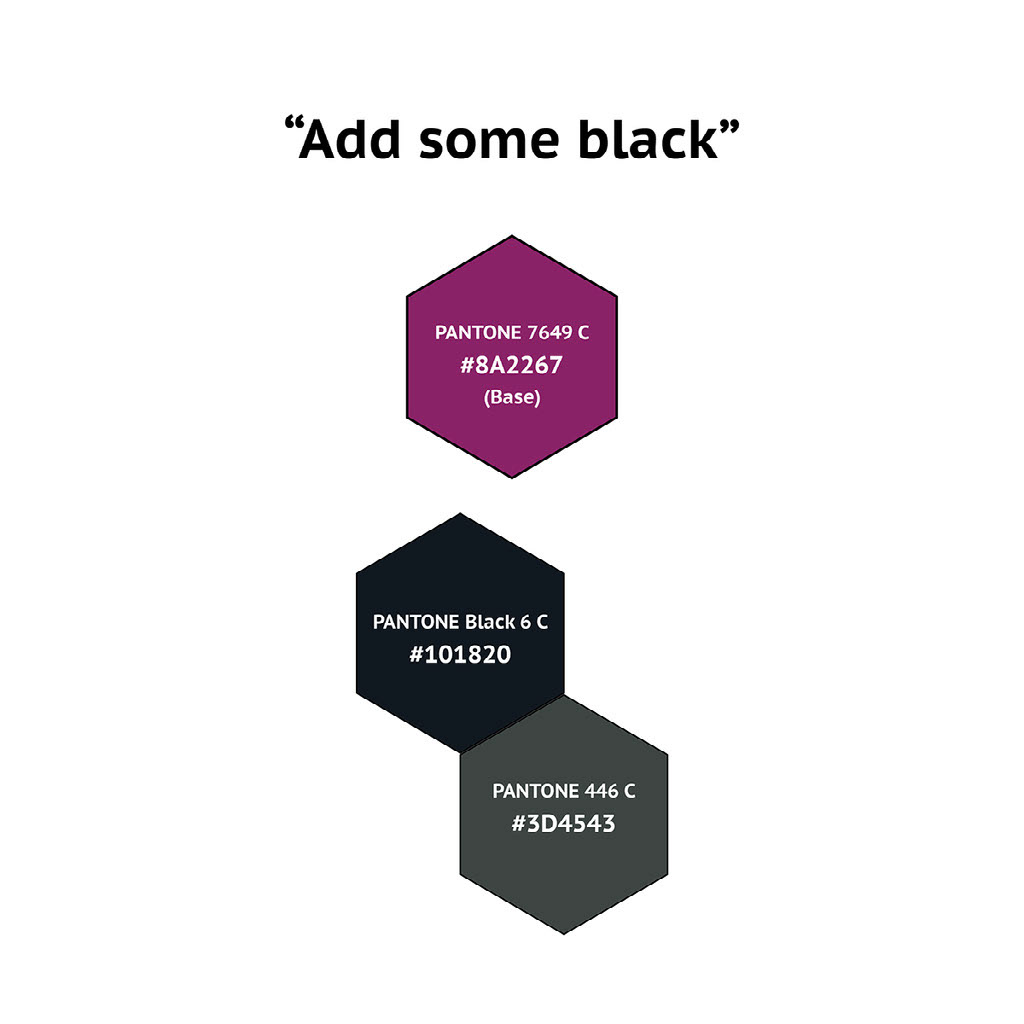
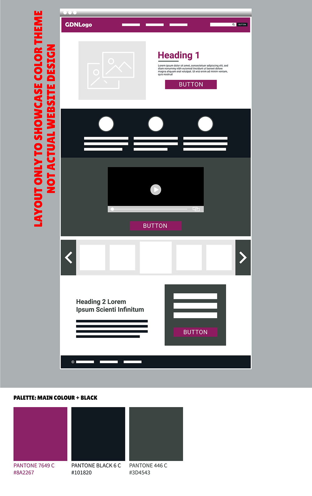
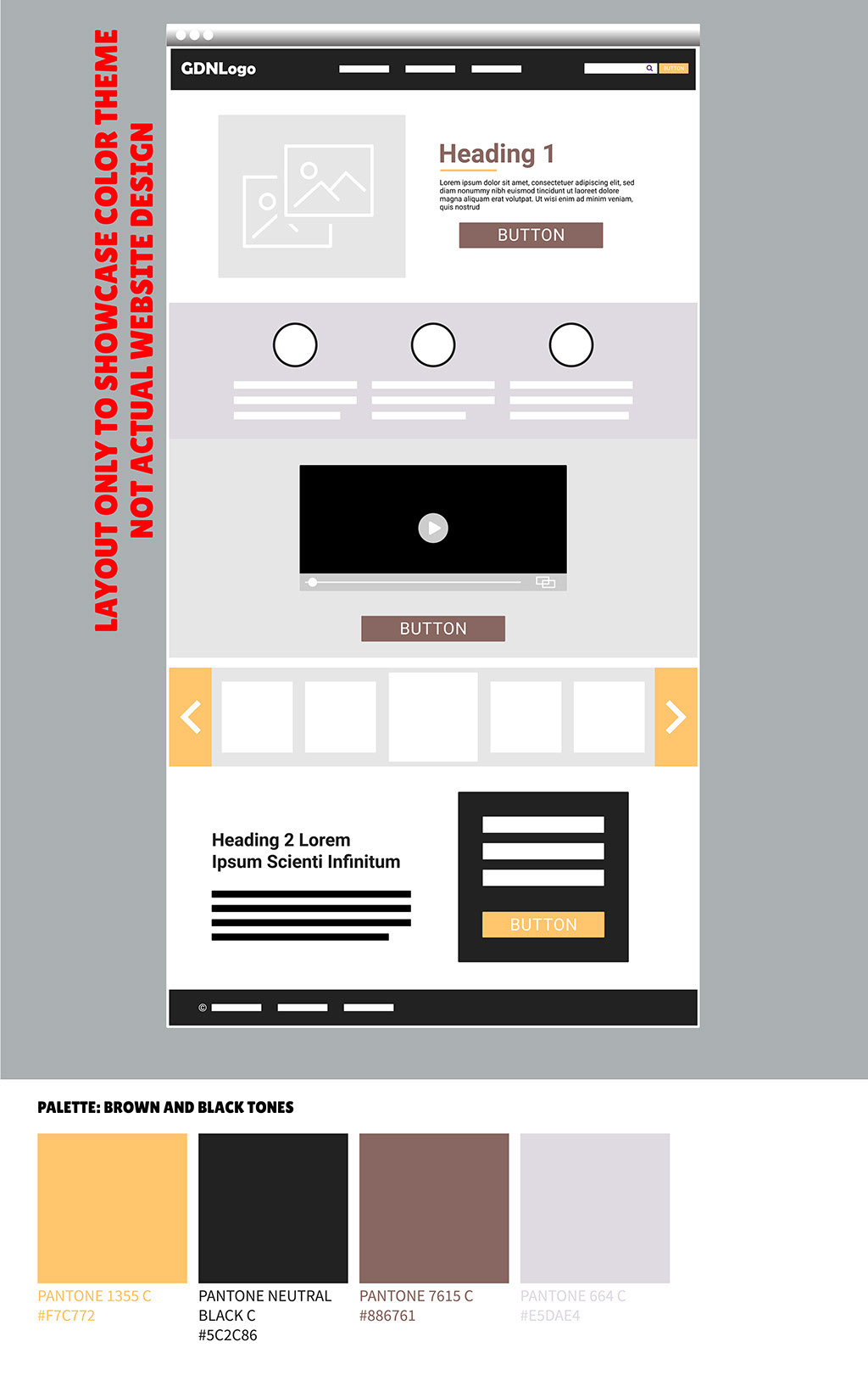
(5) System Override (The Custom Palette). Beginners follow colour theory rigidly; experts establish rules so they can strategically break them. This final palette ignores traditional wheel mechanics. We stripped it down to the base purple, injecting stark black and a calculated shade of grey. It is not about being wildly original. It is about utility. The legacy site used a variation of these colours poorly; we rebuilt them into an effective, high-contrast system that simply works.
The Colours applied to a web layout
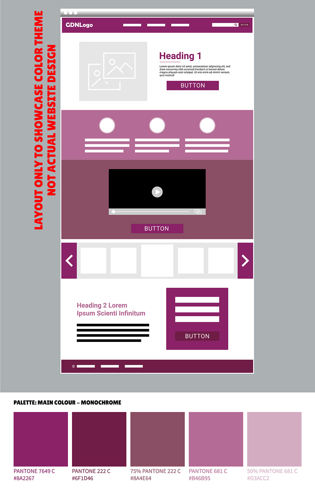
I detached from the usual old purple and used other colours...
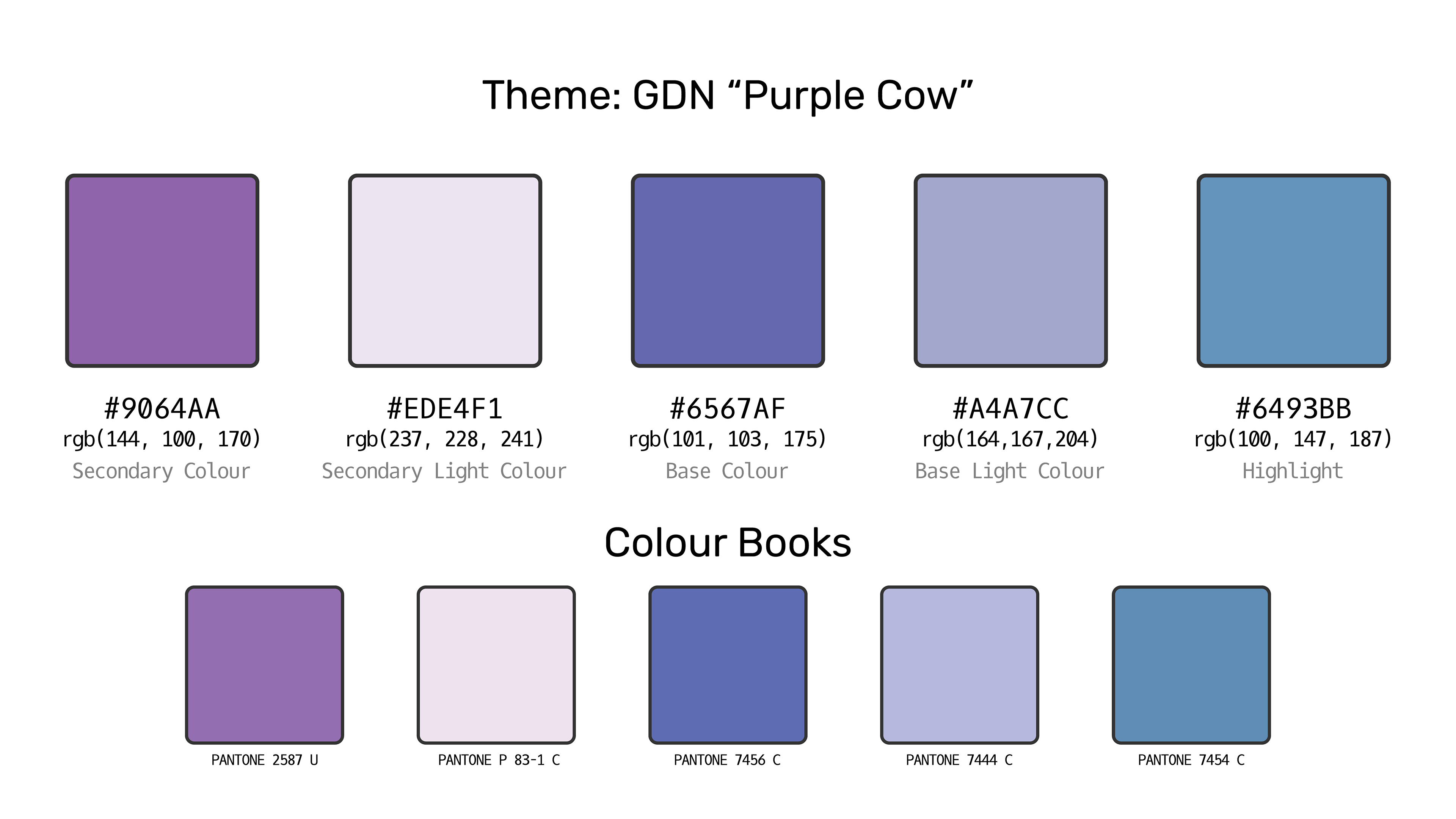
Ultimately, I discarded every conceptual palette shown above. By 2020, the strategy demanded something sharper. I engineered a completely new colour system from the ground up to directly complement the final 'Purple Cow' brand identity below.
The Visual Pivot (Logo & Identity)
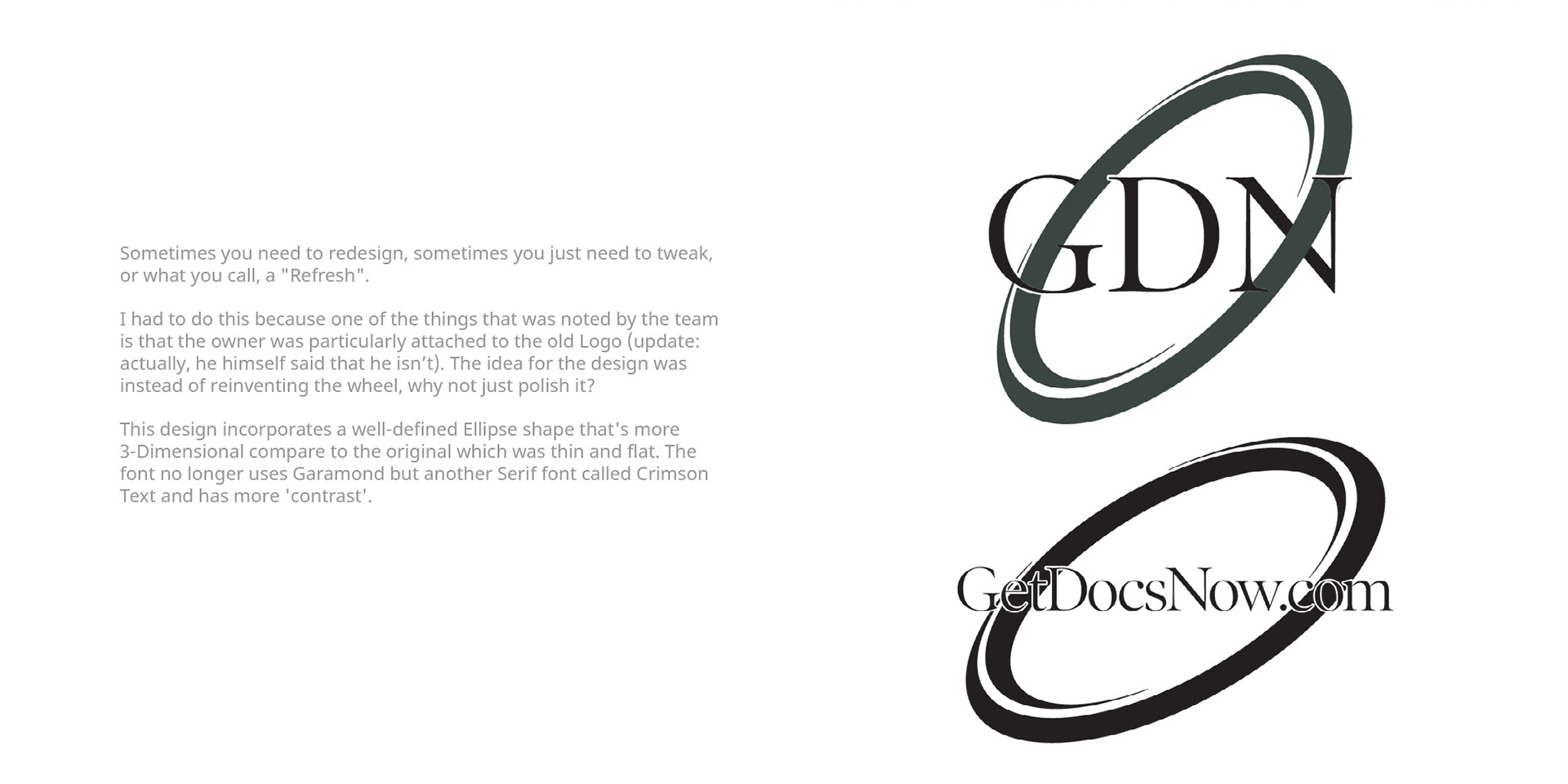
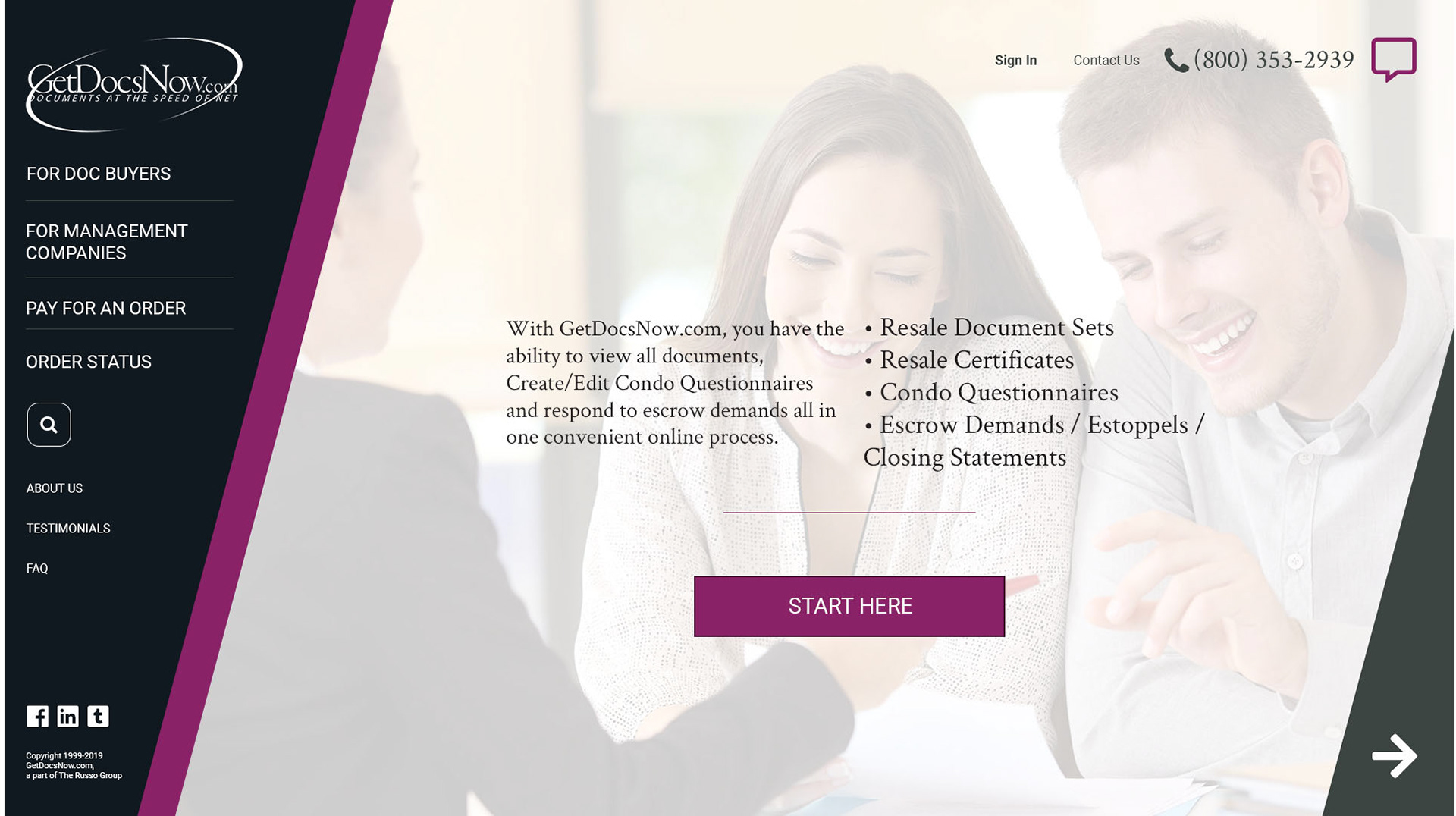
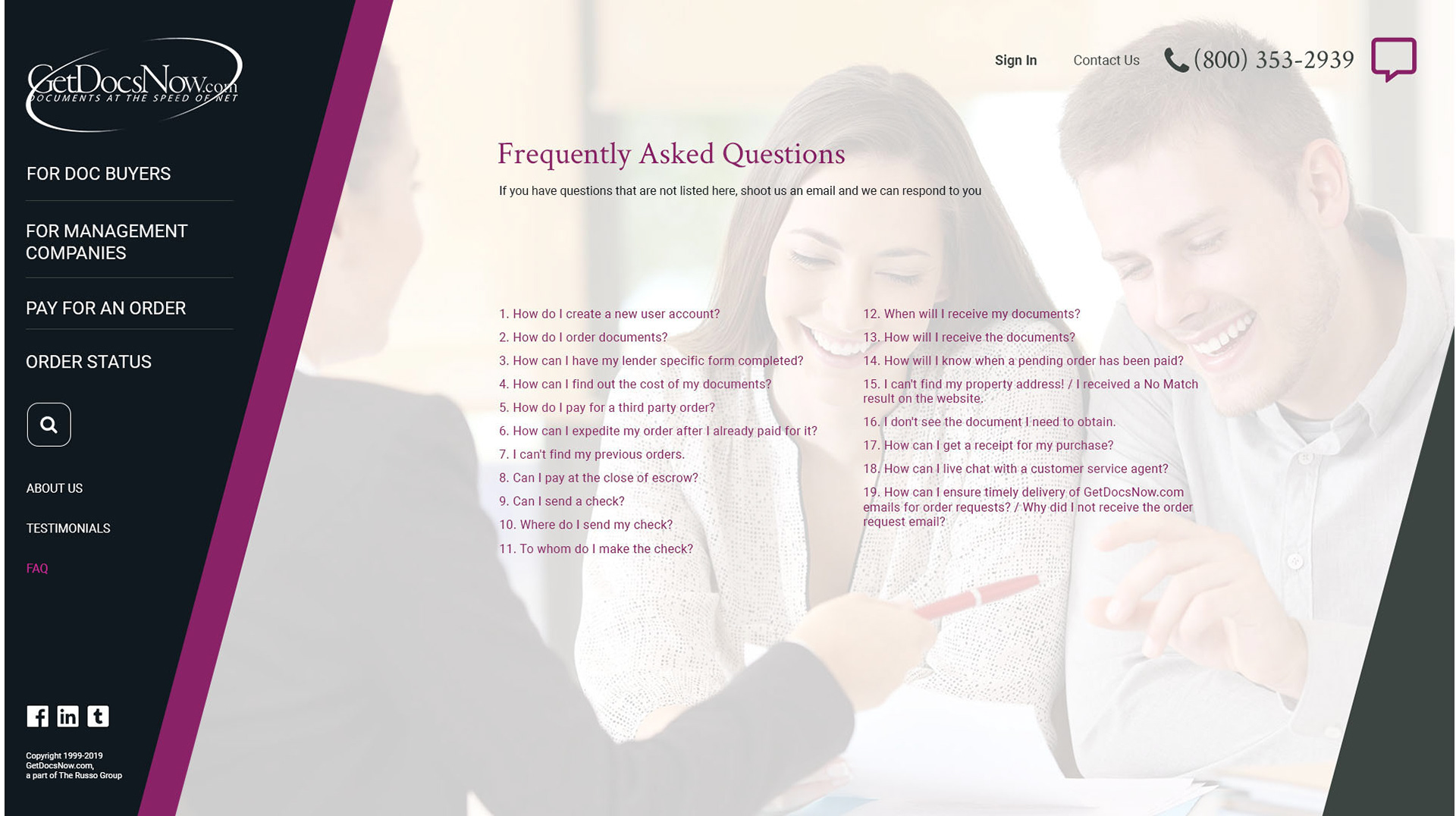
A brand mark must communicate authority instantly. The legacy GetDocsNow logo failed this basic test. It lacked volume. The primary text was typed out in a single line using an unmodified Garamond font – functional for a printed paragraph, but structurally weak for a digital identity. It lacked the weight and contrast required to anchor a modern interface.


The old Logo
Furthermore, the defining graphic element – the ellipse – created active visual friction. While the swirl technically worked on the abbreviated "GDN" mark, it carelessly overlapped the "m" on the full logo. It was a distraction, not a deliberate design choice.
We stripped the logo down to its most essential form. We moved away from weak, literal executions toward a more abstract, professional mark that suggests movement and security. It is assertive but grounded. We overhauled the palette to prioritise accessibility and high-performance interfaces, replacing muddy legacy colours with a high-contrast system that guides the eye exactly where it needs to go.
The concepts below outline the structural evolution from that flawed baseline to a functional, scalable identity.
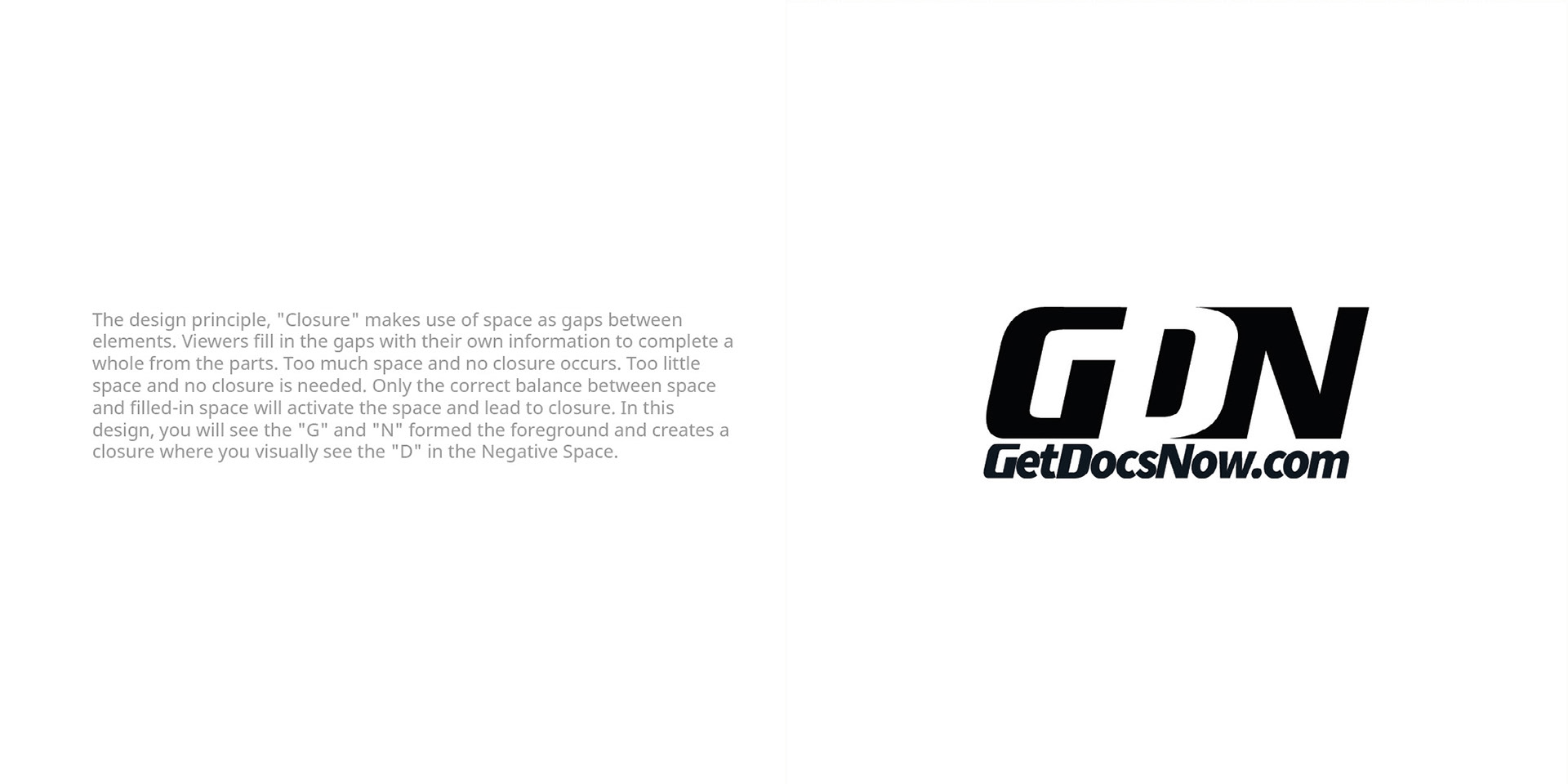
Design 1: Closure Principle
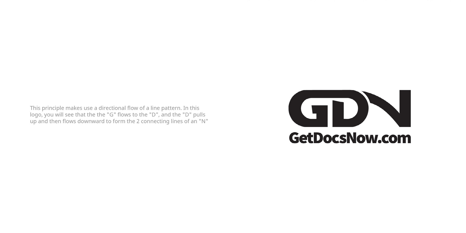
Design 2: Continuity Principle
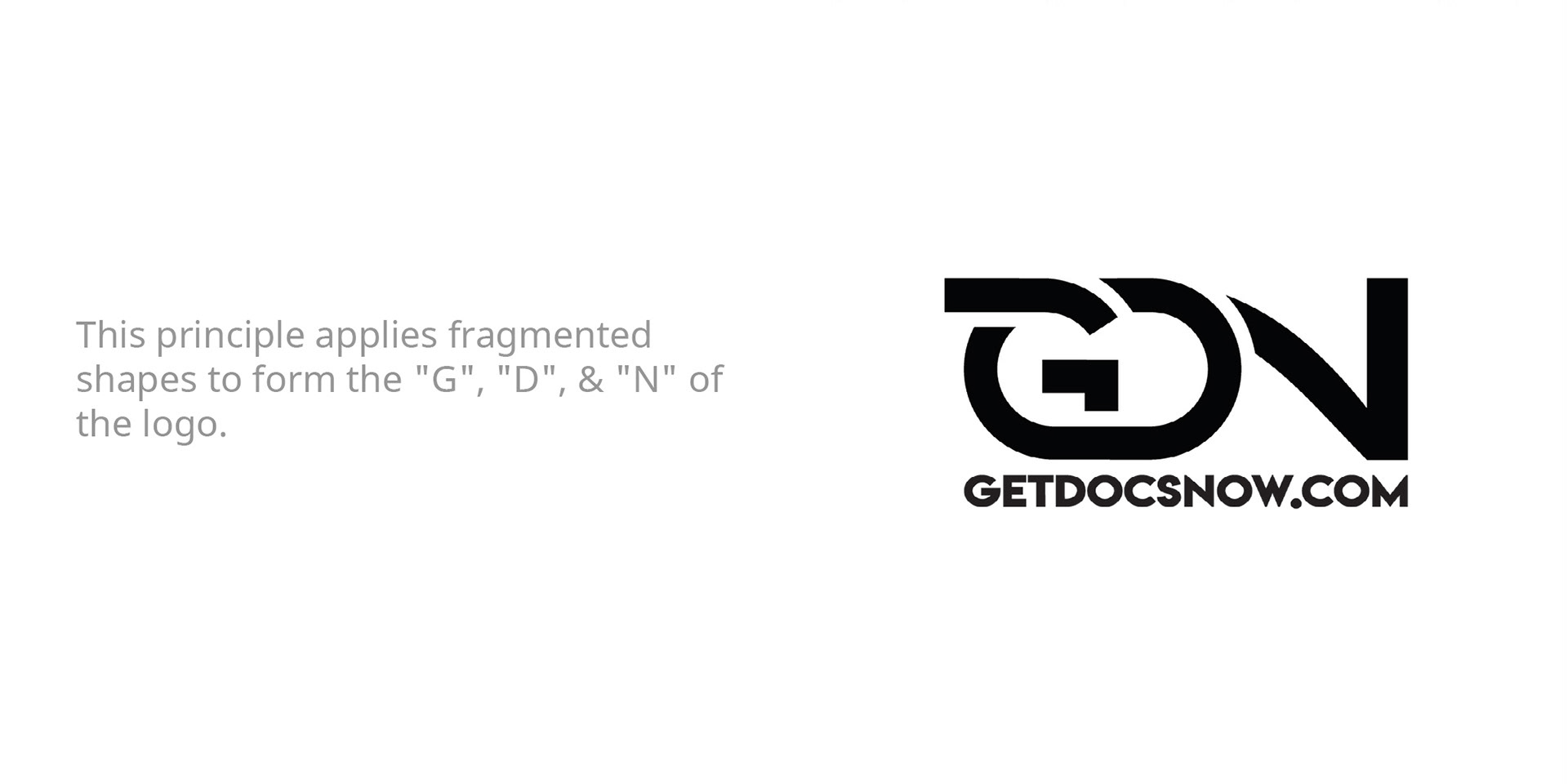
Design 3: Proximity
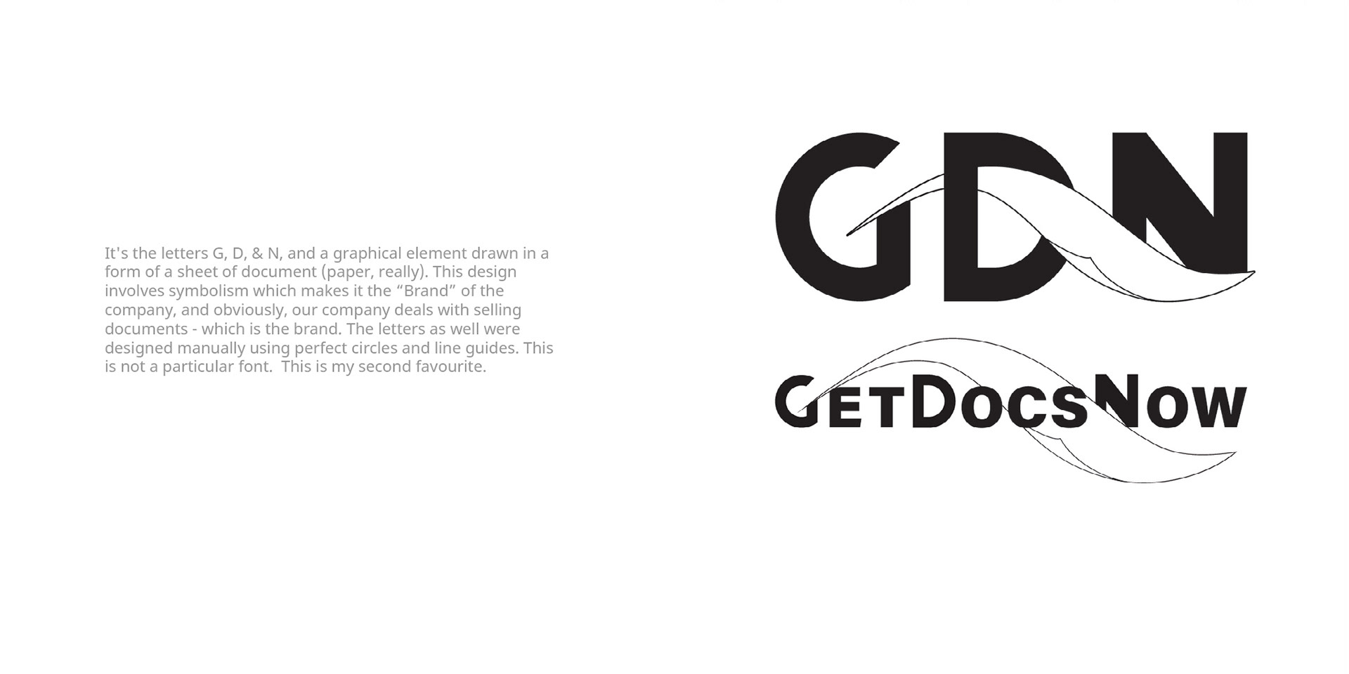
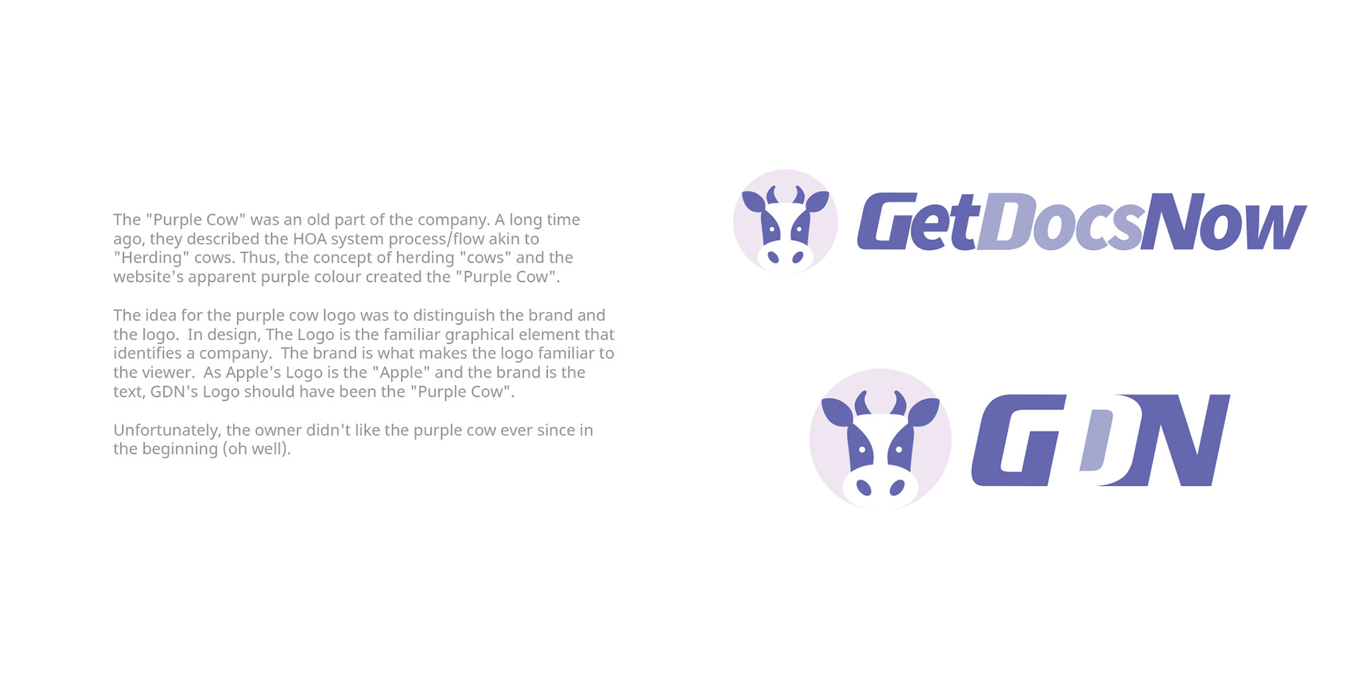
Design 4: Brand & Logo - 1 : "Symbolism"
Design 5: Logo Refresh - Not a "Redesign"
Design 6: (2020) Purple Cow
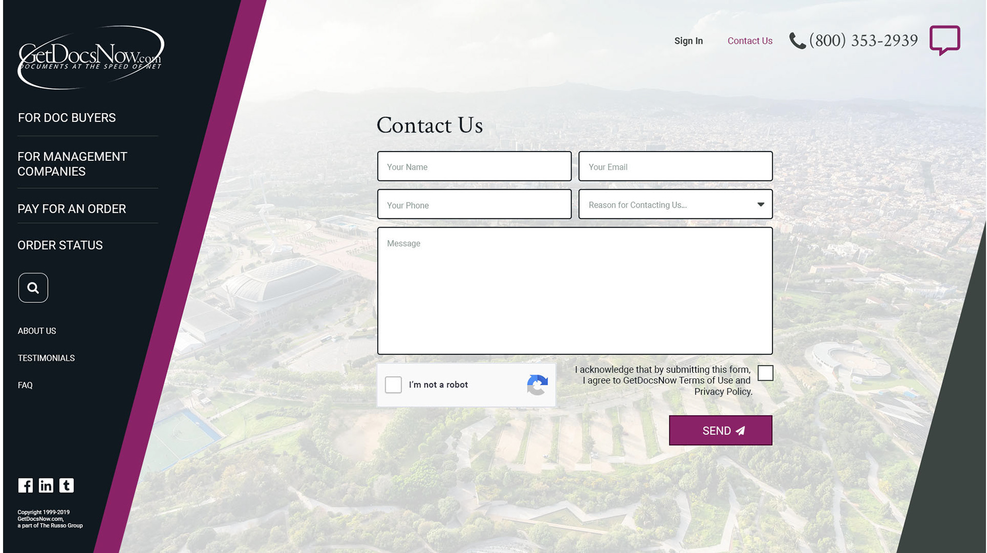
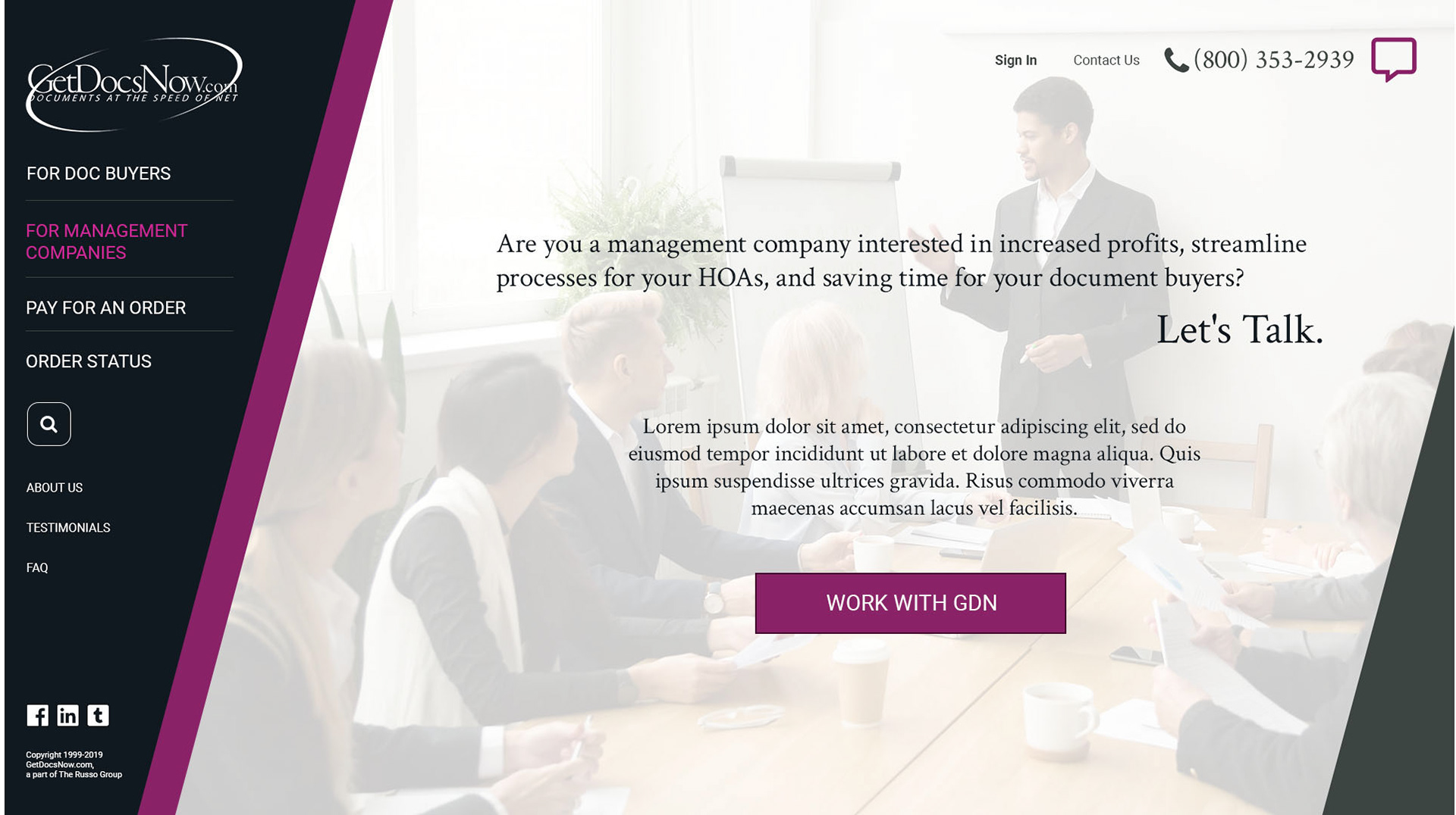
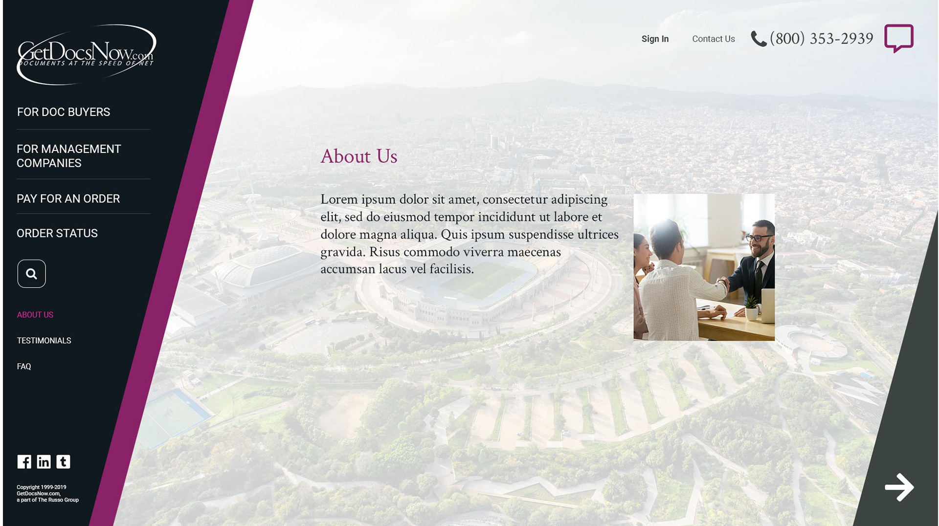
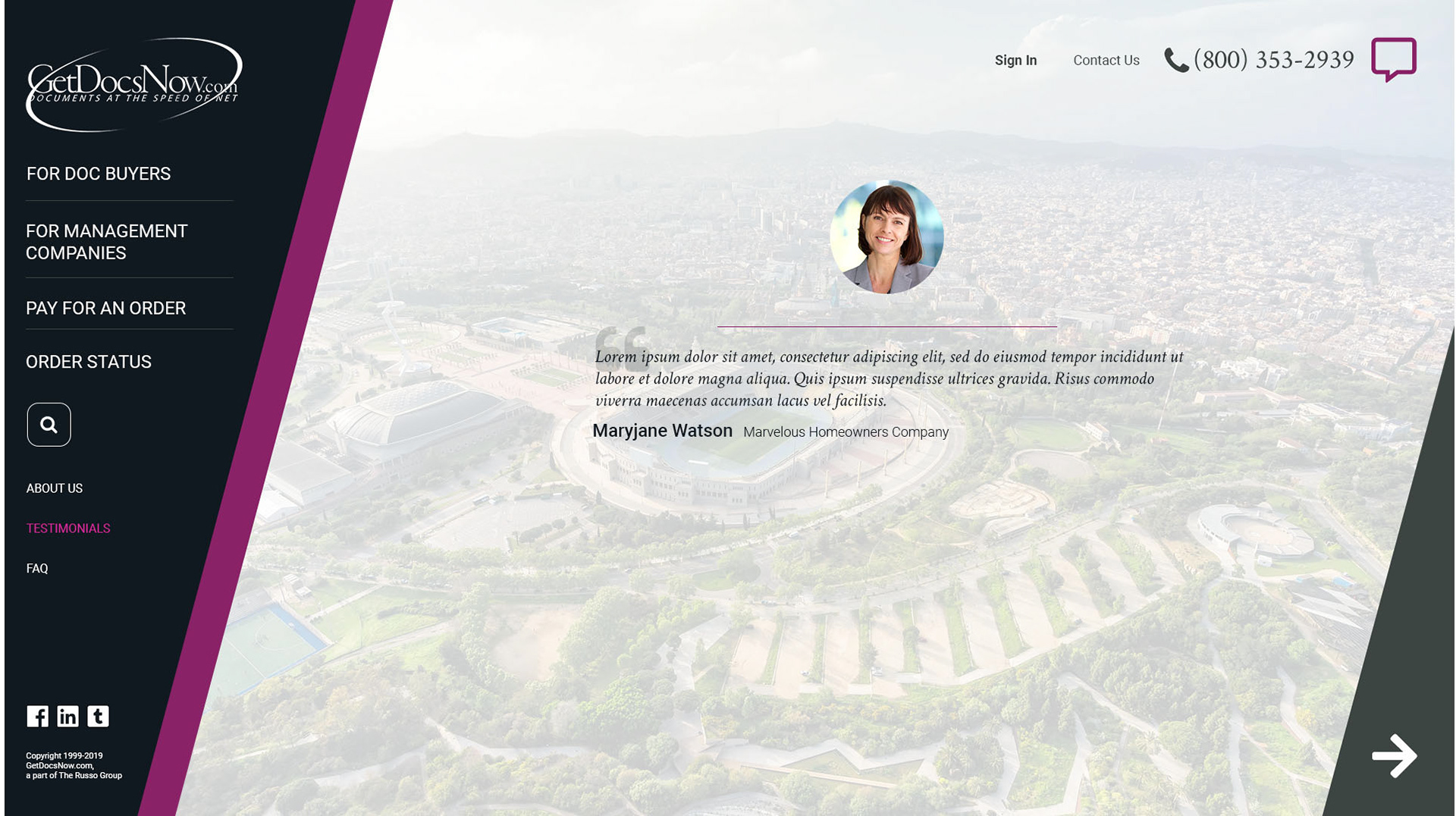
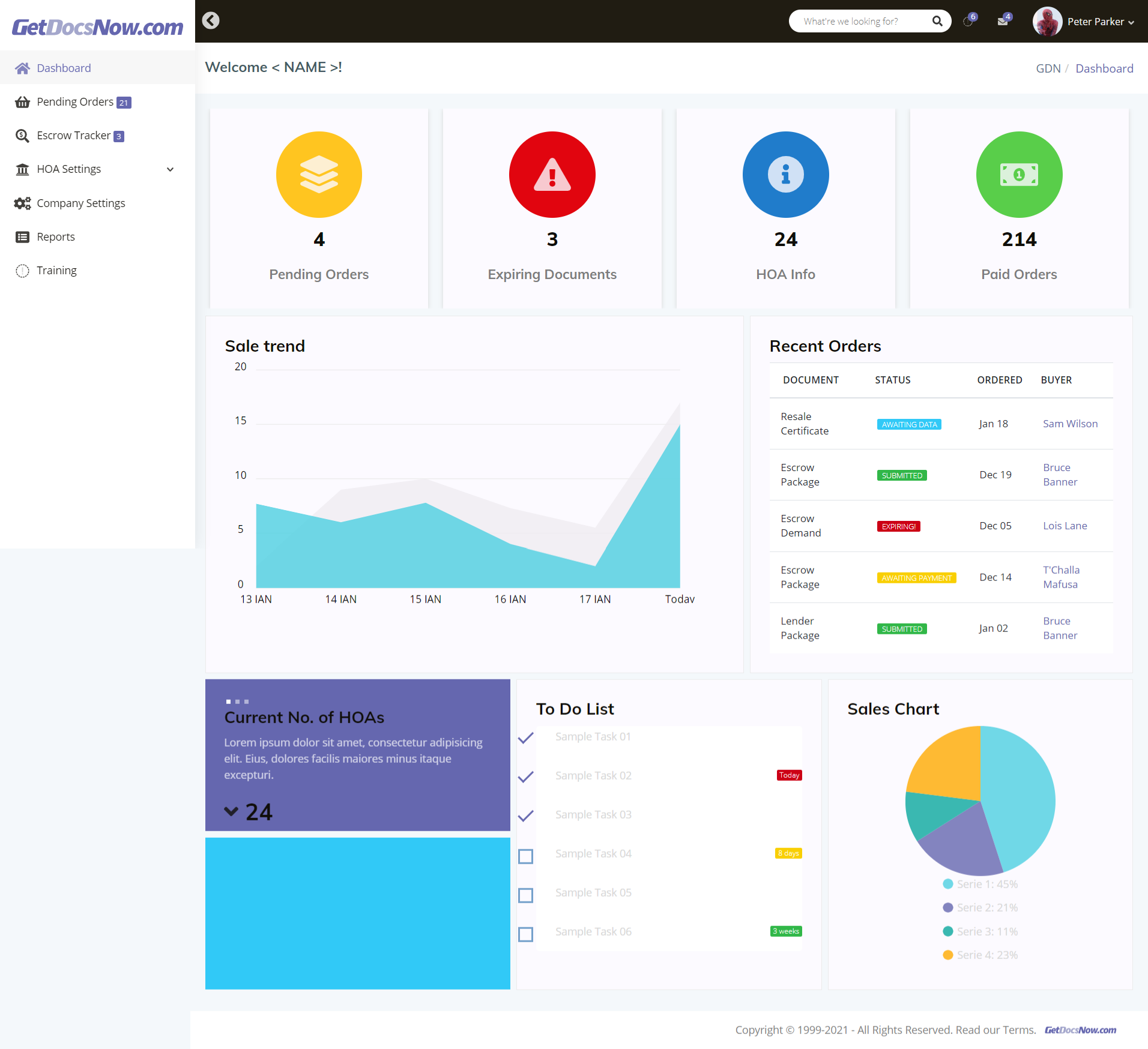
UI Architecture & High-Fidelity Showcase
The new interface is a blueprint for efficiency. We moved the evaluation from subjective preference – 'I like how this looks' – to objective, principle-based analysis. Look at the spacing: we used a modular grid to ensure consistency across the entire ecosystem. This is a component library built for speed and technical specificity. Every button and form field is designed to promote expert-level performance while remaining clear enough for a first-time user.
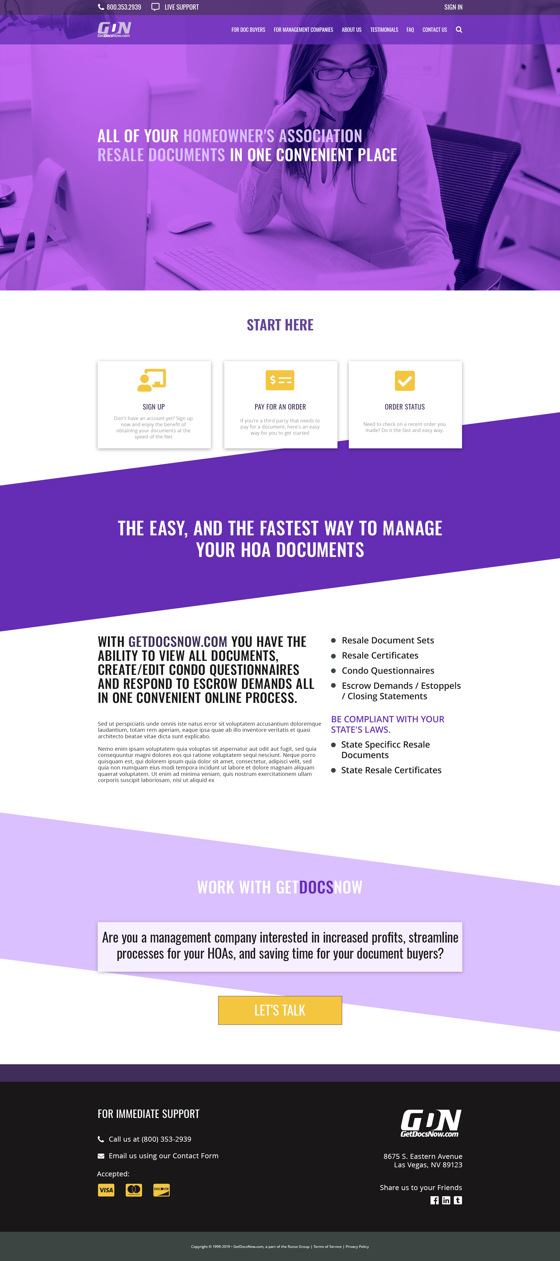
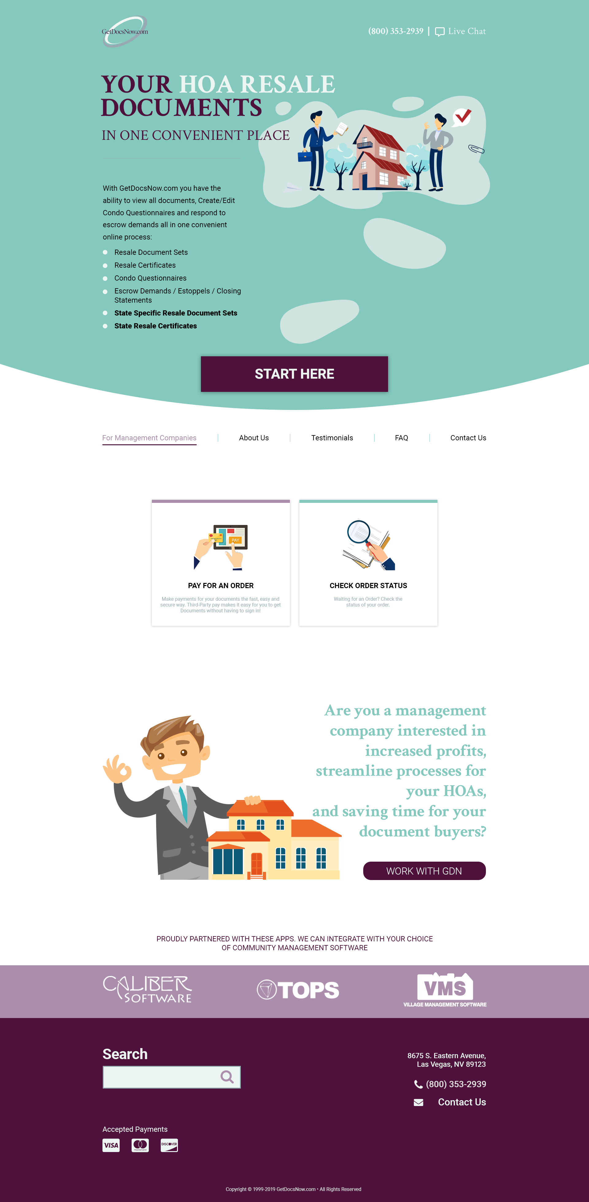
Marketing Front Design I, II, III

Members area Website Design Concept (2020)

The Members site concept is an HTML/CSS build created using Node.js and Gulp.
This project also has an ongoing prototype in Adobe XD
Initial Review
The contrast is stark. The old design was an exercise in noise; the new one is a masterclass in focus. We didn't just move elements around; we redefined the hierarchy. By comparing the legacy screens with the new high-fidelity mockups, you can see where we eliminated puffery and subjective clutter in favour of direct, functional design.