
User Experience Design CA Dept of Public Health (CDPH) – CAIRHub
Vernard Mercader, Lead User Experience Designer
Check out the Web Application Project | View this project on Behance
Check out the Web Application Project | View this project on Behance
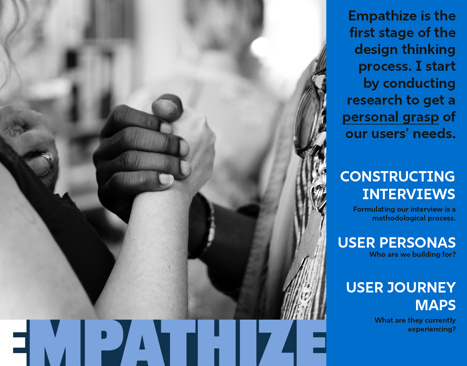
The Objective
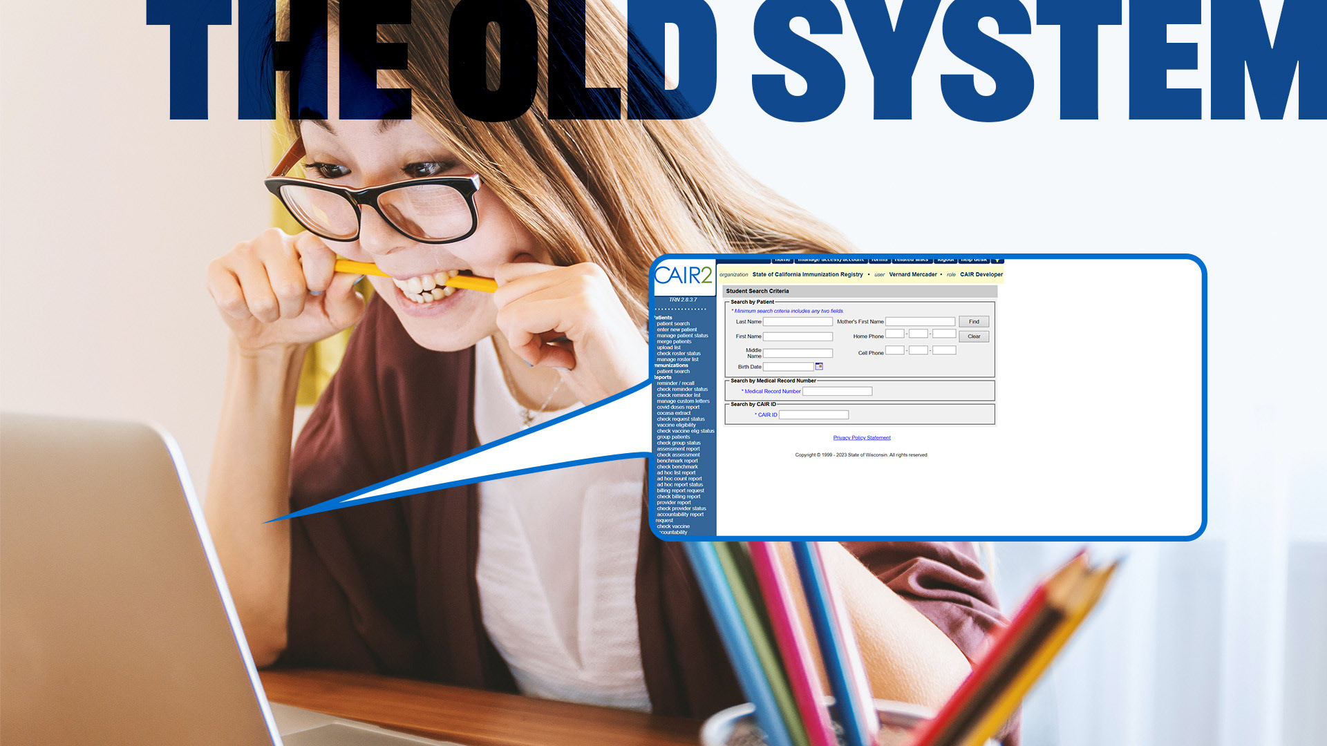
The California Department of Public Health sat on a fractured digital infrastructure. Student vaccination records were fragmented across disparate servers and managed by different vendors with incompatible tech stacks. It was not just inefficient; it was a data integrity risk.
My directive was clear: architect the School Roster Management System (SRMS) from the ground up. We needed to replace the legacy CAIR2 module with a centralised fortress for sensitive health data that could handle the scale of California’s entire student population.
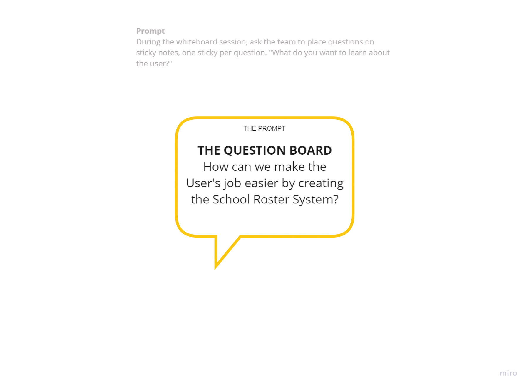
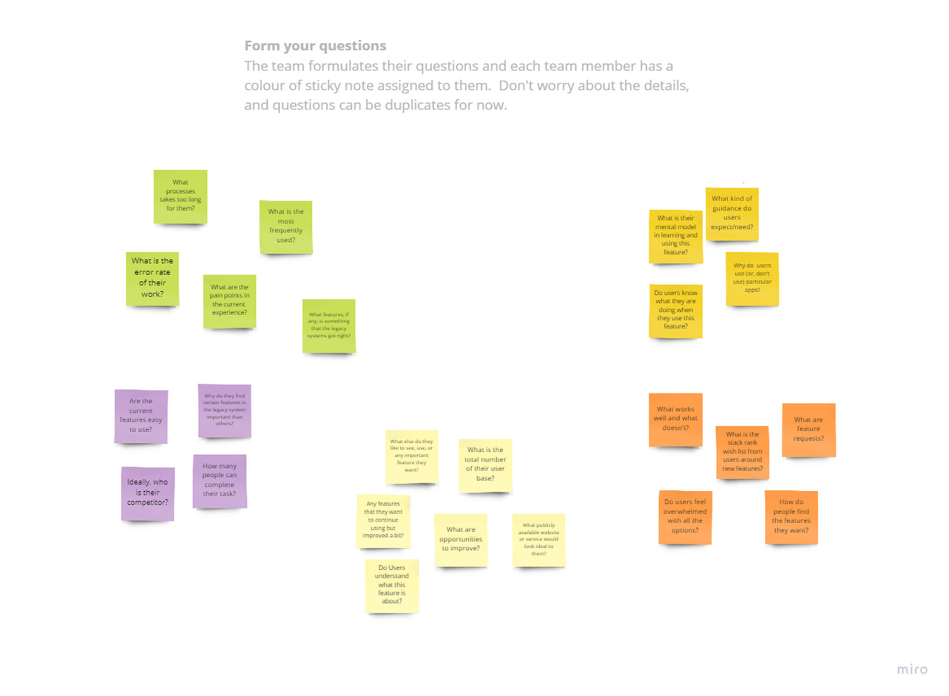
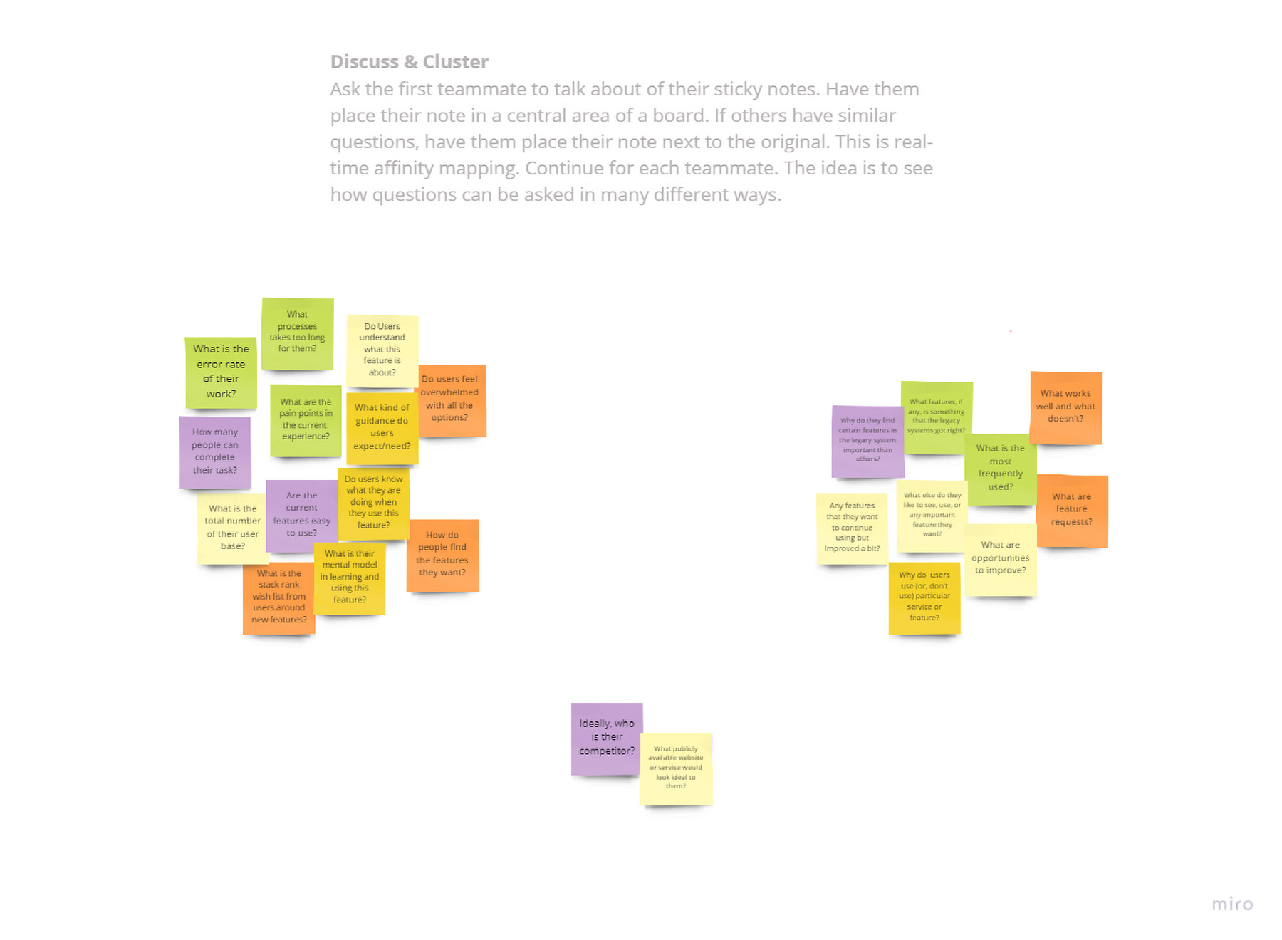
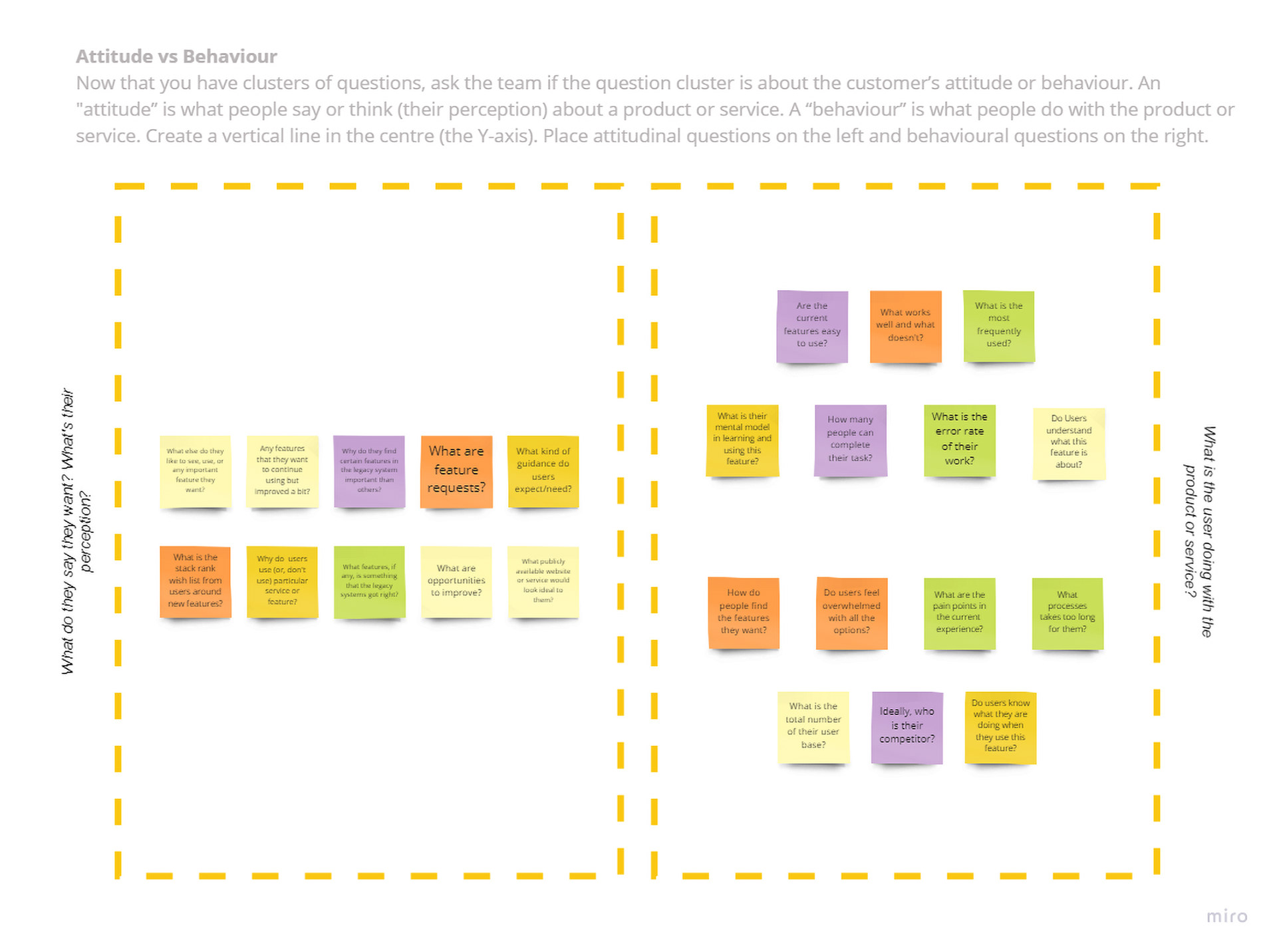
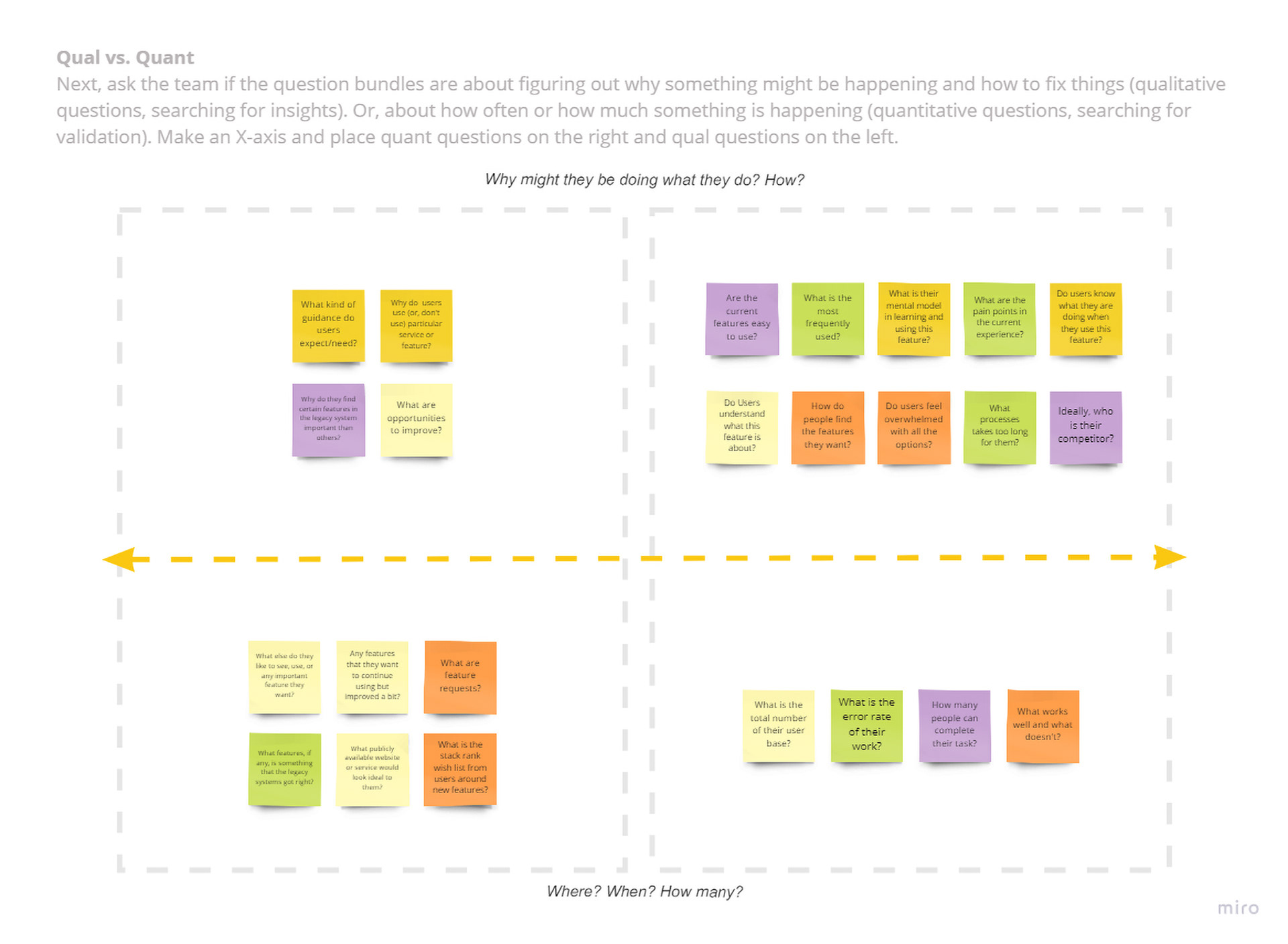
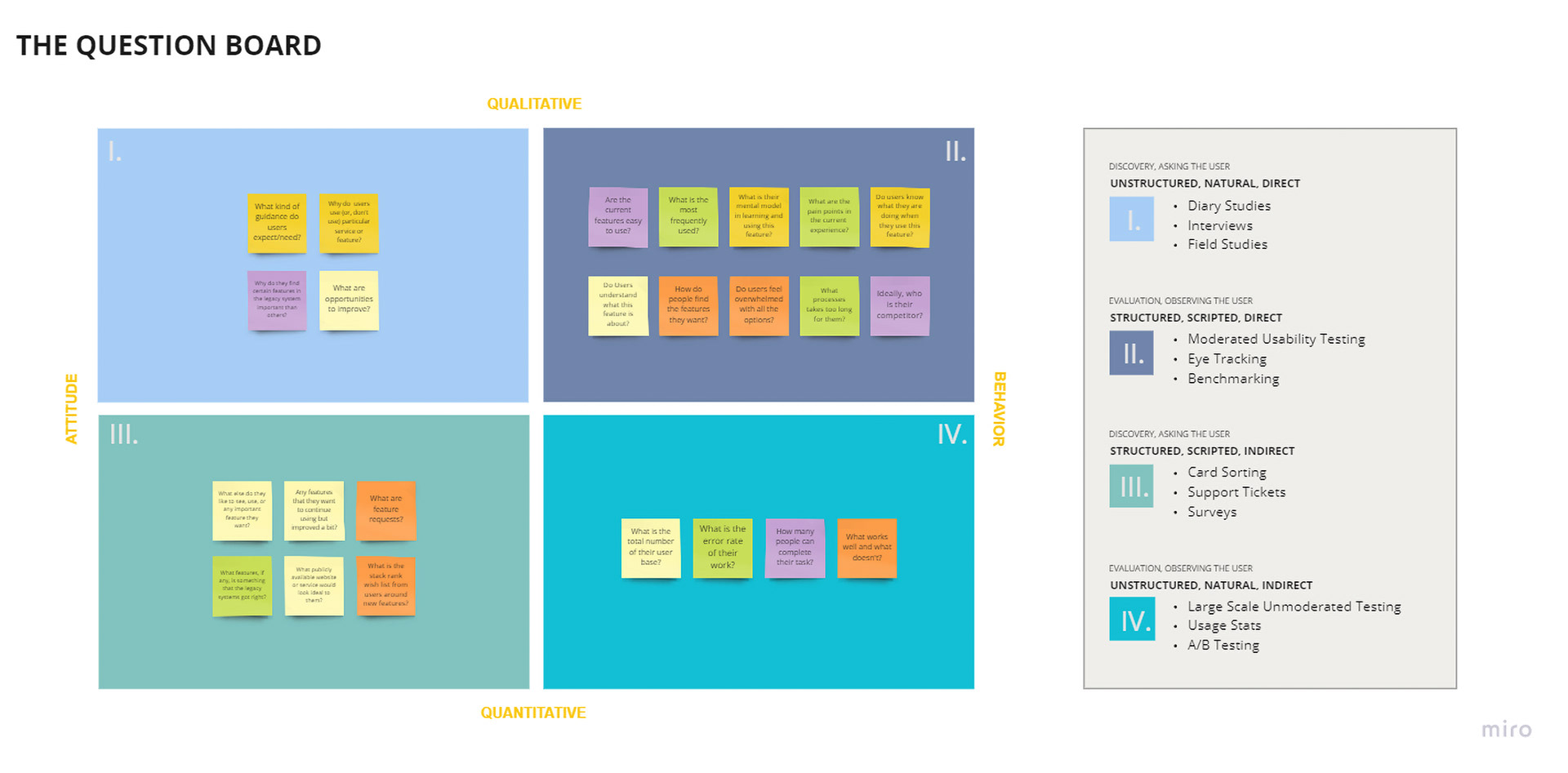
1.1 Survey Design: Question board
The Strategic Pivot
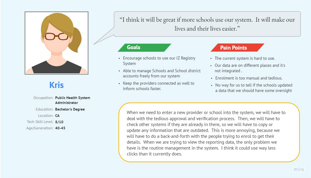
We identified two distinct user archetypes with diametrically opposed needs. First, the school user – often a nurse or administrator – overwhelmed by paperwork and terrified of breaking the system. They needed simplicity, clear guardrails, and reassurance. Second, the CAIR Admin. This is the power user responsible for the state-wide database who needed speed, bulk actions, and granular control over permissions.
The legacy system failed because it forced a one-size-fits-all interface on these groups. My strategy was to decouple their workflows. We built a streamlined, wizard-driven interface for school users to prevent errors while providing a dense, data-rich dashboard for admins to manage system health.
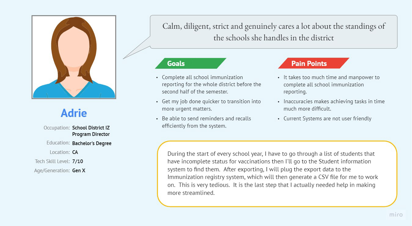
1.2 User Personas
1.3 User Journey Maps
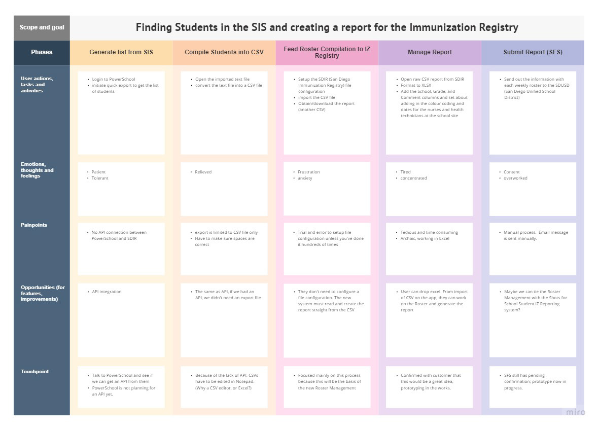
Discovery and Friction Points
Our research exposed a critical failure in the old workflow: the Fear of Deletion. School users were hoarding obsolete student records because the deletion process in the old CAIR2 system was obscure and final. They were terrified of deleting the wrong student and facing compliance penalties.
We didn't just redesign the button; we engineered a "Soft Delete" and "Archive" workflow. This psychological safety net gave users the confidence to clean their rosters, drastically improving the quality of the data entering the system.
2.1 The Problem Statement
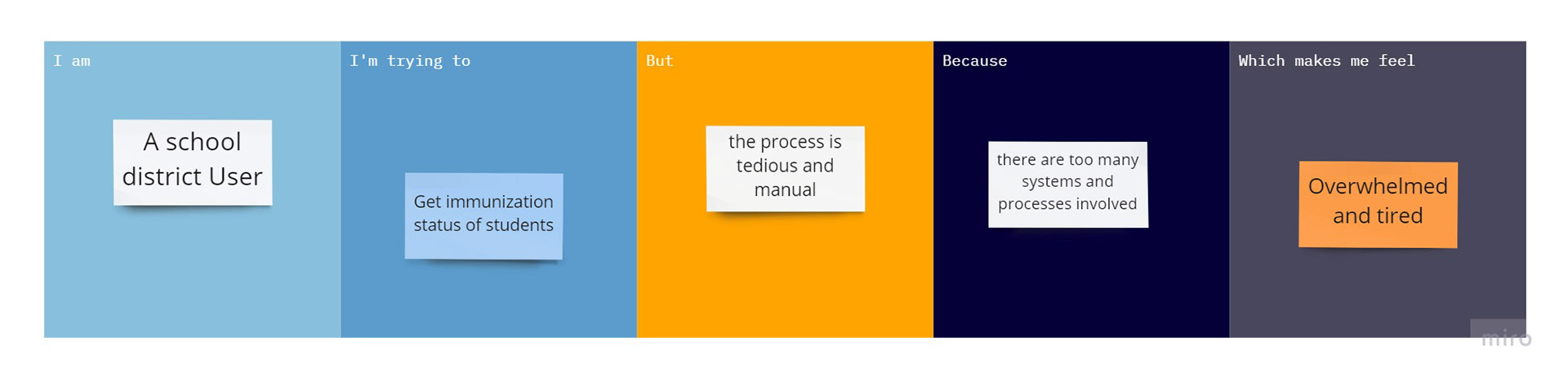
Customer Problem Statement
2.2 Product Vision Board
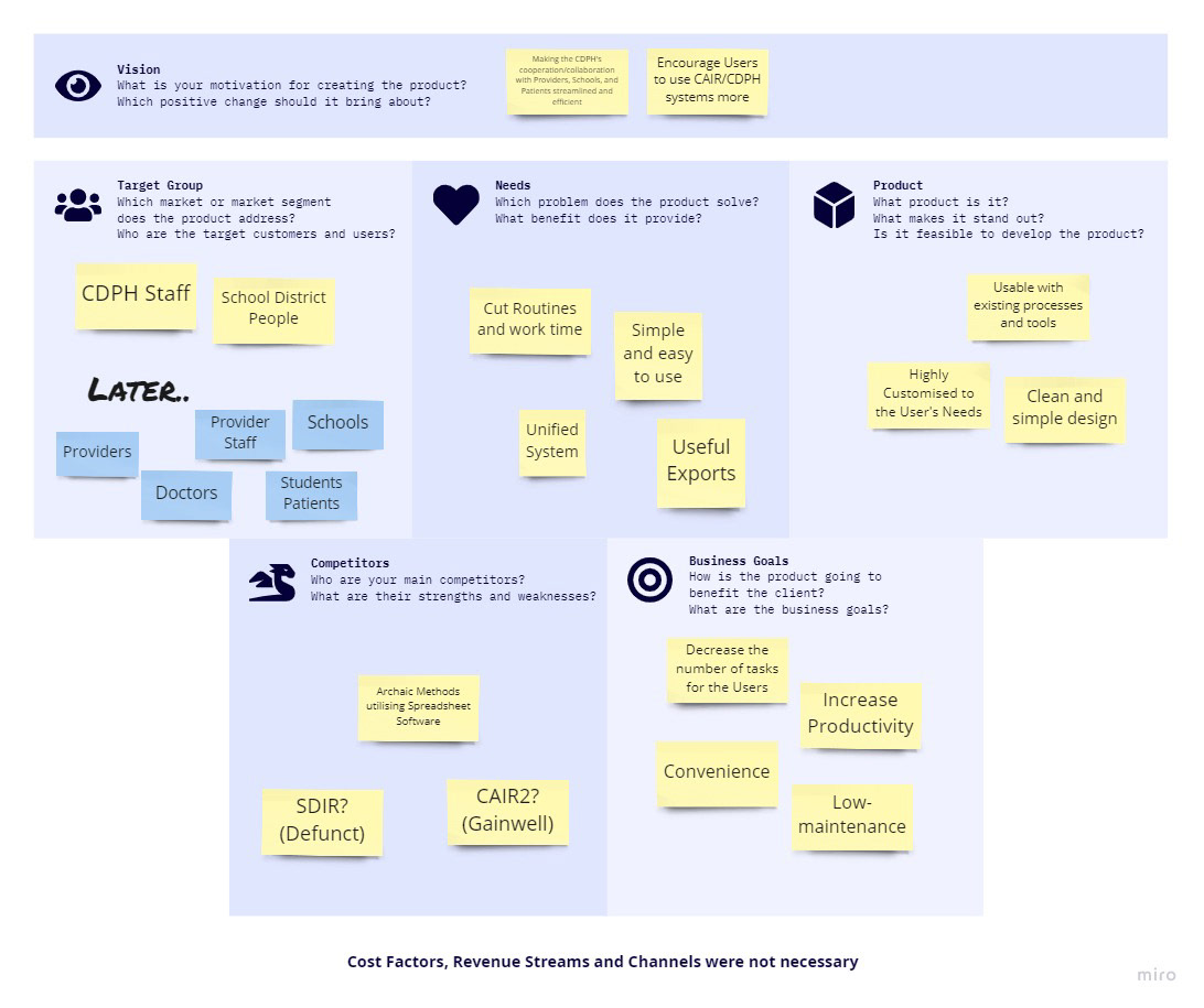
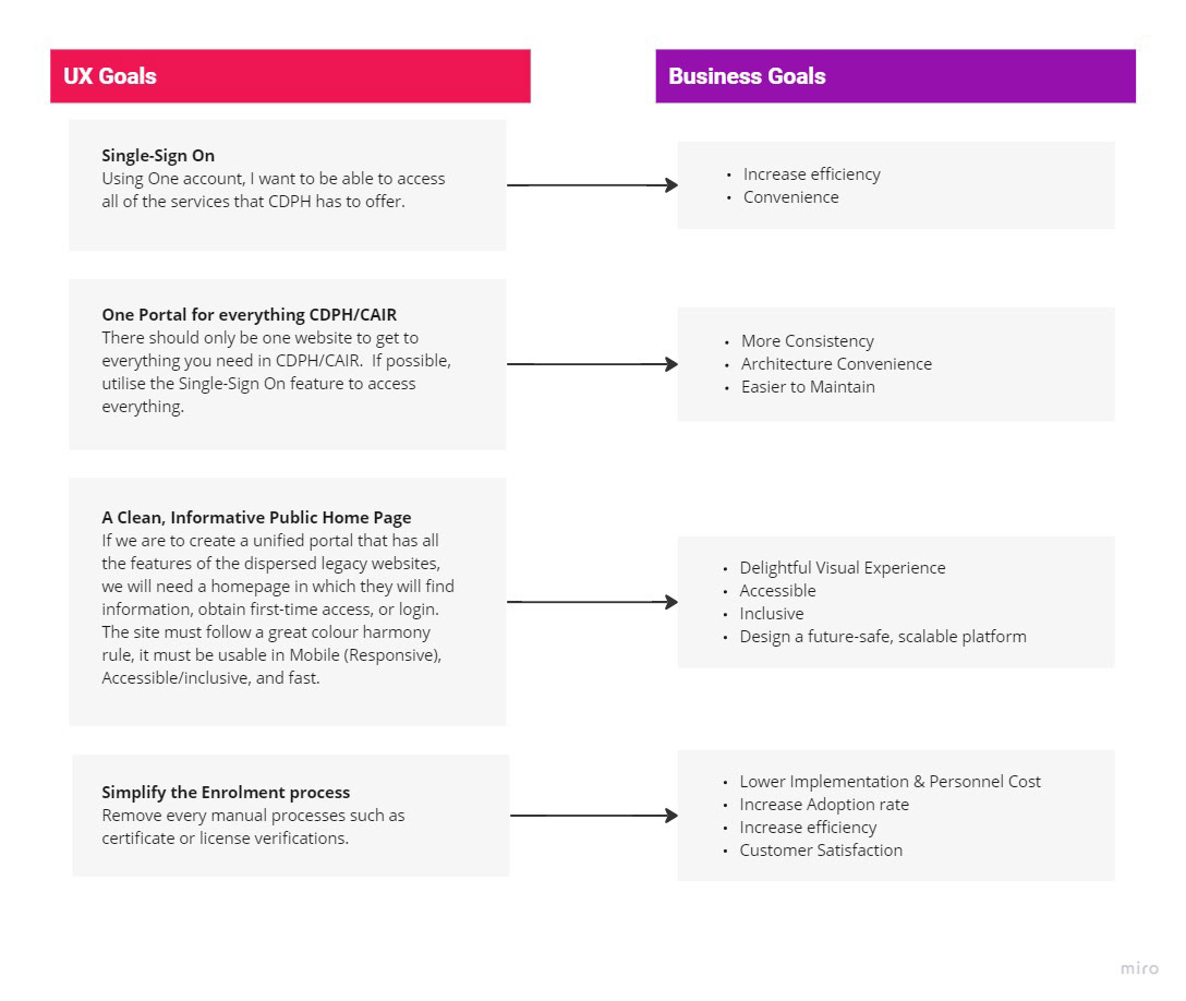
2.3: Value Proposition Mapping
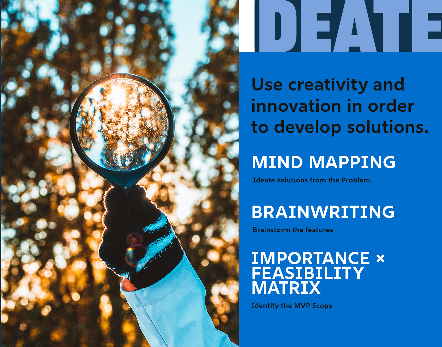
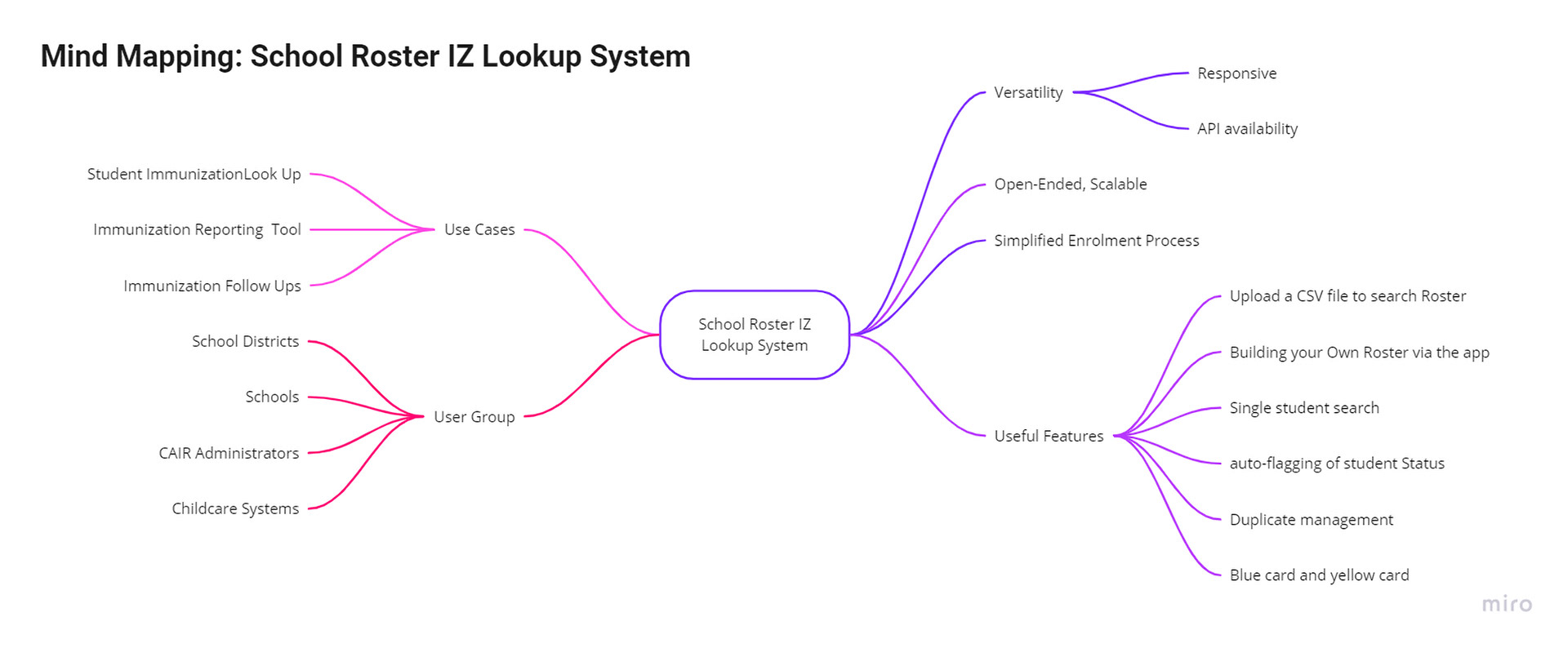
3.1: Mind Mapping
3.2: Brainwriting session
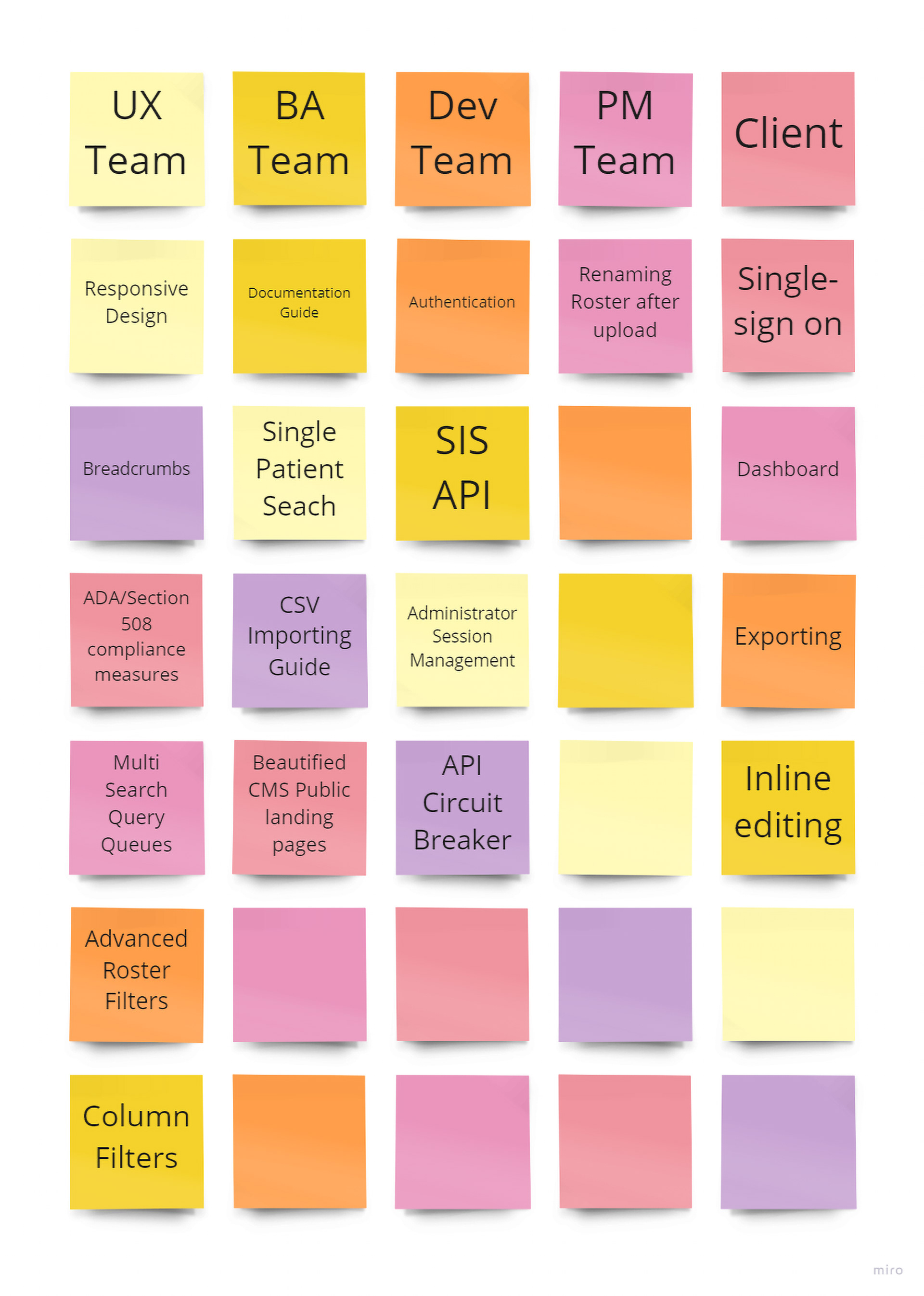
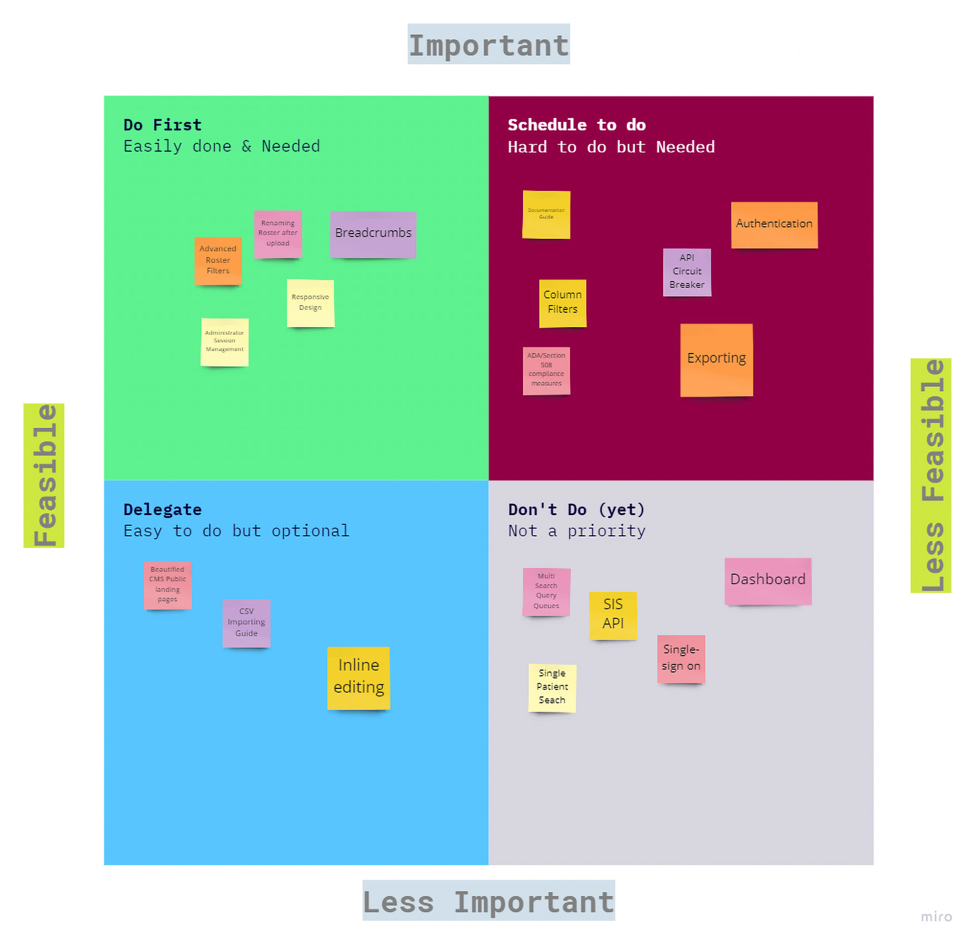
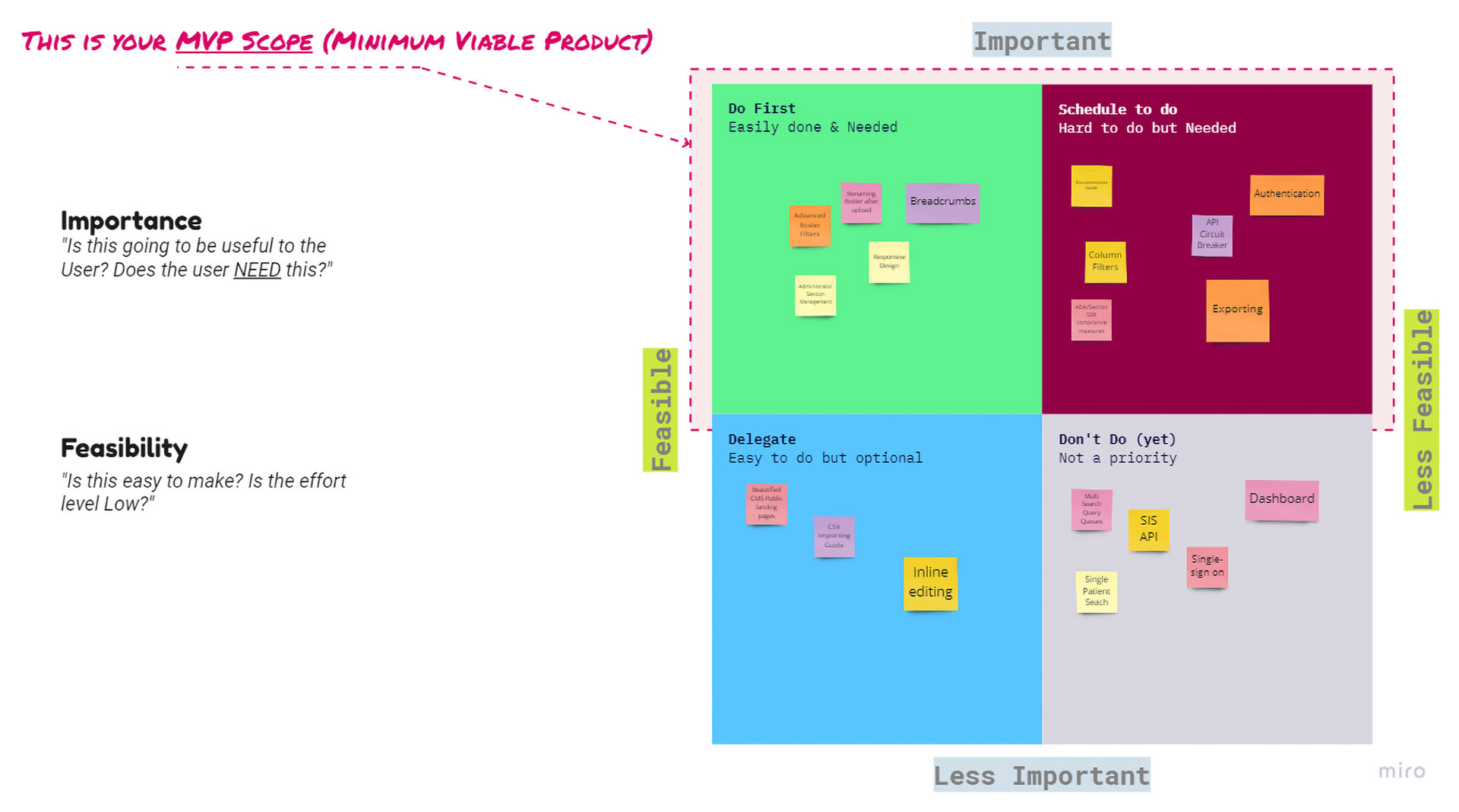
Ruthless Prioritisation
Scope creep is the death of government projects. During the ideation phase, we utilised an importance/feasibility matrix to aggressively cull the feature list.
The decision was controversial. I cut the immediate integration of the Immunisation Gateway System (IGS). While high value, the technical complexity would have missed the school-year launch window. Instead, we directed all resources to the Bulk Roster Upload feature – the primary bottleneck for 90% of our users. This trade-off ensured the system was fully functional when schools opened their doors, rather than perfect and late.
3.3 Importance/feasibility Analysis (Eisenhower Matrix)
PRE-DEVELOPMENT
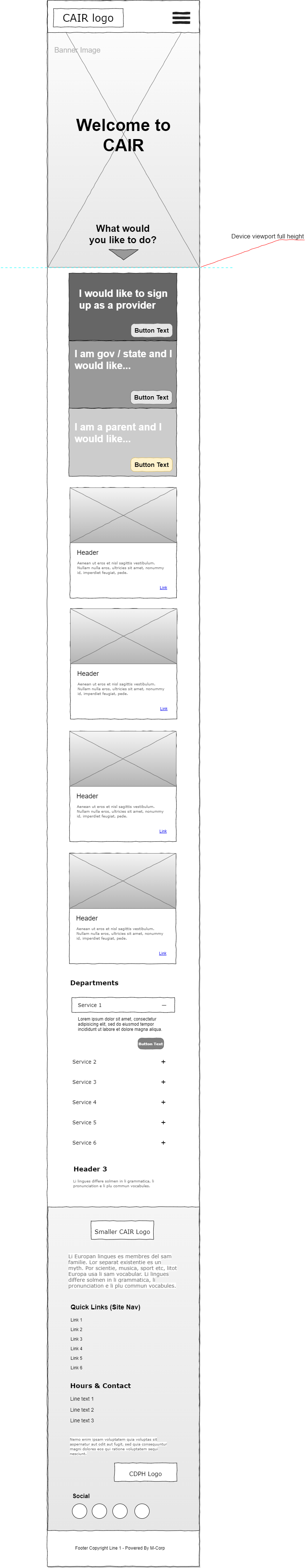
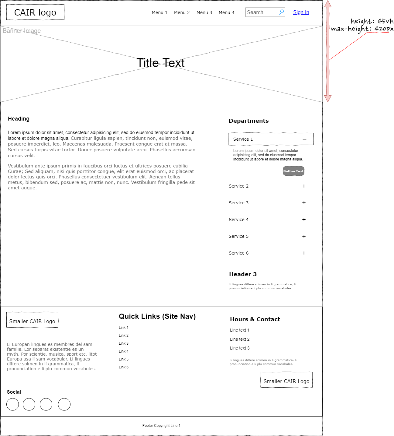
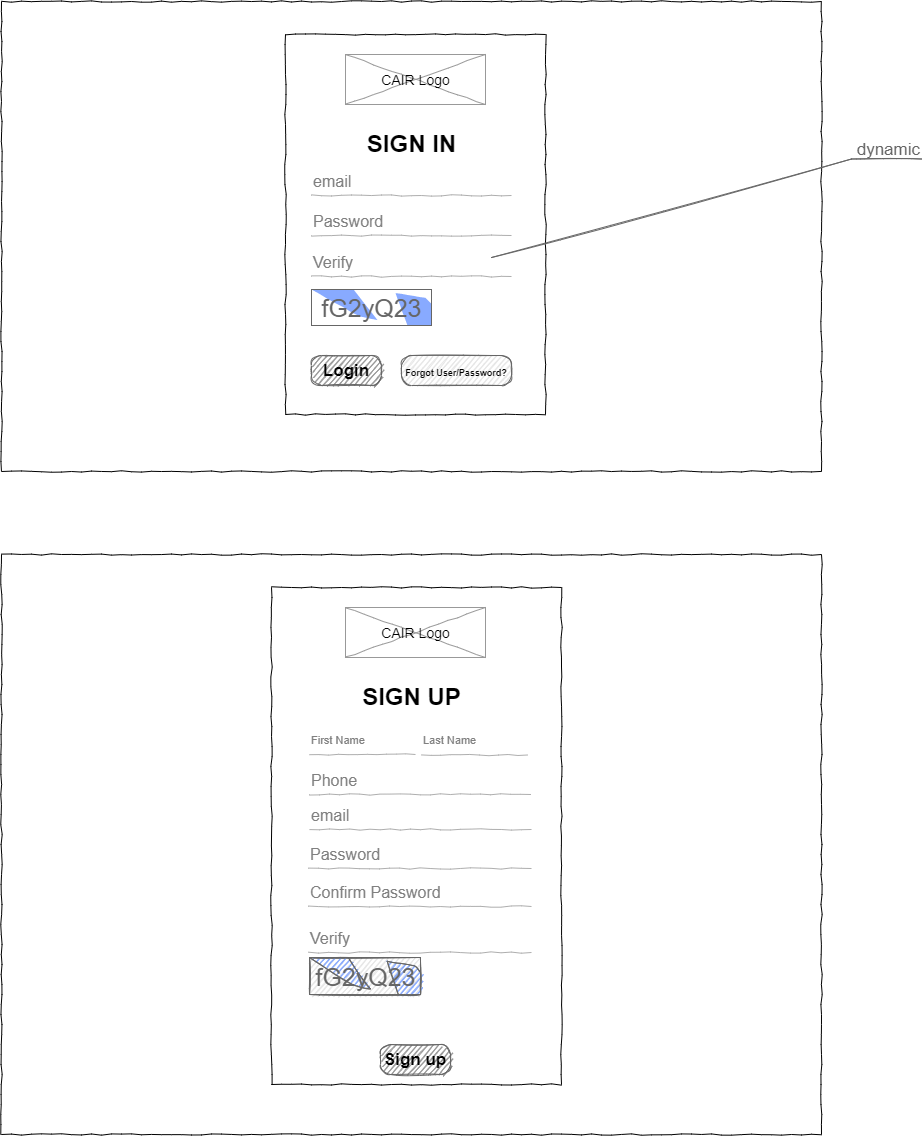
WIREFRAMES
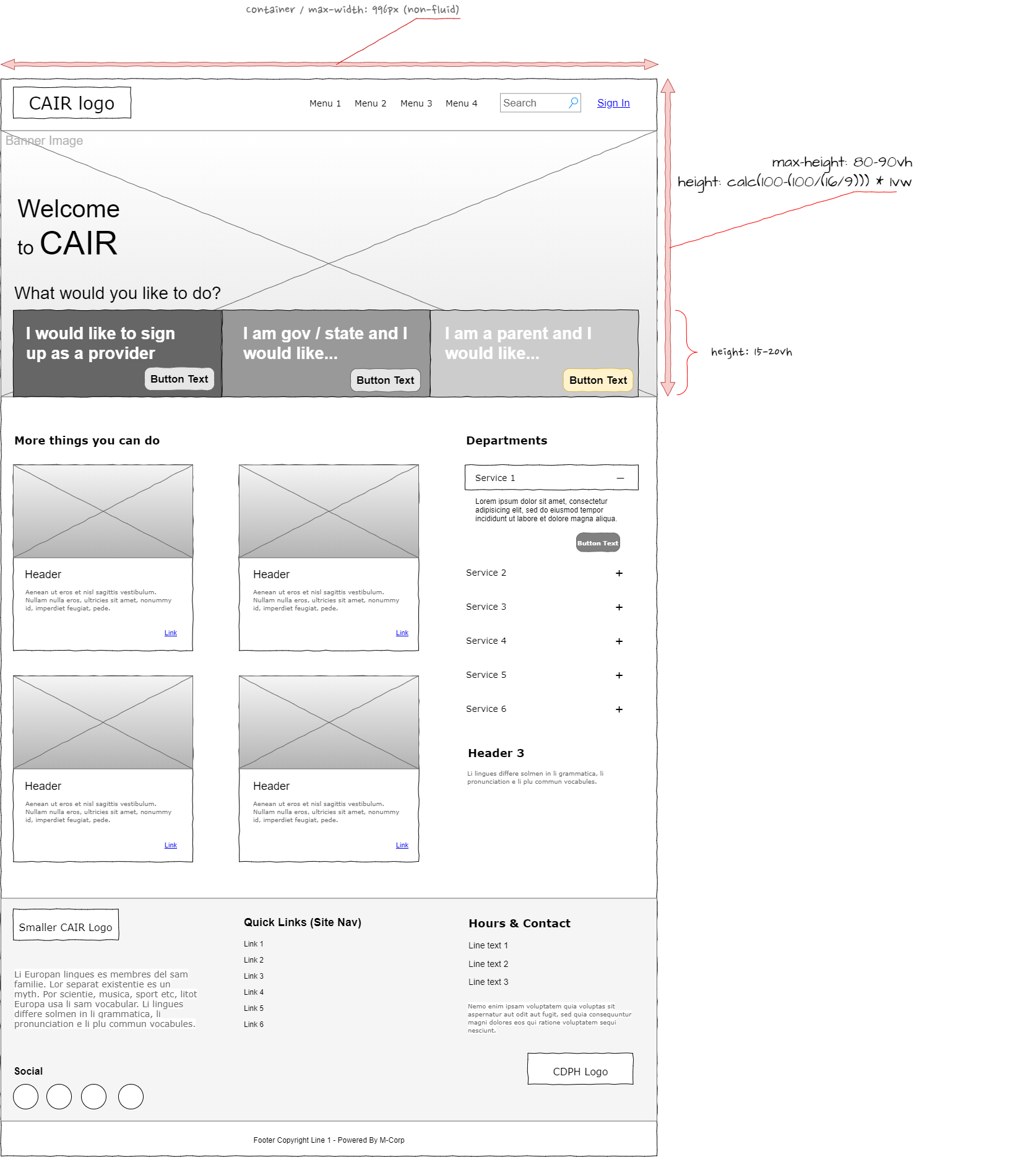
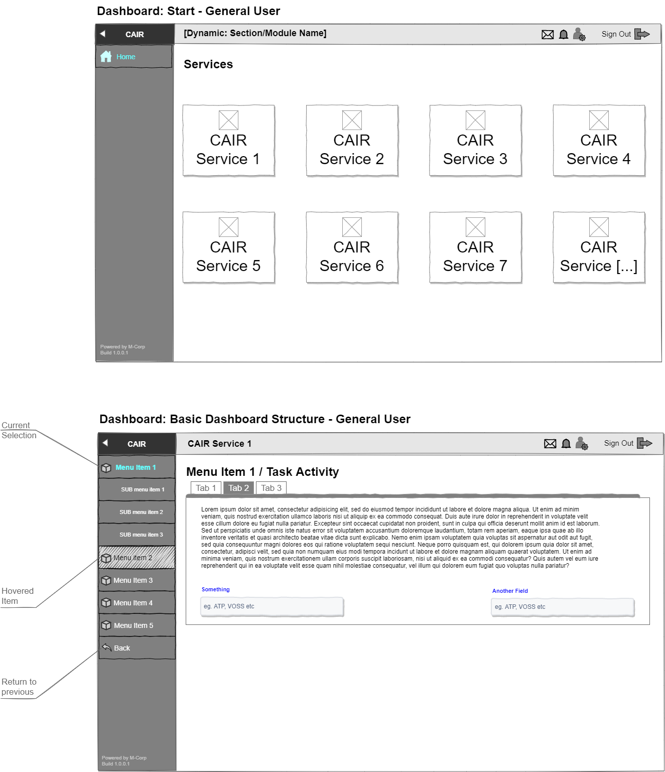
THE PROTOTYPE
The Build
We moved from legacy architecture to a modern Angular frontend backed by C#. This allowed us to connect with Accenture’s APIs while maintaining a responsive, state-managed UI.
We prototyped the complex interactions in Figma, specifically focusing on the validation logic for vaccination dates – a common source of user error. By moving validation to the client side, we reduced server load and gave users instant feedback on their data entry.
The Outcome
The SRMS successfully replaced the fragmented legacy systems. We secured the vaccination data for the state and reduced the administrative burden on school staff. By focusing on the specific anxieties of the user (the fear of error) and the hard constraints of the timeline (the school year), we delivered a system that works.