Project Summary
The brief was genuinely so simple on paper. Make the whole process usable. Fix the workflow so clinics, schools, and health organisations could get through CAIR without fighting it.
I did that. But the workflow was only the symptom! Underneath it sat the real rot: an incoherent, inconsistent design system. Or rather, no system at all. CDPH's web presence was a total junk drawer. Applications were scattered across servers, each built by a different vendor on a different stack, and none of them agreed on what a button looked like. You cannot make a process usable when every screen speaks a completely different language.
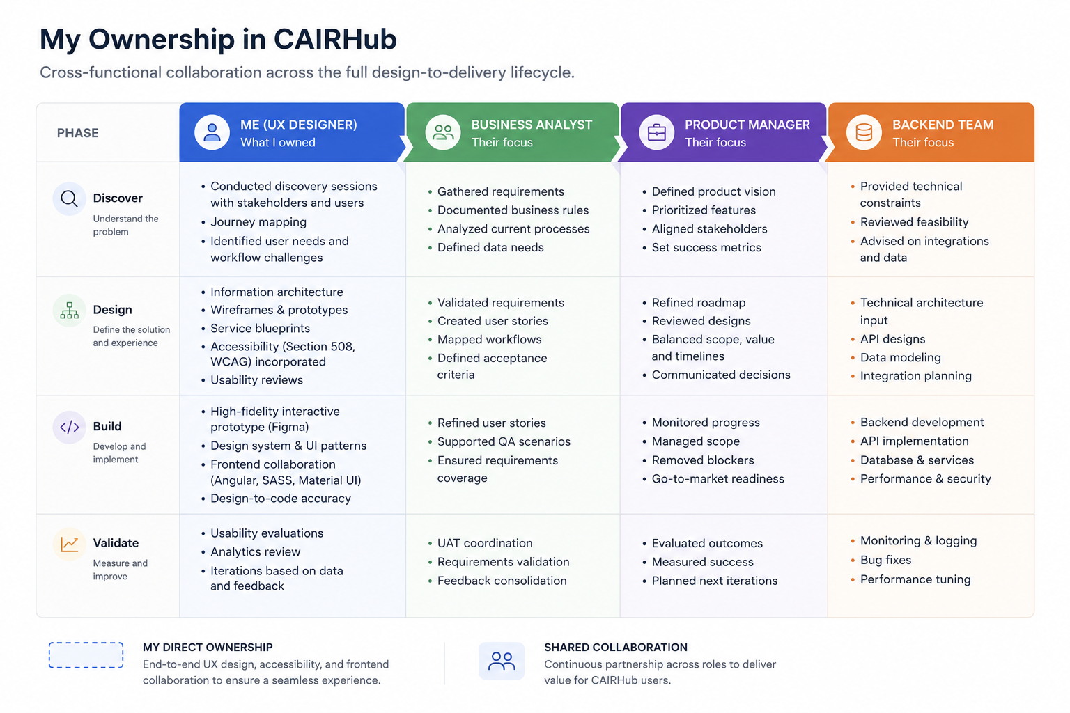
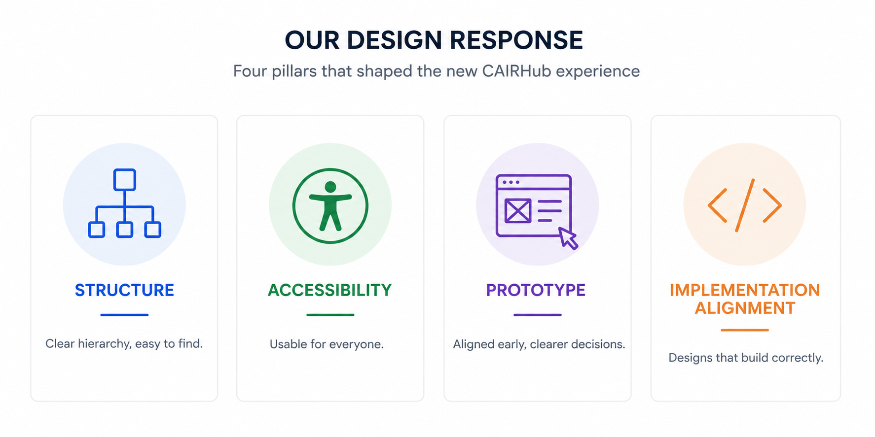
I was the only UX designer on the job, so I owned it end to end. Discovery, workflow mapping, information architecture, and then the massive fix the brief never even asked for: a single tokenised design system. It was thrilling to pull that fragmented mess into one product with a real spine. Every colour, component, and type choice had to clear WCAG and Section 508 before it earned a place on screen.
Context
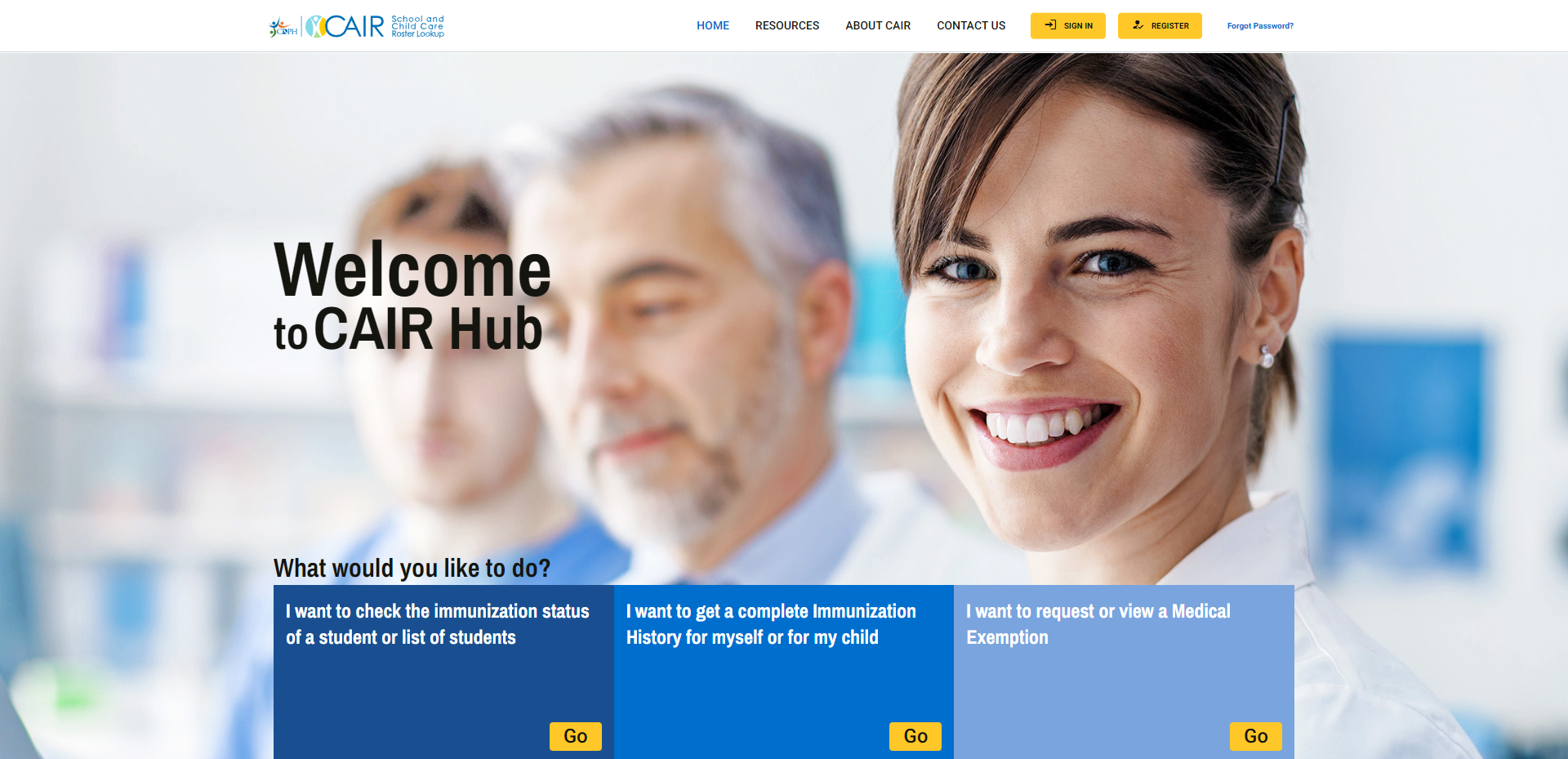
CAIR is the California Immunisation Registry: the definitive system of record for health data across the state. CAIRHub is the front door everyone walks through to get there.
That is exactly what made the design mental. The platform served people with absolutely nothing in common. A school administrator pulling roster records operates with a completely different job, vocabulary, and mental model than a clinic uploading doses or a parent checking a child's history. Yet they all landed on the exact same surface. They all expected it to make sense on their own terms.
This was the public sector. Real compliance obligations. Massive institutional weight behind every single brand and content decision. This was not some startup where you get to move fast and break things. You do not just rename a button because you feel like it.
Problem Statement
This is what fragmentation does to the people stuck living in it.
A clinic uploads doses in one tool, then re-enters half of it elsewhere because the two systems never learned to talk. A school administrator keeps a spreadsheet on the side, not because they want to, but because the interface loses track of what they need and the spreadsheet does not. Public health staff, healthcare organisations, parents – all of them switching between tools that work in their own bespoke ways, each with its own logic to relearn.
None of them agree on a thing.
The registry held vital public health data. Immunisation records for the state. The experience of getting that data in and out was inconsistent, exhausting, and in places entirely inaccessible. On a government platform, that is not just bad design. It is a compliance failure waiting to be named.
None of this was a visual problem. You could have made every single one of those screens prettier and changed nothing. The fault ran deeper. Nobody had unified the model underneath, so nobody could unify the experience on top.
Fix the paint, and the house is still built wrong.
The full discovery, personas, journey maps and friction analysis live in the companion case study, UX Design Thinking Process: CDPH. → link
Ownership
I was the sole UX designer on CAIRHub. End-to-end responsibility for the experience, from the first discovery session to the interactive prototype engineering built against. I want to be precise about the edges of that, because the honesty is the point. The data unification had a backend microservice story. That was not mine. My work was the experience layer and the system that made it coherent.
I owned:
– Discovery sessions
– Discovery sessions
– Journey mapping
– Service blueprinting
– Information architecture
– Wireframes and high-fidelity interactive prototypes
– Usability evaluations
– Accessibility audits (WCAG 2.1 / Section 508)
– The design system: tokens, components, typography, colour
– Frontend UI consulting: Angular, SASS, Material UI implementation guidance
Owned by others
– Business requirements gathering — Business Analyst
– Product definition — Product Manager
– Discovery session scheduling — Product Manager
– Backend and microservice architecture — engineering
Constraints
Government work sets the rules before you draw a single line. Section 508 and WCAG were not aspirations. They were the floor. Absolutely everything had to clear it.
The brand was locked. You do not get to rebrand a public health institution just because you fancy a fresher palette. The CDPH and CAIR marks carried years of recognition and institutional equity, and they were non-negotiable. That made people nervous. It should not have. I checked the hex codes, and the existing colours already cleared WCAG contrast and sat in a clean split-complementary harmony. I told them to stop worrying and build on the brand exactly as it stood. The constraint was real. It was simply never a problem.


I started from a recycled legacy template instead of a blank canvas. Multiple vendors and stacks were already in play. Working with a Product Manager and a Business Analyst who owned the requirements and definition. My influence had to come entirely from the quality of the work, not positional authority.
Then there was the box the frontend itself drew around the work. This is where knowing the stack stops being a bonus and starts being the job: you cannot design past constraints you cannot see. The frontend was already Angular. Every recommendation had to fit its routing, services, form patterns, and lifecycle rules. I was designing into a system that already had loud opinions.
Sass dictated that every visual change stay reusable and strictly in scope. A one-off that broke the styling system was not a fix. It was debt.
Material UI set the component vocabulary, requiring any customisation to improve usability without breaking its core patterns.
Finally, the C# and .NET backend. API contracts, permissions, the data states that actually existed in the database – they set the absolute outer edge.
Current State / Before
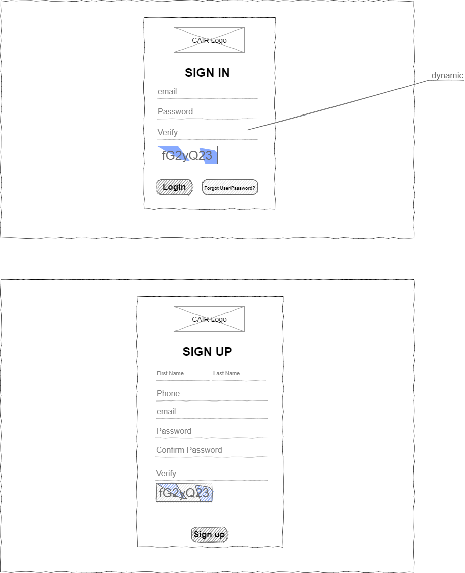
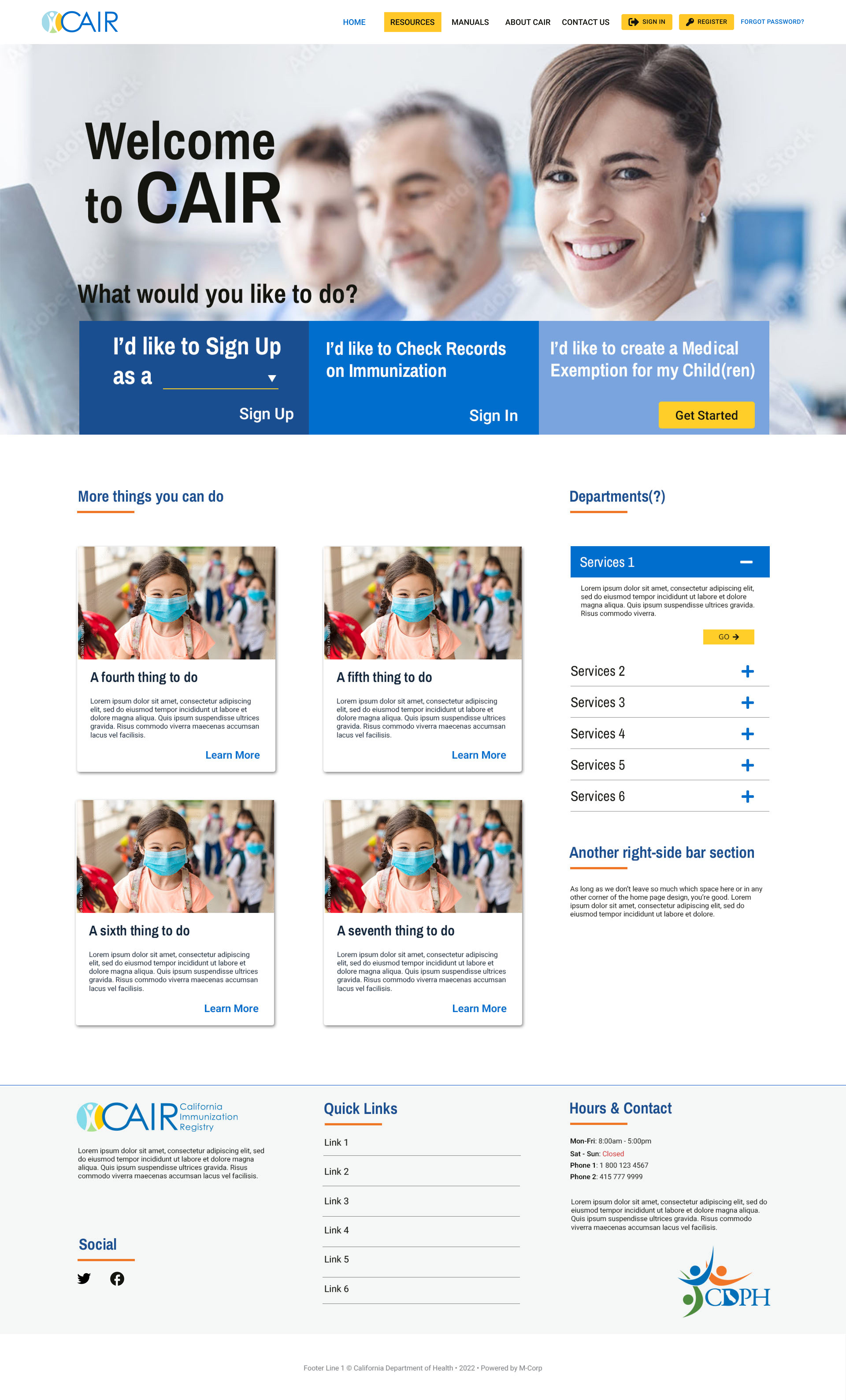
The old CAIR presence looked like exactly what it was. A legacy template stretched across mismatched applications, each one carrying a different vendor's idea of what a button or a form should be. Dense, inconsistent, and hostile to anyone using assistive technology.
Users coped the way users always cope with a bad system. They built workarounds. Spreadsheets to hold what the interface lost, manual re-entry to move data between tools, tribal knowledge to remember which system did what.
The interface was where the pain showed up. The real fault was that nothing shared a model, so nothing could share a language.
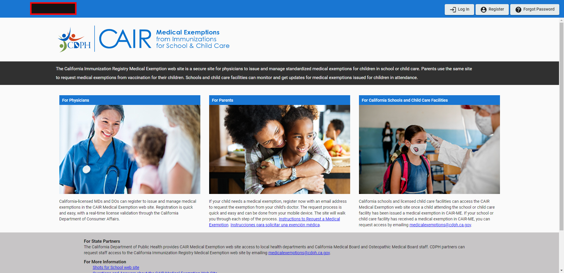
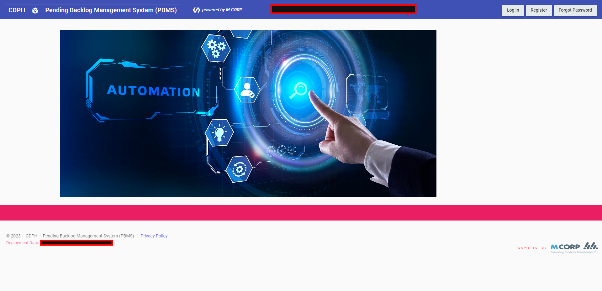
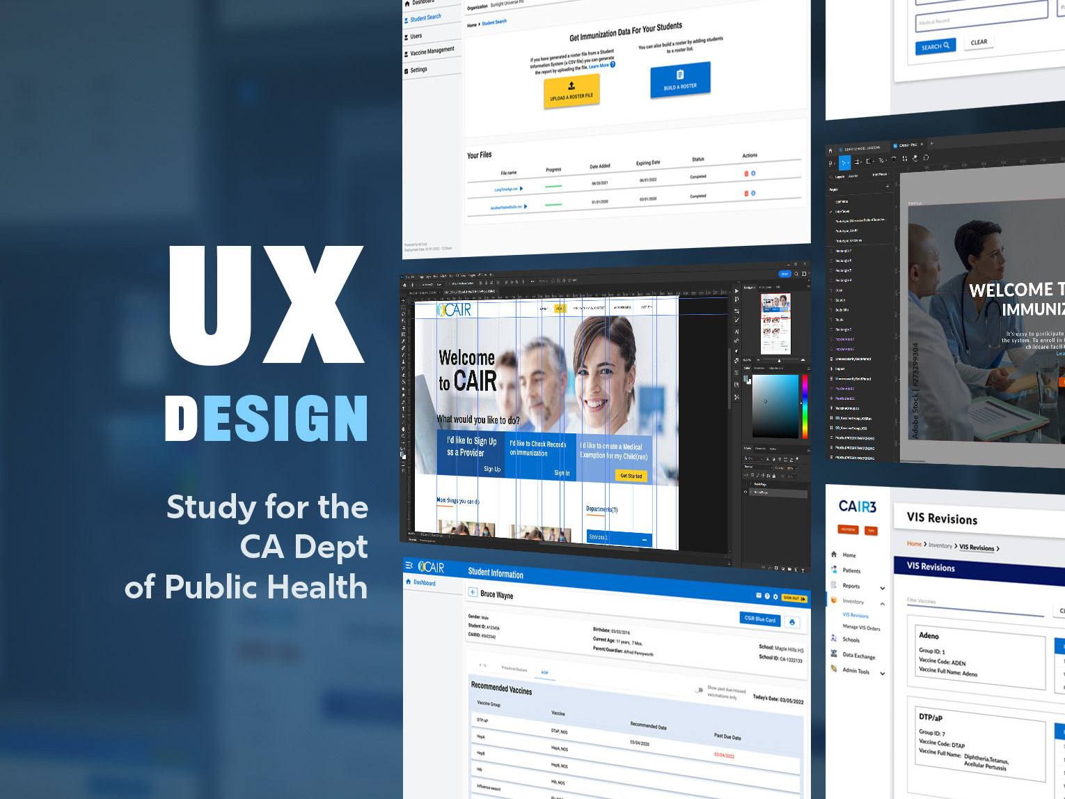
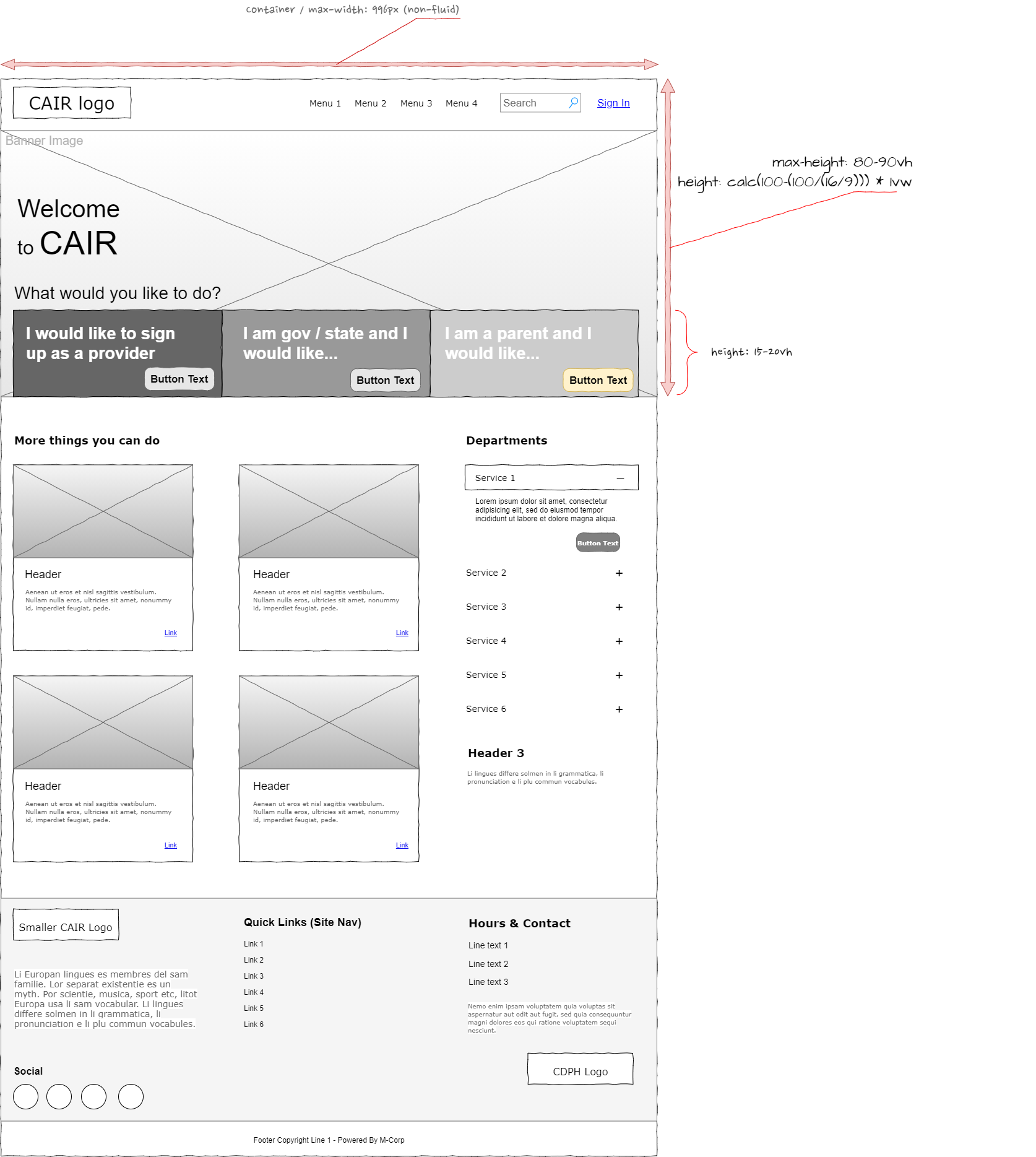
Old CAIR website
I built one system and made everything answer to it.
The opening move was information architecture. I had to work out exactly how these drastically different user groups actually move through CAIRHub, then give them a structure that held up for everyone without pretending they were the same person.
On top of that sat a tokenised design system. Not a style guide. A proper system. Every colour, type ramp, spacing value, and component state was defined exactly once, given a clear purpose, and reused everywhere.
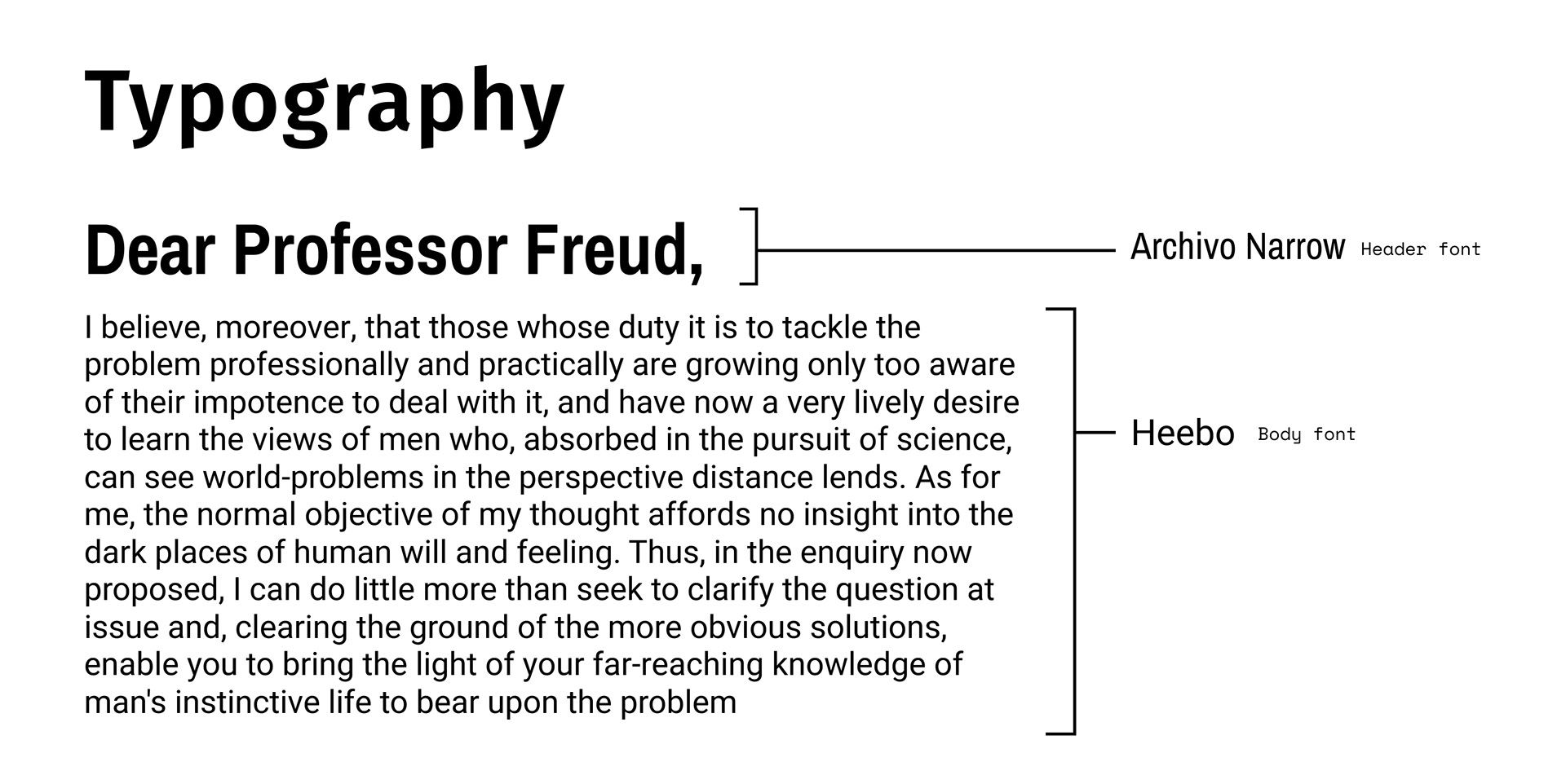
Typography was engineered for readability first and decoration never. I chose Archivo Narrow for headings and Heebo for body copy. Medical and administrative users need to read fast and get out. They are not there to admire the type.
Design System
The colour system was built as a compliance instrument, not a palette. I took the locked brand colours, narrowed them straight down to Pantone 300 C and 109 C, structured them in a split-complementary harmony, and mapped every single one against WCAG contrast requirements before it ever became a token.
Nothing decorative survived.
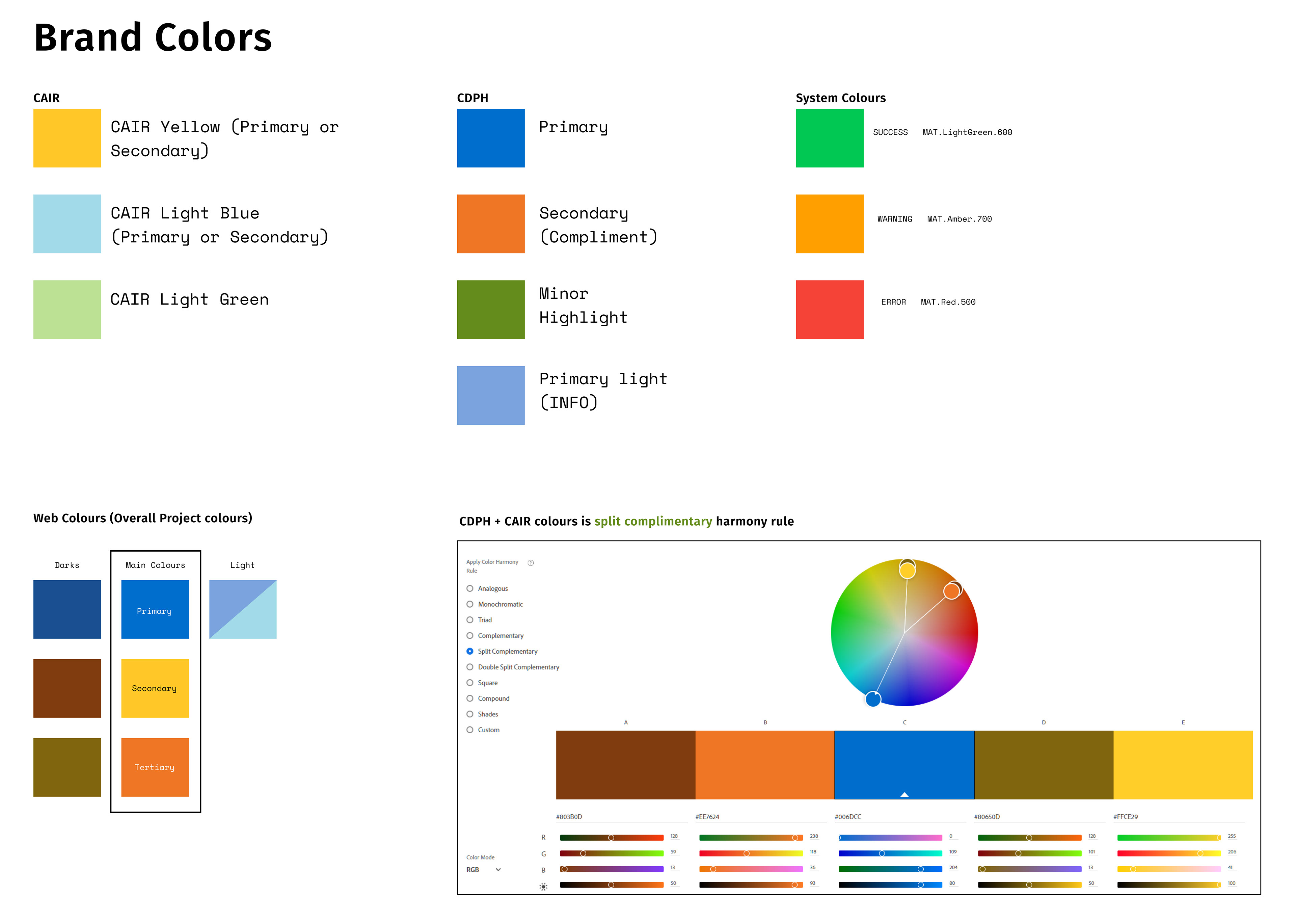
Taking from ideas from the brand colours, I narrowed down to using Pantone© 300 C (Blue) and 109 C (Yellow)
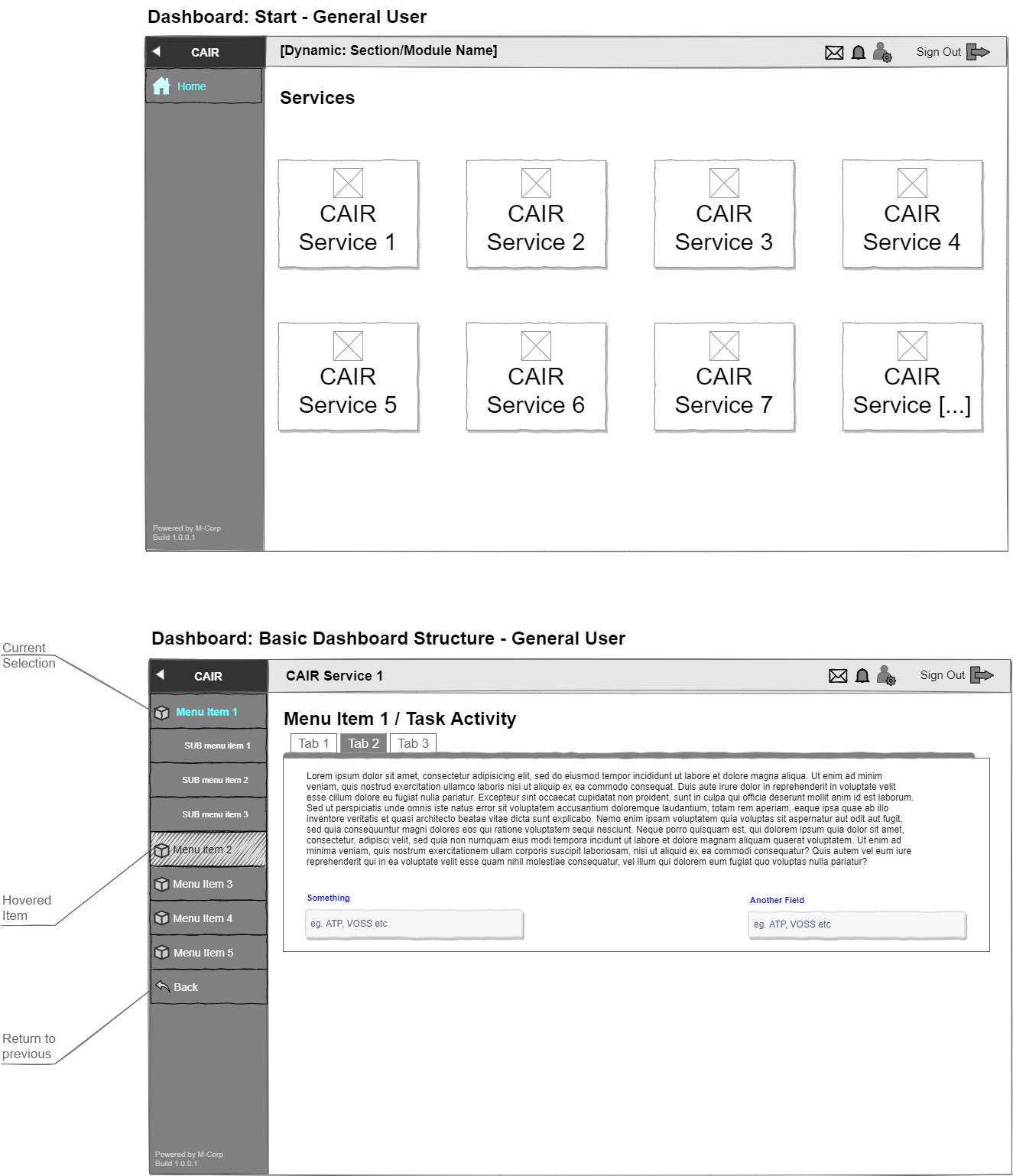
Then came the high-fidelity interactive prototype. It was built in such exacting detail that it served as the living specification the engineering team used to build the real thing.
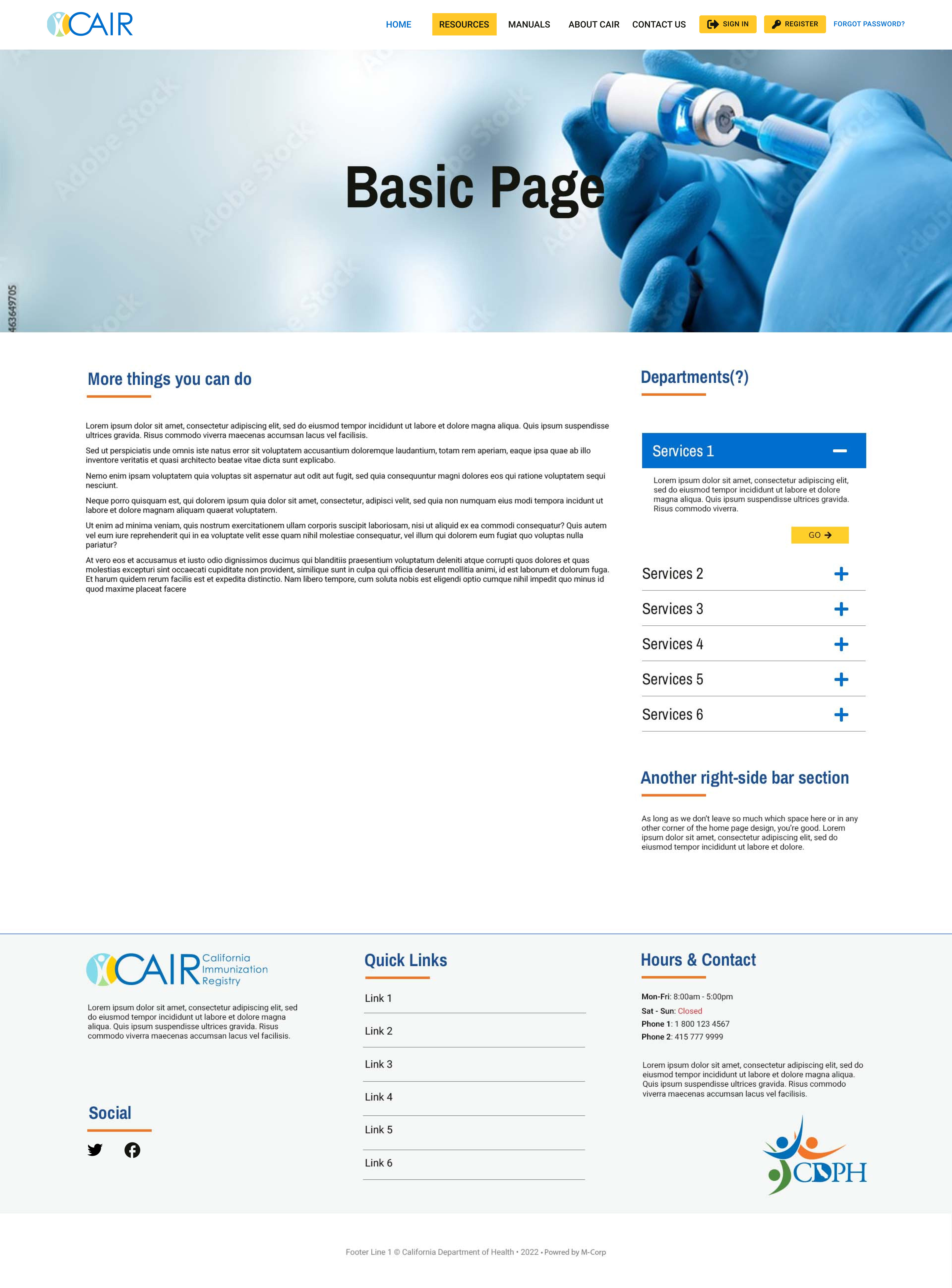
Hi Fidelity still mockups
Key Decisions
I prioritised legibility over decoration, and it was genuinely the best call we made. I stripped out every single decorative element. For users doing medical and administrative work under immense time pressure, ornament is just friction. You ask if it photographs a bit less "designed" for a portfolio thumbnail? Yes, it does. I took that trade every single time. It feels brilliant to build something that just works.
We treated colour as pure compliance. It was never a standard palette. Instead of picking colours that looked nice and checking contrast afterwards, I completely inverted the process. Contrast requirements and the locked brand came first. The palette was simply whatever survived the filter.
I delivered a system rather than a static set of screens. I could have easily handed over polished comps and let engineering try to interpret them. I built a tokenised component system with rigid logic instead.
The design was grounded entirely in what actually ships. Because I had years in frontend before this, I advised on implementation directly in Angular, SASS, and Material UI rather than chucking a file over the wall. The designs were completely feasible by the time engineering even laid eyes on them. The Tech Lead (Steve Yerkes, goodness bless that grumpy old bloke's heart) actually told me he had not seen a designer handle SASS and the frontend at that level before. I kid you not, that is the part I am proudest of. And it is not even a visual design claim!
We used the prototype as the actual spec. The interactive prototype was never meant to be a pitch artefact. It was detailed enough to be the exact reference the build ran against. It completely killed the usual translation loss between the design and the thing that actually got built. It was a proper triumph.
Final Experience
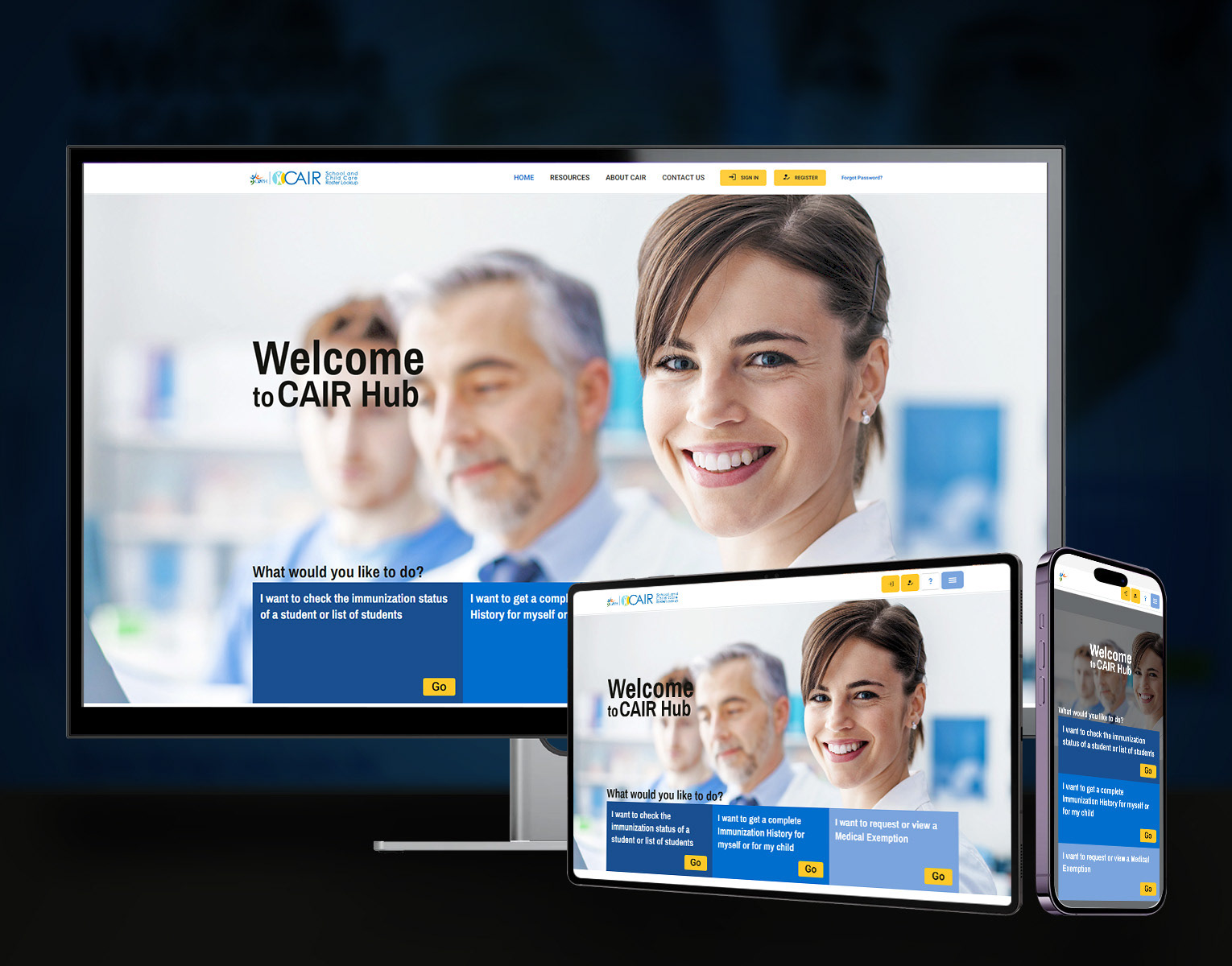
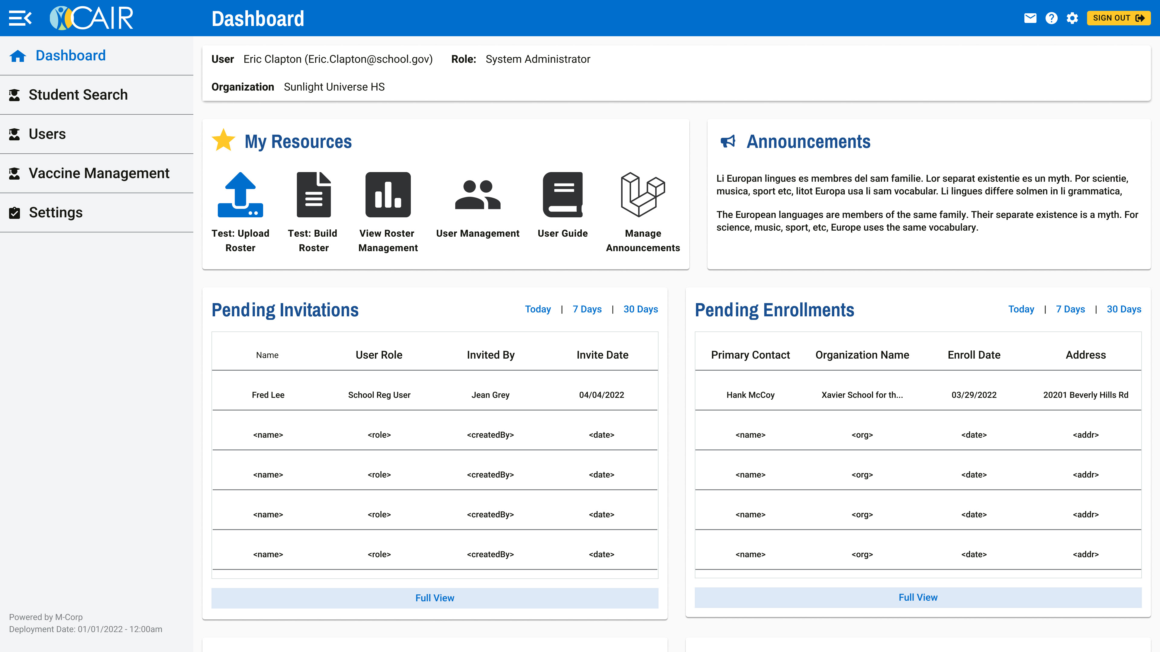
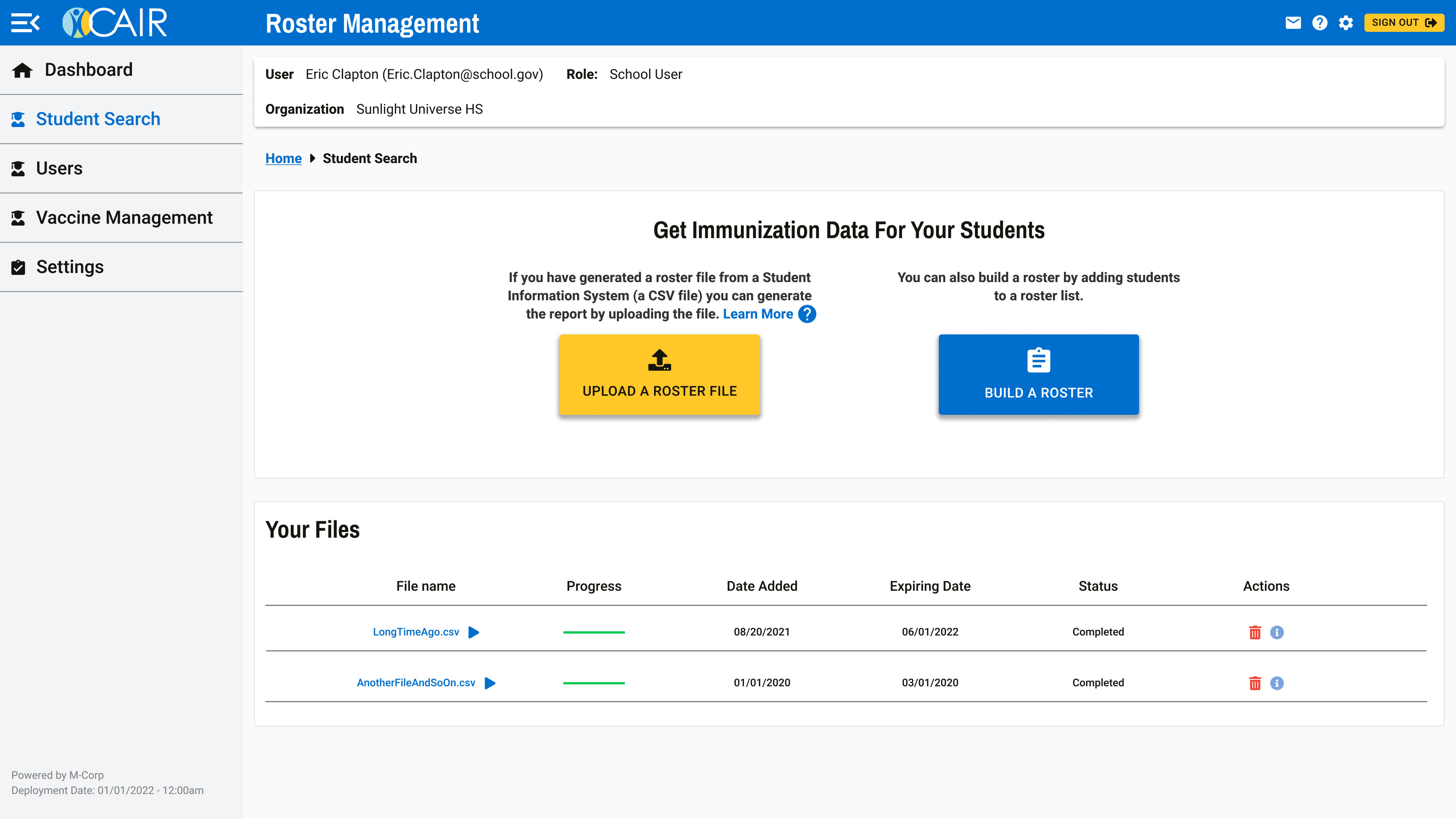
CAIRHub launched as a single, sorted hub. We binned the scattered vendor interfaces. A user lands on a dashboard that organises services into a proper grid. They find what they need and move through a task flow that behaves exactly the same way every time.
The responsive framework holds the experience together across desktop, tablet, and mobile. Same logic. Same components. Same accessibility guarantees at every width.
For assistive-technology users, the experience finally cleared the bar it was legally required to meet: a bar it had practically ignored for years. The data-heavy views stayed entirely usable because the component system was actually built to carry the weight.
It reads as one product made by one hand. After the absolute fragmentation it replaced, that was the entire point.
Outcome / Metrics
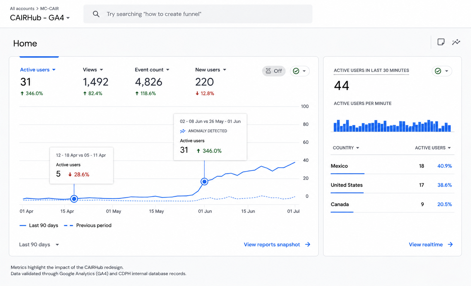
Google Analytics: 346% increase in user sessions
The redesign I shipped drove a 346% increase in user sessions.
That number is measured. It is not an estimate. We pulled it directly from Google Analytics and CDPH's internal database records, pegging the baseline to the session count right before the 508-compliant redesign went live. It reflects actual behaviour rather than vanity metrics. Clinics and health organisations are finally using the system to finish their work instead of just bouncing off it.
The VP of Product (Chuck) gave the prototype full marks. The frontend Tech Lead had every reason to be completely sceptical of a designer touching implementation. He called me the most capable designer he had ever worked with on SASS and the frontend.
What Would I Improve Next?
Two things, and one admission.
First: measurement. The session count is a strong adoption signal, and it is the number I have. But I should have instrumented task-level metrics from the start. Completion rates, error rates, the exact time-to-complete for every user group. I needed to prove the experience was improving. Instead, I only showed that traffic was climbing.
Second: handoff governance. I built the system to stay strictly consistent. A system only survives if someone owns it after the designer leaves. I should have shipped proper governance documentation and a contribution model. That stops the work from drifting once iteration continues without me.
Now the admission. We needed real usability testing with actual assistive technology users. That takes accessibility from legally compliant to genuinely brilliant. We relied on standard audits. Audits only catch what the checklist knows to look for. Real users catch what it misses.
One honest caveat. I owned the version that produced these results. It shipped between 2022 and 2023. After I rolled off the project, iteration continued at pace, so the live site has likely moved on from what I originally delivered. I am claiming the work I did and the exact outcome it drove. I do not claim whatever is sitting on the server today.